4 Fabulous Tips to Get Started with Multi-device eLearning

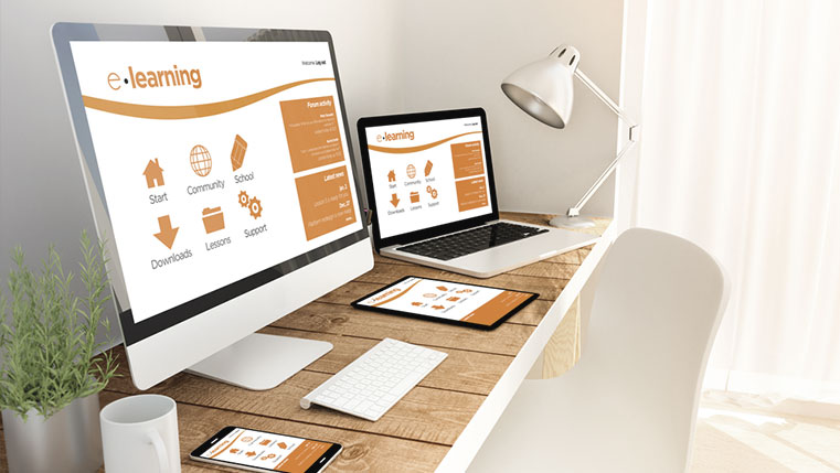
Developing eLearning courses for desktops are passé. Now, most of the Gen-Y learners use multiple devices for learning and based on the situation at work and availability of devices at that moment. If your training needs to reach a maximum number of learners, it should work on any hand-held device that people use. Just the broad idea of multi-device online learning is not enough for training managers to implement it in multinational organizations. So, here are some important tips for you to consider to start multi-device eLearning in your organization.
1. Plan to Build Multi-device Learning
Before you jumpstart building courses for multiple devices, you need to plan for a successful device-agnostic learning implementation in your organization.
You need to consider these things while planning:
- Ease of learning on mobile devices
- Check the readiness of your employees and the organization
- Additional resources the learners needed to access the training on mobile devices
- Support needed from other teams for implementation
2. Decide the learning approach – Slide-based or Web-based
There are two major approaches to multi-device online learning – Web-based and slide-based learning. You can decide the approach or switch between the two based on the learner’s needs and content.
a. Slide-Based Learning
Slide-based e-learning is commonly used approach in many companies even today. Slide-based courses are developed using authoring tools such as Storyline, Captivate, Lectora and more. In this approach, courseware developers design courses by placing text, pictures, videos, and other multimedia elements on slides.
If the relative positioning of objects is important and high level of design customization is needed, then you can go for slide-based learning. Example: scenario-based courses. Positioning of objects and proper order of scenes are important in scenario-based learning for learners to get a clear understanding of the given situation.
b. Web-Based Courses
Web-based courses appear and work like small websites instead of slides where learners click next to go further. They are intuitive in navigation and fully responsive. That means the course content dynamically adapts and reflows based on the different screen sizes of the devices learners use. Storyline’s authoring application ‘Rise’ helps create innate responsive courses effortlessly without any programming skills.
In web-based courses, the relative positioning of text and objects is not important. It’s useful for simple online courses where positioning of objects doesn’t matter, for example, if the message won’t change when you place image beside, above, or below the text. You can use web-based approach for video-based learning too because there is no chance of content reflow and you won’t have any issues. This form is also useful to develop simulation-based/how-to courses.
3. Start Designing for the Smallest Screen Devices
If you want to create a multi-device eLearning, start designing your courses for smallest screen handheld devices. This way, you come across most of the limitations and find answers for them. Here are some aspects you need to consider while designing side-based multi-device learning:
a. Length of the Course – If your learners need to take online courses on mobile devices, they’re often on-the-go and won’t have time to take a lengthy eLearning course. Dividing the lengthy eLearning into bite-sized microlearning modules is helpful for learners and occupy less screen space.
b. Smaller File Sizes – If your learners use smartphones to access online learning, they may run it using 3G or 4G networks. That’s why you need to compress images and videos to download faster.
c. Readability of Text – Use simple and legible font for course text for learners to take the courses comfortably on hand-held devices. Based on the fonts you use, the numbers display differently, but using san serif, non-fancy fonts that are easy to read is good and if have any doubt, you can always test and use.
d. Use Big Enough Buttons – If the buttons in online courses optimized for mobile devices are not big enough, your learners end up pressing other buttons accidentally and it’s an unnecessary waste of time for them. Buttons that are big enough to place fingertips avoid this negative experience.
e. Minimal Use of Graphics – Use of too many graphics distract your learners. So, recheck the relevance of your graphics when you develop courses for multiple devices. Use graphics in your course only if it is necessary, and if the text conveys the message clearly without that graphic, you can avoid graphics.
f. Choose the Right Authoring Tool You have a number of authoring tools in the market to develop a multi-device compatible eLearning. Articulate Storyline 360, Rise, Adobe Captivate 2017 Release, Lectora Inspire, Gomo learning are some of the major authoring tools that offer multi-device responsive and HTML5 outputs.
To select the right authoring tool that fits your training needs consider these points:
- The selected tool must help you create courses that work well on all handheld devices without any supported devices or no support at all.
- The authoring tool must adjust your online course to all screen sizes so that it works on all devices without much tweaking.
Hope the given tips help you transition smoothly from desktop eLearning to multi-device online learning. Opting for the right responsive eLearning authoring tools based on your online training needs will make the creation of multi-device eLearning easy. So try that.


