

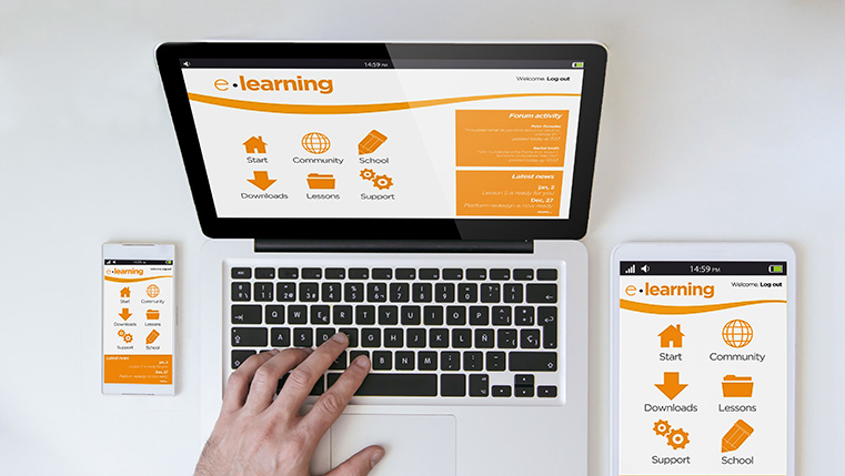
Ever thought about how many devices you use in a single day? Whether it’s a laptop, desktop, tablet, or smartphone, we seamlessly hop from one to another based on our needs and convenience. Imagine the power of having your eLearning courses accessible across all these devices for your employees—no matter where they are or what gadget they're using.
But here's the catch — creating individual courses for each device can be a real hassle—expensive, time-consuming, and downright exhausting. So, how do we tackle this challenge smartly? The answer lies in leveraging responsive eLearning design. It's the game-changer that ensures your content looks stunning and works effortlessly on any screen. But here's the catch — creating individual courses for each device can be a real hassle. Crafting individual courses tailored for each type of device can be a daunting task. It’s not just a drain on resources, but also a marathon of time and energy. So, how do we smartly sidestep this obstacle? With responsive eLearning design! This innovative approach ensures that your content not only looks breathtaking but also functions flawlessly on any screen. It’s time to rethink your eLearning strategy and simplify the process for everyone involved. Let’s dive in!
→ Access Tool: eLearning Authoring Tool Finder
TOC
- What is Responsive eLearning Design?
- What Are the Benefits of Responsive eLearning Design?
- How Do eLearning Authoring Tools Impact Responsive eLearning Design?
- What are the Tips for Developing Responsive eLearning?
What is Responsive eLearning Design?
Responsive eLearning design involves developing digital content that seamlessly adjusts to different screen sizes and orientations, providing an optimal viewing and interaction experience on various devices.This method involves the use of flexible layouts, adaptable images, and cascading style sheet (CSS) techniques that automatically adjust the content presentation according to the learner's device, whether it be a smartphone, tablet, or desktop computer.
Understanding with Examples
- An onboarding course for new employees that features interactive simulations and quizzes, designed to be responsive so that it delivers an engaging learning experience whether accessed on a computer at the office or on a mobile device at home.
- A leadership development program that includes video lessons and real-time feedback tools, accessible on any device, allowing managers to enhance their skills on the go.
- A sales training module that automatically adjusts its layout and content for viewing on smartphones, tablets, or desktops, ensuring that sales representatives can access crucial information anytime, anywhere.
- A customer service training series with case studies and role-playing exercises that adapt to various screen sizes, enabling staff to improve their techniques from wherever they are.
What Are the Benefits of Responsive eLearning Design?
1. Enhanced Accessibility:
Employees have the flexibility to access training materials on various devices, including computers, tablets, and smartphones. Whether they're at the office or working remotely, this ensures that learning can continue uninterrupted, accommodating diverse work environments and schedules.
2. Cost-Effectiveness:
By utilizing responsive design, companies eliminate the need for creating separate content versions for different devices. This approach significantly reduces development costs, allowing organizations to allocate their resources more efficiently and invest in other critical areas of employee development.
3. Streamlined Updates:
Responsive eLearning facilitates easier updates and maintenance of training content. This ensures that all employees consistently have access to the latest information and training materials, helping them stay informed and up-to-date with industry standards and practices.
4. Increased Engagement:
Content that is easily accessible and visually appealing across any device enhances learner engagement. This increased engagement leads to better knowledge retention and application, as employees are more likely to interact with and absorb the training material.
5. Scalability:
Organizations can efficiently scale their training programs to accommodate multinational teams with responsive eLearning. This guarantees consistent content and training quality, regardless of the employee's location or device, fostering a unified learning experience across the company.
How Do eLearning Authoring Tools Impact Responsive eLearning Design?
1. Simplification:
eLearning authoring tools offer intuitive interfaces and robust features, streamlining the course development process. This simplification focuses creators on content quality rather than technical complexities, making course design accessible and efficient.
2. Accessibility:
Instructional designers can craft engaging, interactive courses without needing advanced technical expertise. These tools democratize content creation, allowing easy use of advanced features.
3. Compatibility:
Built-in functionalities ensure eLearning content remains intact across various devices and platforms. This compatibility is essential for consistent access and engagement, regardless of device or location.
4. Branding:
Authoring tools provide templates and design assets that support consistent branding, aligning with corporate identity. This ensures training materials reflect the organization's brand values.
5. Engagement:
By incorporating multimedia, animations, and interactive elements, these tools enhance learner engagement. This variety in content delivery keeps learners motivated and immersed in their courses.
Here’s an insightful video to help you get started with designing responsive eLearning courses.
6. Collaboration:
They facilitate real-time collaboration among content creators, experts, and stakeholders, ensuring comprehensive input during course development. This collaboration enriches course content.
7. Impact:
eLearning authoring tools are crucial for creating responsive eLearning courses that drive corporate success and employee development. They equip employees with the skills needed to excel.
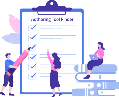
Authoring Tool Finder
Find the Right Authoring Tool, Whatever Your Requirement.
- Enables hassle-free decision-making
- Offers ideal authoring tool options
- Boosts your productivity
- Understands your custom eLearning needs
What are the Challenges in Designing Responsive eLearning, and How to Solve Them?
Challenge: Ensuring compatibility across multiple devices and screen sizes.
Solution: Use flexible grid layouts and scalable vector graphics (SVGs) to maintain design consistency on any device so that the content must display correctly and be fully functional, regardless of the device or screen size used by the learner. Implementing flexible grid layouts allows the content to adapt automatically to different screen sizes, ensuring that text, images, and interactive elements are displayed properly. SVGs maintain high-quality visuals without pixelation when resized, providing clear and crisp images on any device. These approaches together help create a seamless user experience across all platforms.
Challenge: Maintaining user engagement with varying content types
Solution: To keep users engaged, integrate a diverse range of interactive elements such as quizzes, videos, and discussions. Quizzes can challenge users and reinforce learning, while videos can provide visual and auditory learning opportunities. Interactive discussions can foster community and deeper understanding. Customize content to match user preferences by leveraging data analytics to understand user behavior and interests. Additionally, provide feedback mechanisms like surveys and comment sections to gather user input, ensuring that the content remains relevant, engaging, and constantly improving based on real user feedback.
Challenge: Managing increased development time and costs
Solution: Streamline the eLearning development process by utilizing advanced authoring tools and pre-designed templates tailored for responsive eLearning. These tools can significantly reduce the time needed to develop content by allowing for easy drag-and-drop functionalities and reusable components. Employ an agile development methodology, which involves iterative development and regular feedback to prioritize essential features. This approach helps in quickly addressing user needs and minimizing unnecessary expenses by focusing development efforts on what truly adds value to the end product.
Challenge: Testing and quality assurance for different operating systems and browsers
Solution: Implement a robust testing strategy that includes both automated and manual testing tools to ensure compatibility across various platforms and browsers. Automated testing can efficiently cover a wide range of scenarios, providing a baseline for compatibility. Supplement this with manual testing to catch nuances that automated tools might miss. Conduct regular user testing sessions to identify potential issues early in the development process. This ensures a seamless learning experience across all devices by allowing real users to interact with the content and provide feedback, ultimately leading to a more polished and user-friendly product.
What are the Tips for Developing Responsive eLearning?
1. Go Mobile First
According to Gallup, 71% of millennials connect more with mobile learning than other, more formal modes of learning.
Consider a mobile strategy first. Here is where you think about the learner experience on a mobile device and then scale it up to desktop/tablet screens. Why do most designers embrace the mobile learning strategy? It’s because, 1 in every 5 people use the mobile device for learning. Mobiles are more relevant than desktops/tablets. The only research you need to do before designing a mobile course is plan and design your course for the smallest possible screen. If you embrace this mobile first strategy, you can build an adaptive environment. Note that here you need to think about the design and learning strategy that will work on mobiles.
2. Offer Responsive Microlearning Modules
Creating a responsive course saves cost, time, and efforts. But you should think about how it will make sense to learners. For example, if you create a course 50-minute course for a smartphone with a small screen size, you are bound to face loading issues and distracted learners.
Responsive design deals with how you adapt your user interface and content based on the device being used. We need to enhance the learning experience on the smartphone, not replace the desktop/tablet experience.
So, how can we make that 50-minute course a worthwhile learning experience on a smartphone? It’s simple, present the content in pieces:
- A series of responsive microlearning modules that are based on one learning objective.
- Responsive refresher courses on specific topics for employees who’ve already completed the entire course on their desktops/tablets
You can maximize ROI by ensuring the right content is shown in the right context on the right device, accepting the limitations of different devices.
Delve into the plethora of benefits of Microlearning!
3. Consider the Need for Speed (Image Quality vs. Speed)
Slow loading is the main drawback of responsive design. No matter what device you use, the learner will be bored if he has to sit and take a course that takes long to load. To avoid this, you need to:
- Compress the content of your eLearning
- Create separate versions of images (optimized images)
Following these tips, you can reduce scaling and bandwidth issues.
4. Think About the Layout and Visual Treatment and Then Wireframe It
Before you start developing or designing a course visually, ask yourself:
- How long will the course be?
- What is the strategy I’m going to use and how can I fit visuals to support it?
- What is the best way of organizing interactivities and how do I carry client branding throughout the course?
- What is the mobile strategy being used?
- How to structure the content?
Now, wireframe it before going further; wireframes are a perfect way to communicate quickly and clearly the screen layout, scope, visual treatment i.e., the usage of visual elements to provide a learner-friendly environment. For example, at the prototype stage, you need fill the gap between the concept and reality, to give the client an overview of how the course will look and function.
5. Eliminate the Unnecessary
Get rid of the unnecessary elements or information; this will declutter the course. Eliminating unnecessary stuff will reduce loading issues and also the diversion factor. You also need to eliminate:
- Excessive whitespace
- Unnecessary graphics
- Layouts and borders that do not add any value
6. Prototype, Test, and Share
Before you publish an eLearning course, you need to check whether the course is viewable in all platforms. You need to do a cross-browser comparability test. You need to:
- Talk to your front-end developers and avoid mistakes
- Develop an early proof of concept and perform a thorough quality check on all target devices
- Engage your learners by giving them a quality output compatible across all platforms
- Share and receive feedback to meet client expectations
Authoring Tool Finder
Find the Right Authoring Tool, Whatever Your Requirement.
- Enables hassle-free decision-making
- Offers ideal authoring tool options
- Boosts your productivity
- Understands your custom eLearning needs
What are the Best Authoring Tools for Responsive eLearning Design?
When you dive into the world of responsive eLearning design, choosing the right authoring tools can make all the difference. Imagine crafting courses that not only captivate your learners but also seamlessly adapt to any device. That's the magic of picking the best eLearning authoring tools! These tools empower you to create content that engages learners on their terms, whether they're swiping through lessons on a smartphone or delving deep into a tablet. With the right tools, your content becomes accessible and engaging, ensuring a learning experience that resonates with everyone.
Learn how to choose an ideal authoring tool based on your eLearning needs.
But there's more! Not only do these tools help in creating engaging content, but they also ensure scalability. As your learning needs grow or change, having the right authoring tools means you can easily adapt and expand your courses without starting from scratch. This flexibility is invaluable, allowing you to keep your content fresh and relevant. Plus, with the collaborative features many of these tools offer, your team can work together seamlessly, no matter where they are. So, embrace the potential of responsive eLearning tools and take your courses to new heights!
Here are three popular tools you should try:
1. Gomo Learning:
Known for its cloud-based authoring capabilities, Gomo stands out for its flexibility and ease of use. It allows designers to create courses that seamlessly adapt to different screen sizes without the need for manual adjustments. Gomo's responsive templates are designed to ensure that content looks good on any device, making it an ideal choice for organizations targeting a global and mobile-first learning. Additionally, its collaborative features enable multiple team members to work on projects simultaneously, streamlining the eLearning course development process.
2. Articulate Rise:
Part of the Articulate 360 suite, Articulate Rise is specifically designed for building fully responsive eLearning courses. Its intuitive interface allows designers to create visually appealing courses using pre-built modules, which automatically adjust to various devices. Rise excels in providing a straightforward approach to eLearning course development, emphasizing simplicity and elegance. It is particularly effective for those looking to create content quickly, as it supports drag-and-drop functionality and dynamic, scroll-based layouts that enhance learner engagement.
3. iSpring:
iSpring offers a powerful yet user-friendly suite of tools that integrate seamlessly with PowerPoint, making it accessible for those familiar with the software. It allows users to convert presentations into rich eLearning content with responsive design elements. iSpring Suite provides comprehensive options for incorporating quizzes, interactions, and multimedia, ensuring that courses are both interactive and adaptive. It also supports SCORM and xAPI, enabling straightforward integration with Learning Management Systems (LMS) for detailed analytics and tracking.
These tools each bring unique strengths to the table, offering a wide range of capabilities that enhance the development process for instructional designers. By leveraging these features, designers can create responsive eLearning experiences that are not only visually engaging but also pedagogically effective. This allows them to address diverse learning needs by incorporating various multimedia elements, interactive activities, and adaptive learning paths that cater to different learning styles and preferences.
Summing up!
Incorporating responsive eLearning design tips can significantly enhance the learning experience by ensuring content adapts seamlessly to various devices, making it more engaging and inspiring for learners. Prioritizing adaptability and interactivity allow learning designers to create a dynamic environment that meets diverse learning needs, fostering a deeper connection with the content. Embrace these strategies to transform your eLearning courses into impactful responsive learning tools that resonate with your learners and drive meaningful outcomes.
If you're seeking to explore different options and want an easy decision-making process for selecting the best authoring tool for your eLearning needs, the task has been made simpler for you with our Authoring Tool Finder! Don’t believe us? Then check out the tool yourself.