

Today’s learners are used to getting their information on the go and in bite-sized pieces. They expect to be able to access content anytime, anywhere, and on any device. This has led to a growing demand for responsive eLearning courses that can adjust to fit any screen size.
In 2015, only 31% of people used their phones to access websites, documents, and more. In 2022, this figure increased to 59%, and the number of mobile screens also increased. This means that mobility is now the new standard, and therefore, the importance of responsive design for eLearning is also increasing.
Wondering Why You Should go for Responsive eLearning?
Here are the 4 reasons how responsive eLearning can act as a gamechanger:
- Improved learner engagement
- Increased course completion rates
- Reduced maintenance and development cost
- Accessibility for leaners
This article will go over the importance of responsive design for eLearning, especially considering how today’s learners are always on the lookout for more convenient ways to learn.
Importance of Responsive Design for eLearning
Responsive eLearning is an emerging trend in the eLearning industry that allows courses to be designed for optimal viewing on any device. It is important for training managers to keep this face in mind when sanctioning any eLearning course development.
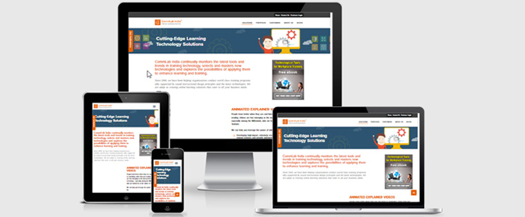
Responsive design principles for eLearning mean that the course adjusts to fit the screen size of the device it is being viewed on. This provides a better learning experience for learners as they can access the content, they need in a format that is easy for them to consume.
There are many benefits of using responsive eLearning courses, including improved learner engagement and satisfaction, increased course completion rates, reduced development and maintenance costs, and more.
As a training manager, it is important to consider the needs of your learners when deciding the design, you use for upskilling and reskilling. If your learners are constantly on the go and need to be able to access course content on their mobile devices, then responsive eLearning is a good option for you.
This is particularly true for Millennials and Generation Z, as they stand out for their reliance on technology and smartphones.
What is Responsive eLearning?
As the name suggests, responsive eLearning is a type of course that is designed to respond or adjust to the different screen sizes of various devices. This type, of course, is built using responsive design principles, which means that the content and layout of the course automatically adjust to different mobile screens, tablets, laptops, and computers.
Regardless of whether the screen being used is 480p, 720p, 1080p, 2K, 4K, 8K, or more, the screen will automatically adjust itself to avoid pixelation and to maintain the course design. A responsive design is, without a doubt, the first element to consider when developing an eLearning course for today’s learners.
Today, learners are more likely to engage with and complete a course (or any form of media) if it is available in a format that is convenient for them.
The A-Z you need to know about Responsive eLearning
Benefits of Using Responsive eLearning
There are many benefits of developing responsive eLearning courses for today’s learners. These include:
Improved Learner Engagement & Satisfaction
One of the main benefits of using responsive eLearning is that it can improve learner engagement and satisfaction. When learners can access course content on their preferred device, they are more likely to engage with the material and be satisfied with the overall learning experience.
Furthermore, it improves retention as well, as mentioned in a later section.
Increased Course Completion Rates
Another benefit of using responsive eLearning is that it can lead to increased course completion rates. This is because learners are more likely to complete a course if it is available in a format that is convenient for them.
More completion means more information retention and a high likelihood of feedback. Furthermore, there is a much higher chance of learners recommending your courses to others because of the quality, utility, and convenience it offers. This, in turn, leads to enhanced ROI, be it a microlearning or microlearning course.
Reduced Development & Maintenance Costs
Training managers can also save time and money by using responsive eLearning courses. These types of courses only need to be developed once and can then be easily adapted for different devices. This reduces the amount of time and money that would otherwise be spent on developing separate courses for each device type.
For example, as a training manager, if you want to develop a course that needs to be accessed by both desktop and mobile users, you will only need to develop one responsive course. The alternative would be getting two separate native courses developed, which would cost much more and take more time.
This way, training managers can save time and money considerably. Responsive eLearning courses only need to be developed once and can then be easily adapted for different devices.
Being Ready for the Future
As more and more people access content on mobile devices, it is important to be ahead of the curve – and the best way to do that is by having responsive eLearning courses. This will ensure that your courses are accessible to the widest audience possible, maintaining their design across different devices, regardless of the technological advancements.
Responsive eLearning courses can also improve accessibility for learners with different needs. For example, learners with visual impairments can make use of screen reader technology to access course content on their mobile devices.
These benefits show that responsive eLearning design helps you improve your course for today’s learners across the board, as well as help it remain viable for your organization.
Is Responsive Design Really Necessary?
With all the benefits of using responsive eLearning, you may be wondering if it is necessary. The answer is a resounding YES! As more and more learners access content on mobile devices, it is important to have courses that are accessible on any type of device and are delivered in a manner that is humanistic and calm for learners.
Despite the many benefits of using responsive eLearning, there are a few challenges that you may face. One challenge is that not all learning management systems (LMS) support responsive design. This means that as a training manager, you may need to find a new LMS or make changes to your current one in order to use responsive eLearning courses.
Another challenge is that developing responsive eLearning courses can seem time-consuming and expensive if not done properly or if the opportunity cost is not kept in mind. However, if you compare the cost and time involved in developing responsive eLearning courses, you can clearly see that the extra effort and time are just a fraction of the latter.
You will need to find people with the technical skills to create the responsive design, though. Alternatively, there are several tools you can use to ensure an automatic responsive design.
Strategic Decisions When Designing Responsive eLearning Courses
Training managers must make several strategic decisions when designing responsive eLearning courses. Three of the most important decisions you will have to make include:
Choosing the Right LMS
Not all LMSs are made equal. While some support responsive design, others may not. So, this means that you may need to find a new LMS or make changes to your current one. When selecting an LMS, be sure to choose one that offers features such as content delivery on multiple devices, responsive templates, and the ability to track learner progress.
Selecting the Best Authoring Tool
Another important decision is selecting the best authoring tool. There are many authoring tools available, so it is important to choose one that offers features such as responsive templates and the ability to track learner progress. Three of the most popular authoring tools include Articulate Storyline, Adobe Captivate, and Lectora Inspire.
Choosing the Mode of Delivery
You will also need to decide how you want to deliver content to learners. One option is to create a separate course for each type of device. However, this can be time-consuming and expensive and is not in line with the “responsive” workflow. So, you should consider a platform that allows responsive delivery as well.
By making the right strategic decisions, you can ensure that your responsive eLearning courses are accessible, engaging, and cost-effective. Remember, when reaching today’s learners, simply telling them that your course is beneficial is not enough. You need to ensure a seamless delivery process as well for a better learner’s journey, too!
To Sum Up!
Responsive eLearning can act as a viable solution that can cater to the needs of learners irrespective of the devices they are using. It can save your time and money, yet you receive the best of assured quality. However, you need to find the right LMS that can host your course, keeping in mind that the initial cost can be a little expensive.
Choosing the right LMS is essential to make sure your responsive eLearning courses are available to the learners. Here’s a free eBook that can guide you to choose the right one.