

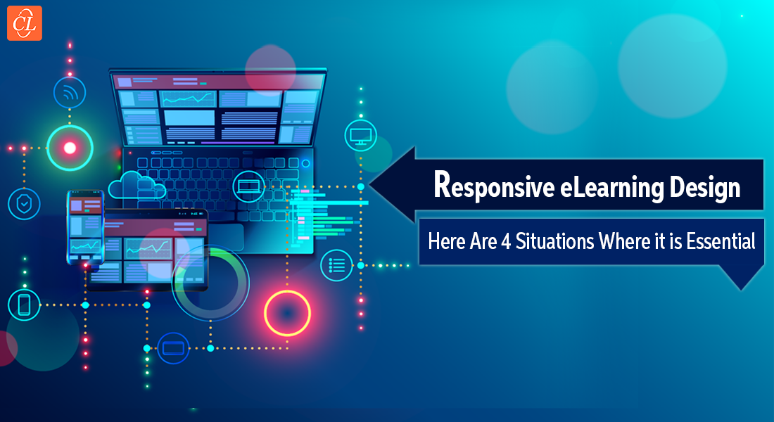
With the boom of mobile devices in the early 2000s, website designers developed multiple versions of the same site that would work flawlessly across all target devices. But, as the number of devices skyrocketed, this practice became increasingly difficult and to a large extent, impractical. As the popularity and functional capabilities of mobile devices continued to rise, the same problem soon presented itself to eLearning developers. Developing device-specific versions of courses was a daunting task, and soon new methods were developed. Responsive design emerged as a strong solution to tackle these problems.
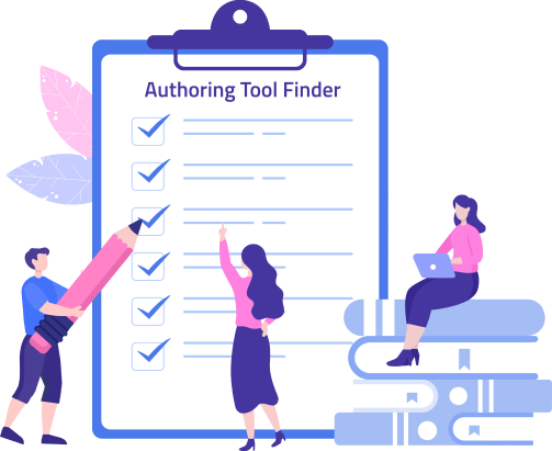
→ Download Tool Now: Authoring Tool Finder
Below are 5 reasons responsive design should be part of your training strategy:
1. Increases Learner Base
A vast and younger generation is entering the workforce. This generation doesn’t believe in staying glued to their desks all the time. They are not afraid to adapt to a more dynamic work schedule, depending on the need of their clients and customers. As work routines become more scattered, young employees find it difficult and inconvenient to undertake training by sitting in front of their computer screens.
On top of this, millennial employees are raised on technology and completely at home managing their entire life through a smartphone or tablet. So, giving them eLearning courses that fit their schedules and mindsets is but natural. Make responsive design a part of your training strategy and give your young employees a seamless learning experience across their ever-changing devices.
2. Seamless Accessibility
Having multiple devices has not only become common, but also essential to a certain extent. Since everyone wants to make the most of their free time, it is common for a single course to be accessed from multiple devices before it is completed. Employees might start the course at their desktop, access it on their phone while travelling, and open it on their tablet while sitting at home.
If your course is designed using responsive design principles, then users get the same superior experience across all their devices. Employees report higher satisfaction with the course material, allowing them to grasp knowledge more readily. As courses can be accessed fluidly across all devices, effective skill development is facilitated as all useful information is at your fingertips.
3. Learning Benefits
By using responsive design for your eLearning program you ensure that your courses look, feel, and function efficiently across any possible devices. For learners who might complete different portions of the course on different devices, this proves to be a boon. Users do not have to worry whether the course will function or load properly on their device; rather, they can just focus on the main learning aspect.
When a course gives learners the best experience right on their smartphones, they are motivated to engage further in their quest for knowledge. A bad learning experience pushes learners away, while a good one prompts them to come back for more. When learning engages users, they display better retention and recollection of knowledge, thus translating into better skill development in the long run.
Authoring Tool Finder
Find the Right Authoring Tool, Whatever Your Requirement.
- Enables hassle-free decision-making
- Offers ideal authoring tool options
- Boosts your productivity
- Understands your custom eLearning needs
4. Lower Development Cost
In its essence, responsive design approach means developing one single master course that runs equally well on all your target devices. You need to author the course just once, as opposed to doing for each specific device or device class. This significantly reduces the development cost as you only have to produce one deliverable.
Instead of having to worry about the technical specifications of various devices, developers can focus on creating more impactful and interactive courses. Managing courses also becomes easier as changes just have to be made on one master design. Handling the entire learning program becomes less resource-intensive and allows you to do more with less.
5. Easy to Maintain
If you have multiple versions of your online training course, then you will have to update each one of them individually to ensure cohesiveness. On the other hand, if you create your online course using responsive design, you just have to modify your master online course and deploy it to every device.
The same principle applies to course glitches or errors. Rather than having to correct a myriad of different modules, you just have to fix the issue once for it to reflect everywhere. When you have one version of the course, creating, tracking, and distributing online training programs becomes very easy through a Learning Management System (LMS). It is also easier to manage, maintain and perform analytics from a single point in the LMS.
Responsive design in can offer your online training courses a wide range of benefits. As the mobile market keeps growing, it would be wise to use responsive design for your learning program soon.