

With the explosion of mobile devices in the early 2000s, designers faced a major challenge of creating websites for an array of different screen sizes. Designers were forced to create versions of the site that were copies of the original site, but designed specifically for users browsing on different mobile devices. Creating multiple sites manually was both time consuming and costly for meeting the growing demands for mobile-ready content. As the number of devices kept on increasing, it became apparent that this device-specific approach simply couldn’t accommodate every new device.
→ Access Tool: eLearning Authoring Tool Finder
The increasing prominence of mobile devices has also affected the digital learning sphere. Powerful smartphones with amazing display capabilities have established their stronghold in people’s everyday life, and thus the way they learn. The principles of morphing content to the varying screen sizes of mobile devices also help us address the challenges associated with delivering eLearning courses for multiple smartphones. But, the challenges for eLearning are different compared to those of webpages.
Challenge in Creating e-Courses
When mobile incompatible websites open on mobile phones, all of its content will be loaded. Only thing is that it won’t be optimized for the smaller screen. This means that the website appears as a smaller desktop version, urging you to pinch or zoom on any section you are interested in.
Apart from this reduced functionality, its content and media elements remain intact. But, the same doesn’t hold true for eLearning courses. The reason eLearning courses are effective is that they have mechanisms to interact with users. When an incompatible course is loaded on a phone, such interactive elements might be misplaced or be missing all together. This subsides the course’s interactive value and diminishes its impact. For an eLearning course to work effectively on various devices, it is essential that all interactive elements are retained, irrespective of the device from which the course is accessed. For this to happen, the course design will have to be responsive.
So, what is responsive design?
To understand responsive design in the context of eLearning, it is essential to go back to its origin, which is in web design.
Responsive design is an approach of web design, aimed at developing desktop webpages that can modify themselves in response to various screen sizes or web browsers. Utilizing a responsive design ensures that the user experience of the website remains the same for a variety of devices. This approach of designing websites achieves responsiveness by using fluid grids, flexible images, and media queries. In simpler words, web developers simply define how a website will reposition, resize, hide, or swap content for various screen size and resolution breakpoints. A responsive website adjusts the content layout from two columns to one column, depending on the pixels available for each mobile device.
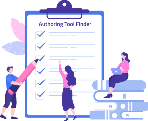
Authoring Tool Finder
Find the Right Authoring Tool, Whatever Your Requirement.
- Enables hassle-free decision-making
- Offers ideal authoring tool options
- Boosts your productivity
- Understands your custom eLearning needs
Responsive design for eLearning works on similar principles, but preserves the relative positions of elements to keep the interactivity intact. It involves the development of only one master course that works fluidly across all your target devices.
Below are some of the advantages of turning smartphones to learning aids by using responsive course design:
- Responsive design provides a frustration-free mobile learning experience. As the layout and functionality of the course adapts to every screen size, users get an immersive feel.
- It increases the reach of your eLearning course as it can be accessed through any smartphone device. No learners will be turned-off with the course, owing to their smartphone preference.
- One responsive e-course design fits all devices. This significantly reduces development costs and maximizes your return on investment.
- Maintaining a course becomes very easy as you need to make modifications to just one master course.
So how do you create responsive e-courses?
By using web-based authoring tools, developers can create fully responsive eLearning courses. Authoring tools take advantage of the same technologies used by responsive website building tools to produce inherently responsive content. The tools treat eLearning content like micro websites, rather than the usual slide-based layouts. Using this type of content makes sure that it doesn’t have the same relative positioning requirements. By using authoring tools, you can ensure that technology does all the heavy lifting in creating courses for multiple mobile devices. Course developers simply add text, insert images, upload media files, activities, and quizzes. Such courses look great and work perfectly with every mobile device, in every orientation.
Responsive design gives smartphones the potential to become the hub of eLearning. Seeing the ever-increasing power and importance of mobile devices, it is a good idea to adapt responsive design in your digital learning strategy. Fewer and fewer employees are depending solely only on their computers to gain meaningful skills. The smartphone has become such an essential part of life that for employees, it is not only more convenient to learn through them, but also more effective. By removing the barriers of screen size, operating systems, and browsers, it gives users a seamless learning experience across all their devices.