

Responsive eLearning – It is no exaggeration to say that this is the most widely discussed topic in the world of online training. But what is this hype all about? Is responsive eLearning really a game changer? Does it require any special design considerations? To find out, we need to delve deeper into the developments in the world of Internet and how these impact eLearning. But first let us see the definition of responsive eLearning.
→ Download Tool Now: Authoring Tool Finder
What is responsive eLearning?
Before we see the definition of responsive eLearning we need to understand what Responsive Web Design (RWD) means. The latest paradigm in the world of web technology, Responsive Web Design (RWD), facilitates the development of websites that are “responsive” to varying screen sizes of different devices – from Smartphones to desktop computers and provide an optimal viewing experience
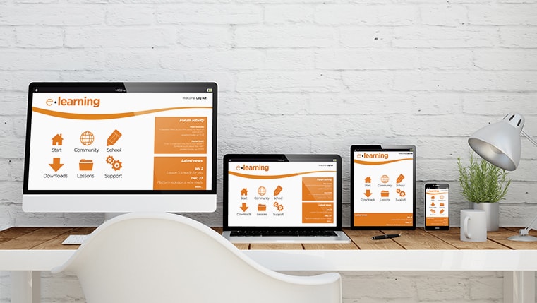
Responsive eLearning is the application of RWD to eLearning. It facilitates the development of online courses that can be efficiently accessed on multiple gadgets.
Why do you need responsive eLearning?
It is common knowledge that online training, to be effective, needs to adapt to the changes in the preferences of learners. The latest developments in the world of Information and Communication Technology have radically altered the way the online medium is accessed. Morgan Stanley Research estimates that by 2015, more people would use the Internet through mobile devices than desktop computers. This phenomenal increase in the number of people who use their mobile devices to access the World Wide Web has resulted in the need to look beyond Personal computers to deliver online courses. The results of a study conducted by Google also prove the same point. It reveals that 98% of Internet users switch between devices with varying screen sizes in a single day.
This leaves you with two choices. One, create multiple versions of the same online course for different devices or create a single responsive eLearning course that can be accessed effectively by multiple devices.
The first option comes with certain major challenges. Let us now see the drawbacks of developing multiple versions of the same course.
Increased cost and time:
Developing multiple versions of the same course results in considerable expenditure. In times, where training budgets are shrinking and demands for optimum use of the training dollar are fast growing, this is not a valid option. Moreover, course development times increase considerably and this is not acceptable when shorter training turnaround times mean better bottom line.
Difficult to track:
It is very important that you efficiently track the use of your online courses to get the best ROI on your training. Using multiple versions of the same course makes tracking of these different versions cumbersome.
Different mobiles come with different screen sizes:
Complicating things further, mobile devices come with varied screen sizes. It is impractical, if not impossible to develop versions of your course for all these devices.
These issues can be resolved effectively with responsive eLearning. You need to create only a single course that can be accessed on gadgets with varying screen sizes and tracked efficiently using an Learning Management System(LMS). But the biggest benefit of responsive eLearning is that it provides unparalleled learning flexibility to your people.
Responsive eLearning enables sequential screening – a learner can pause the online course on one gadget and resume it on another device exactly at the point where he/she has stopped. This makes learning highly flexible and user-friendly. Consider the following scenario:
An online course is assigned to a busy employee. He accesses the course on a desktop computer during working hours, but completes only a part of the eLearning program due to time constraints. He completes the unfinished part at his home by accessing the course on his mobile.
Authoring Tool Finder
Find the Right Authoring Tool, Whatever Your Requirement.
- Enables hassle-free decision-making
- Offers ideal authoring tool options
- Boosts your productivity
- Understands your custom eLearning needs
We have seen what responsive eLearning is and why it is needed. But what does it take to design a responsive eLearning course that helps provide the best learning experience for your users? Let us now look at 5 very useful tips that go a long way in the effective design and development of your course intended for multiple devices.
1. Simplicity is the mantra:
It certainly helps to use a simple layout. Use HTML5 document types. We suggest that you don’t clutter the HTML script with unnecessary CSS3 special effects and JavaScript.
2. See that your layout is flexible:
Use flexible grids that utilize columns to organize the learning content and use relative width to adapt the viewport size.
3. Choose the screen-sizes:
Width of the screen is the basic aspect you need to bear in mind when you design an effective responsive online course. You need to proceed keeping in mind the intended screen sizes. It is advisable to target the most frequently used screen sizes. It is useful to categorize the screen sizes into 5 primary groups.
- Less than 320 pixels (for low resolution devices)
- Less than 480 pixels (for the first generation smart-phone)
- Less than 768 pixels (for high-end smart-phones and portrait iPads)
- Greater than 768 pixels and less than 1024 pixels (for trigger tablets, landscape iPads and devices with exactly this resolution)
- Greater than 1024 pixels (for desktop computers)
4. Use media queries:
Media Queries is a CSS3 module that renders your content on the targeted screen sizes effectively. Media Queries as a powerful tool that changes the style of presentation depending on the size of the device.
5. Evolve the right visual strategy:
You need to consider the length of the page before you zero in on the images. Your strategy for presenting images needs to be based on these factors:
- Organization of the interactivities in your course and how the ocular elements fit into it.
- The purpose of making the online course accessible on mobile devices. This is important because your visual strategy needed to present just a brief gist of the desktop course is different from making comprehensive modules accessible on these devices.
- Presentation of the core-content on a smart phone. You many opt to load the key content first because users starved for time just scan through it and get the intended message.
It is essential to remember that you do not get lost in the technicalities of making your eLearning course responsive and neglect the fundamental element of an effective course – the right learning content. Whatever device your learners might use, they deal with the content. Don’t they? Make sure that the learners and the learning content continue to remain your first priority.
Responsive eLearning is still in its nascent stage and it will be some time before it fully evolves. However, there is not an iota of doubt when we say that the future of learning is responsive eLearning. What do you think?