

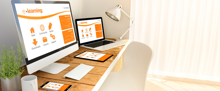
Smartphones and tablets have established their stronghold in the everyday life of almost everyone. With their increasing processing power and functionality, smartphones are making an unparalleled impact in the way we live our lives. Naturally, they have also impacted the way we learn.
→ Access Tool: eLearning Authoring Tool Finder
Increasingly, employees are accessing training material on their mobile devices. But, with so many different devices by numerous manufacturers, it’s inevitable that there are going to be many different screen sizes. So, how can you ensure that your eLearning course gives users the same experience across each device? Using a responsive design to develop your digital courses is one approach that breaks the barriers of screen sizes. Responsive design allows your digital learning to move fluidly between different screen sizes. No matter what the device, the elements of the course will modify themselves, giving learners the same seamless experience that they get on their computers.
But, do you really need to reshuffle your existing eLearning program and adapt responsive course design? Below is a comprehensive list of questions that will help you decide:
Will your training be accessed from multiple devices?
What is your organizational goal that your training program has set out to achieve? This is perhaps the most basic and important question you need to ask before implementing responsive design. Is your training program limited to giving basic compliance and procedural learning to employees sitting at their desks? Or are employees going to use it on the go to meet the real life challenges that their work throws at them? The answer to this question will help you decide the platforms that are going to run the course and consequently the need for responsive design.
Is your training future-proof?
Think about the mobile phones we were using just ten years ago. Technology moves pretty fast and mobile technology certainly has only moved faster. Ten years ago, we had basic keypads on phones, now we have advanced touchscreens. So, the important question is, where will we be in another ten years? Responsive design means it doesn’t matter how much device screen sizes change, your learning platform will adapt to fit them. A fluid design is one of the best solutions for future-proofing your learning platform, ensuring it stays up-to-date as mobile technology advances. New devices will be introduced every day and responsive design ensures that your course runs smoothly on each one of them.
Do you want to optimize development time?
Using responsive design means you only need to develop one master course. This single course layout will be adapted appropriately across all your devices. As course developers need to author just once and publish, responsive design saves development time and cost immensely. Also, a single version of the course is easier to maintain and update. If your organization is parched for training budget and yet needs to develop a course that suits a plethora of devices, then you should use a responsive design approach.
Authoring Tool Finder
Find the Right Authoring Tool, Whatever Your Requirement.
- Enables hassle-free decision-making
- Offers ideal authoring tool options
- Boosts your productivity
- Understands your custom eLearning needs
Will you need to restructure your e-learning?
Let’s say your company doesn’t have mobile learning courses, but owing to the changing work landscape you are considering developing it. Creating a mobile learning course isn’t usually as easy as simply migrating current courses to the new format. Responsive design should be considered during the instructional design process. Since you are dealing with less screen real estate, content must be chunked accordingly and appropriate visual design and interactivities should be specified. You need to carefully evaluate your current and future organizational goals before you proceed with reshuffling your current eLearning course to adapt a responsive design.
Do you need a single point distribution?
Using responsive design brings a great amount of consistency in your eLearning courses. As there are no different versions for different devices, you get superior control over your course. This facilitates single point distribution of the course, as you need to upload only one version of the course for all user devices. Tracking employee training attendance and completion also becomes a simpler affair due to the consistency of responsive courses.
Work schedules are no more restricted to the confines of a cubicle. Portable devices have enabled users to effectively stay on the field and work remotely. More and more employees are working without a fixed desk space, in a bid to keep up with stringent market or client demands. Use a responsive design for your digital learning program to train employees who are ever on the go, and who may or may not get time to access their computers. Using responsive design, give the best possible mobile learning experience to the employees who are out there making a difference for your organization.