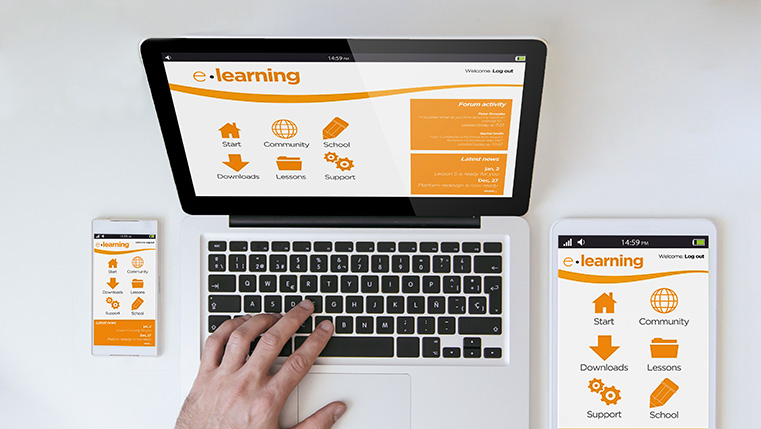
Tips to Make Your Online Courses Ready for Responsive Design

Responsive design is the talk of the town when it comes to future-proofing your e-learning courses. By making a single course compatible with multiple mobile and computer devices, it makes the lives of course developers easy. It also gives today’s millennial employees a flawless, cross-device compatible course that gels well with their methods of learning.
→ Access Tool: eLearning Authoring Tool Finder
Responsive design essentially means creating a single course that will run well on all possible devices. This ‘one size fits all’ approach takes a shorter time to develop as compared to creating individual courses for different devices. A single design also means that managing and updating the learning program becomes an easier affair. Responsive design not only saves on development cost but also allows you to run your learning program with fewer resources.
But for responsive design to work its wonder, it is essential that your digital learning program is ready for it. Below are some tips you can follow when making the transition to a responsive design:
Evaluate your requirements
Responsive design brings significant improvements in mobile learning. Sure, responsive courses also work well on desktops and laptops, but the real challenge it helps overcome is mobile screen incompatibility. Hence, before you adapt responsive design you should evaluate your organizational need for mobile learning.
If your training program is limited to only standard compliance related trainings, then responsive design may be unnecessary for you. But if your employees require just-in-time learning or performance support, then responsive design becomes an important ingredient for the success of your digital courses. At the same time, you should also evaluate your target audience. Using learner data, you can easily determine whether your audience prefers using portable devices or not.
Restructure your old courses to better suit new screen sizes
One of the most notable benefits of using a tablet or smartphone to access eLearning is interactivity. Hence, creating a mobile learning suite isn’t usually as easy as simply migrating current courses to the new format. As you are dealing with less screen size, you should reduce the content accordingly. The new content should also make the most of the visual and interactivity capabilities of the smartphone.
Authoring Tool Finder
Find the Right Authoring Tool, Whatever Your Requirement.
- Enables hassle-free decision-making
- Offers ideal authoring tool options
- Boosts your productivity
- Understands your custom eLearning needs
While restructuring the course, you also need to think of the situations your learners will be in when accessing learning, such as on the train commuting home or squeezing in a learning bite over coffee. You can also create several shorter bite-sized learning courses out of one big e-learning course. The bottom-line is that you should construct your responsive course around the abilities of the mobile-universe.
Adapt a mobile-friendly instructional design strategy
As the platform of your e-learning course changes to portable devices, your instructional design strategy should change as well. Every e-learning course has a high-level strategy of how the subject must be taught. Instructional design strategy begins with setting up clear goals and determining the actions that must be taken to meet these goals.
The various resources and techniques used to achieve these goals must change when an e-learning course is adapted to a responsive format. Owing to the limited screen sizes of phones, it would be best to keep interactions simple and navigation easy. Limit the amount of text on each screen and select an easily readable font.
Determine if your LMS can support responsive design
A learning management system (LMS) is the pillar on which your entire e-learning program stands. It helps you track individual user data such as attendance, completion of courses, excellence in assessments, etc. Using these learner statistics, it generates insightful reports that help you make useful decisions for your learning program.
Before you set out to make your course responsive, it is essential to check the compatibility of your LMS. If the LMS doesn’t support responsive design, then it can become a huge financial hurdle for you.
Check loading time
There are few things more frustrating than trying to open an e-learning course, only to be met with a loading bar slower than a tortoise. This is why it’s imperative that you test your responsive course to ensure that it offers quick loading time and smooth navigation, on a variety of devices. Compressing the content in a zip file can also help you deliver heavy content in a very less time. But if your course is still loading slowly, it might be a good idea to reduce the amount of graphics and multimedia in the course.
Responsive design gives your digital learning courses a new lease of life in today’s fast changing mobile world. Follow the above tips to get the most of this powerful design approach.


