5 Rules of Designing Responsive E-learning

Over the past decade or so, mobile technology has grown by leaps and bounds. Mobile devices have influenced almost every aspect of our lives. Mobile technology has also triggered a change in learning. Smartphones and tablets with their sharp displays, powerful processing, and interactive capabilities have anchored themselves as the driving force of today’s digital learning. No longer do users access and complete trainings through a single device.
→ Access Tool: eLearning Authoring Tool Finder
On top of this, the work culture in many organizations is shifting. Fewer and fewer employees are confined to their desks all day long. Instead, they are adapting a dynamic work schedule to better suit the needs of their customers or clients. So the question you need to ask is, whether your e-learning program is ready for this mobile revolution.
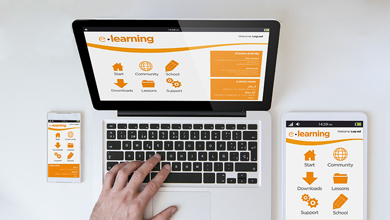
Adapting a responsive course design can be the first step to ensure that learning isn’t hampered just because the screen size of the device. A responsive course design dynamically changes course parameters to suit the device in use. This ensures that courses run seamlessly across all device types.
However, just HTML5 is not enough to ensure the proper delivery of knowledge to your employees. Responsive courses need to be designed the right way to be fully effective. Let’s see some basic thumb rules to be followed to ensure a responsive course creates maximum impact:
1. Think Mobile-First
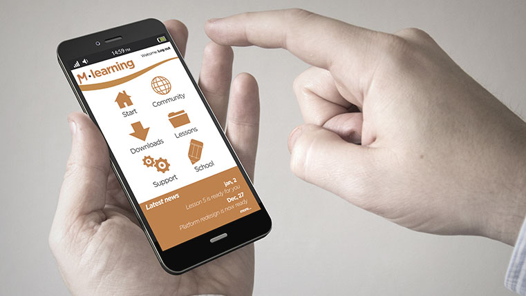
You cannot create an e-course for desktops or laptops and expect it to deliver similar learning results on mobile devices. Responsive design makes the course mobile compatible, but that is not a measurement of learning effectiveness. That’s why you should think ‘mobile’ right from the start.
Keep the course layout clutter-free and enunciate the key takeaways clearly. Also, it would be a good idea to increase multimedia use, as it will create much more impact on a smaller device, compared to plain text.
2. Stay Focused
When developing courses for multi-device responsive use, it would be a good idea to keep modules short and focused. During the development process, chunk as much unnecessary content as possible. But in a bid to reduce size, don’t chunk information that might hamper proper understanding of the concept.
If there is too much information, you can always divide the modules further. When learners access well-defined micro modules on their mobile devices, it helps them stay more focused, which results in a better learning experience.
Authoring Tool Finder
Find the Right Authoring Tool, Whatever Your Requirement.
- Enables hassle-free decision-making
- Offers ideal authoring tool options
- Boosts your productivity
- Understands your custom eLearning needs
3. Keep Simple Navigation
The power of a sleek and easy to understand navigation panel is often understated for a responsive course design. Confusing navigation is one of the major pitfalls for effective learning. A pop-out menu might look great on a computer screen but it won’t have the same usability on a mobile device.
Navigation icons that are too small or large can also hinder a smooth learning experience. Keep in mind that your learner should also be able to freely move across any topic in the entire e-learning program. Do this right and your learners will thank you for it.
4. Ensure Universal Readability
Ensuring full readability on a smaller screen is a major challenge and should be given your full attention. The type of font you select plays a major role in easy readability. Choose an easy to read and clear font with appropriate size.
Taking into account the screen sizes of mobile devices while doing this ensures that learners get the optimum amount of information from a single slide. When screen utilization is maximized, it ensures that learners don’t have to scroll through pages and pages of material.
5. Create Effective Tests
Creating effective tests for your learners is the final step you must take to complete your responsive experience. Use the mobile-device compatibility to your advantage by using touch-specific interactivities.
Use drag-and-drop, double tap, touch and hold and swipe-based interactivities to create innovative and engaging assessment strategies. You can even segregate the course and tests. Employees can access the course on a computer and use mobile devices to take the tests on their own accord.
Responsive course design has become an essential technology to ensure the accessibility of your courses. Go a step further and follow these design principles as well to ensure your content and design keep up with the technological advancements in the field of e-learning.


