

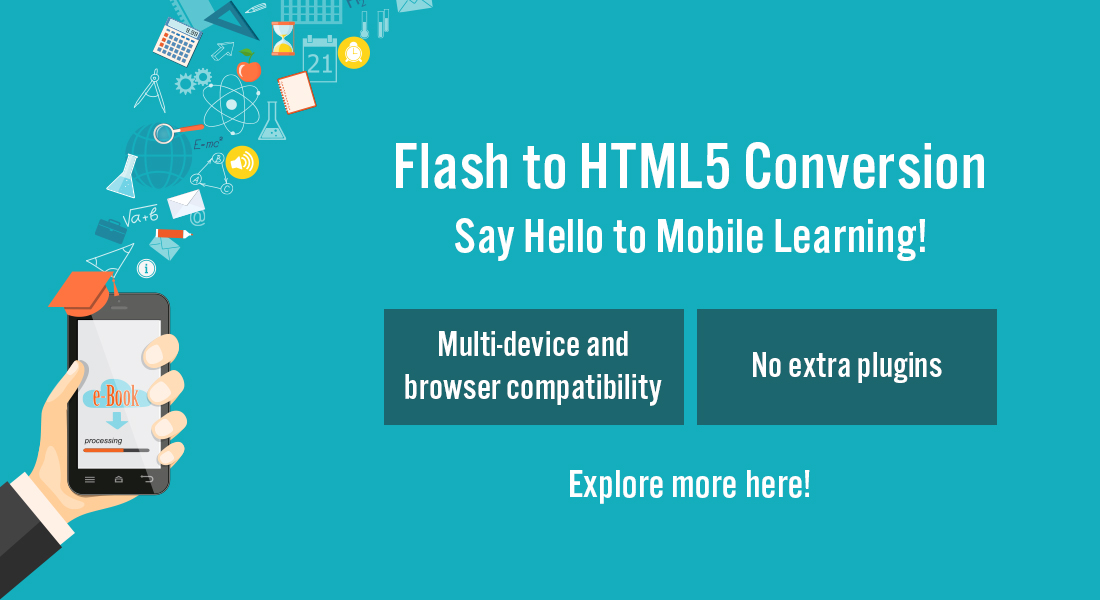
Do you know that 57% people use more than one device in a day to access information? According to a report by Google, 80% people use smartphones. Wondering how this is relevant to your organization? The ubiquity of mobile devices allows you to use it as an additional touchpoint for imparting online course as part of your training strategy. Additionally, to keep pace with changing learning needs, it is only appropriate not to restrict learning to just desktops.
But, how do you create effective content for mobile learning? There are several authoring tools that are used for designing mobile learning courses but choosing the right one can make all the difference!
Read on to explore three popular authoring tools your organization can use to design content for mobile learning.
1. Adobe Captivate
The rapid eLearning authoring tool by Adobe is packed with features that allow course developers to develop technology-enabled eLearning solutions for your training needs that can be accessed across devices. Let’s look at what these features are:
When objects such as text and image are placed in Fluid Boxes, they align automatically so as to fit the different screen sizes, irrespective of the device and browser used. You can either create your own Fluid Boxes or use Suggest Fluid boxes which logically align objects without the intervention of an eLearning course developer. You can also convert your non-responsive Captivate courses to responsive using Fluid Boxes.
Adobe Captivate enables the usage of learning interactions on all touch-based mobile deviceswith varied screen sizes. Learners can pinch, tap, zoom, swipe, and scroll to navigate seamlessly through the learning material with their fingers.
This eLearning course development tool allows publishing of eLearning courses directly to HTML5 or as responsive. Additionally, it allows you to provide customized mobile learning content with Geo-location support. The GPS facility in mobile devices enables location-aware content delivery whenever required by learners. What’s more? You can review how the eLearning course will look on different screen sizes and makes changes before final publishing.
On the flip side, Adobe Captivate has a steeper learning curve than other tools and provides limited support. Also, since it is a desktop-based tool, it poses challenges for collaboration and the review process.
2. Articulate Storyline 360
Articulate Storyline allows you to design mobile-friendly eLearning by offering HTML5 publishingoption. In the latest version of this eLearning course development tool, the Responsive Playerfeature makes navigation easier across smartphones of different screen sizes.
What about this Responsive Player? This feature has the ability to provide optimal view of your eLearning courses on every device by easily adapting to smartphones and tablets screens. Unlike Adobe Captivate (which uses Fluid Boxes), there is no need of tweaking the online course in Articulate Storyline; the Responsive Player takes care of it.
Additionally, the tool also offers a responsive preview toolbar if you want to understand how the content will appear on screens of various sizes. When you click the device of your choice on the toolbar, the screen will dynamically scale and adapt depending on the screen size.
What’s more? The player automatically hides sidebar menus until you want, which provides more screen space. It also provides a mobile-friendly playback option that is optimized for every screen, irrespective of dimensions and orientation. Also, the responsive player enables the use of touchscreen gestures for optimal learning interactions using swipe, drag, scroll, and pinch-to-zoom on smartphones and tablets. When it comes to learning curve, it is modest than Adobe Captivate.
Although the latest version offers responsive navigation, the tool isn’t really mobile responsive; instead, it shrinks and scales the screen according to devices.
3. Lectora Inspire
Lectora Inspire was the first eLearning course development tool that supported HTML5 for delivering courses that can run across devices. Mobile learning courses developed on HTML5 can be viewed on multiple devices with different browsers and operating systems. Not only this, Lectora also offers the benefit of downloading online content for offline reading in case of no Internet connectivity.
If you want to save time while creating multiple courses with a similar look, you can make use of the pre-installed templates, be it for smartphone, iPad, or notebook. These templates are responsive in design for optimized viewing on different mobile devices with various screen dimensions and resolution. You can also customize these templates according to your requirements and the learning content.
Lectora allows rendering of buttons and shapes to Scalable Vector Graphics (SVG). This allows clear and crisp view of shapes and buttons in mobile phones with high resolution. It can also reduce file sizes for quick loading of your mobile learning courses.
The ‘Seamless Play’ feature plays video and audio files automatically which are usually blocked by Chrome and Apple to prevent added data charges. This feature becomes extremely helpful when you don’t want learners to skip either watching a video or listening to audio. But, you also have the option to turn it off when not required.
Unlike Articulate Storyline, Lectora’s learning curve is steeper. The interface of the tool is less user-friendly than other authoring tools.
Now that you know the different features offered by these authoring tools for creating content for mobile learning, it is extremely important to choose the right one. It saves you time on course development and reduces cost.