

Gone are the days when your employees stayed in their cubicles and worked on a single computer. This is the dynamic age of hyper-connectivity. With high speed Internet readily accessible to most and mobile devices becoming a commonplace, employees now tend to carry their work everywhere they go. Naturally, along with their manner of work, the way they learn also has changed. Employees might begin the course at their desktops, view it on their smartphones while commuting and finally complete it on their tablets sitting at home. In such a learning ecosphere, the question you need to ask is: Is my e-learning program ready to keep up with the learners? Can it provide a seamless learning experience across devices of all classes?
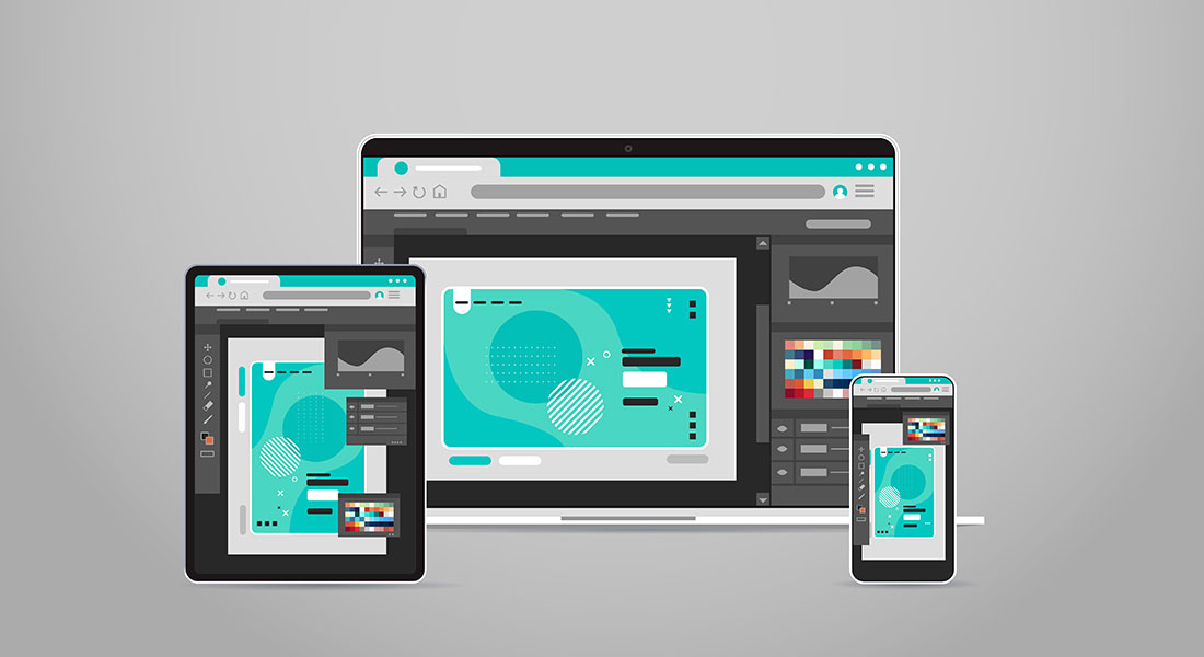
Owing to the sheer number of devices in the market, developing different course versions for different device classes is simply not feasible. That’s why developers have started using responsive course design for developing e-learning programs. A course that uses a responsive design automatically resizes the on-screen text and graphics to fit on a screen of any size or orientation. Not only that, it also ensures that all your course interactivities work equally well on clickable and touch-enabled devices. Let’s explore some of the major benefits that responsive course design brings to the table:
Greater Course Reach
A course that is developed using responsive design works equally well on all possible devices. Not only the screen size, but the course also adapts to the different types of operating systems, browser applications and media players that run on the devices. This widespread reachability ensures that your learners can access the course anywhere they want and on any device available to them. Accessing an e-learning course no longer remains a device-exclusive thing, and learning can be easily squeezed in the few minutes that your learners have in between tasks. Even the busiest of employees can make the most of their course due to this unmatched flexibility.
Easier Maintenance
When a single version of a course runs smoothly across all devices, you don’t need to create multiple versions. This means that when you need to update your course or make a few changes, you just need to modify the single version of your current courses and upload it to your LMS. A responsive course design ensures that the update is received throughout and the course continues to function just as smoothly. This significantly reduces the time and effort that go into keeping your course up to date.
Better Learning
Only when your e-course works flawlessly across all devices can you say that you have achieved true flexibility. Responsive course design allows learners to make the most of their time. They can easily access short learning modules before visiting a client or play some game-based content on their smartphone while taking a break and so much more. Responsive design even makes sure that all interactivities work equally well on touchscreen devices as well. The fact that your course looks, feels and works flawlessly across all devices makes learners more motivated to access it whenever they can.
Future-Proof Learning
Flash-based and other legacy courses couldn’t keep up with the technological advancements for a specific reason. Since they were tailor made for device classes, every time a new class emerged, they had to be reworked. But, a responsive design is developed in an entirely different manner. It dynamically changes its parameters according to the device in use. This makes sure that no matter what the future holds, your e-learning course is ready to adapt to it.
Cost Effective
Using a responsive course design will allow you to keep your training costs low. When you don’t have to worry about different course versions and compatibility issues, you can operate with a smaller team. If you are using a responsive authoring tool like Articulate Storyline 360 or Lectora 17, you can make the most of the team-based development capabilities that allow your designers to collaborate and work together effectively, which increases production rates and reduces costs. Since a better course design, means better learning, employees display greater skill development, which in turn increases profitability.
The responsive course design is no longer the future but the present. If you are not aboard this train, it’s high time that you got on one.