

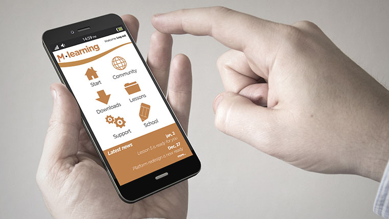
Ever wondered why a website that looks great on your desktop computer does not look attractive when viewed on your smartphone? Chances are that the website does not follow a responsive design. The same problem is faced when you view e-learning courses on different mobile devices.
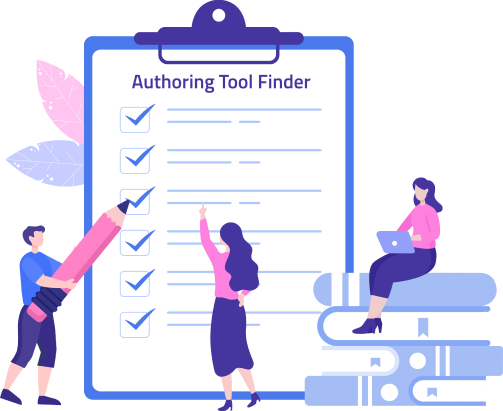
→ Access Tool: eLearning Authoring Tool Finder
Each new mobile device that is introduced in the market comes with a new screen resolution and size. There is no way to know how your content is going to be rendered on different mobile devices, unless you test it on each device. But, continually testing content on devices with different screen resolutions and sizes is not a practical solution. Lectora offers a solution to this problem with its responsive design feature (RCD). Let’s look at why you need to switch to Lectora for responsive e-learning.
Responsive Bar
Apart from new responsive courses, you might have old e-learning courses that need to be made responsive so that your content reaches more learners. You don’t have to take the trouble of copying and pasting old content into a new responsive title. In fact, doing this can affect the functionality of the course.
All you do is go to the ‘Design’ ribbon, select ‘Title Options’ and check ‘Enable Responsive Title’. Lectora will add a responsive bar at the top of the work area with 5 different device views.
Different Course Design Views Offered by Lectora
When you design a mLearning course, ideally you would be designing for a desktop, tablet, and smartphone. A tablet and smartphone are accessible in portrait as well as landscape modes. Here are 5 possible views in Lectora.
- Desktop
- Tablet – Portrait mode
- Tablet – Landscape mode
- Phone – Portrait mode
- Phone – Landscape mode
You only need to design the content once, in the desktop view. The content is automatically positioned and resized to adjust to other views. Existing objects are scaled to fit each view.
Learners in your organization might want to go through an eLearning course on the desktop while they are in office. Later on, they might want to switch to other mobile devices, and continue taking the course. Lectora’s RCD feature enables multi-device learning, helping you make the seamless transition from one device to the other. Whether you take the mLearning course on the tablet or the phone, Lectora takes care of delivering a flawless learning experience.
Create Once, Distribute Multiple Times
Imagine if you had to redesign your course every time a new device is introduced in the market. With responsive design, Lectora gives you the option to design once for the desktop view. Content is automatically rendered for optimal viewing in portrait and landscape modes for tablets and smartphones.
Authoring Tool Finder
Find the Right Authoring Tool, Whatever Your Requirement.
- Enables hassle-free decision-making
- Offers ideal authoring tool options
- Boosts your productivity
- Understands your custom eLearning needs
So, you design content for the desktop, but can access it on multiple mobile devices. If you had to design different versions of courses according to the mobile device, imagine the cost that would arise. It is certainly cost-effective to develop one version of the course which is designed for optimal viewing on all devices.
Device Inheritance
The device inheritance feature of Lectora lets you transition design from one device to another. When you have an object or a group of objects that need to be displayed on all pages of the e-learning course, inheritance comes in handy. For example, you need the logo and navigation controls to be displayed on each page.
When you develop these objects for the desktop, they are automatically inherited for viewing on a tablet and smartphone. Developers need not spend a lot of effort in making a responsive m-learning course. The objects and course elements designed for the desktop are automatically inherited for optimal viewing on the tablet and phone.
Page Height Adjustment
When there is a lot of text to be displayed on the screen, the scrolling feature is enabled to ensure that content is not lost. This is very useful when you are viewing courses on a phone.
Lectora automatically scales content to fit the narrow screen width. Text can be customized to appear larger for improved readability on mobile devices.
Adjust Mobile Device Views
Custom adjustments can be made to objects in your e-learning course, so that it functions well on all devices. The responsive bar is at the top of the work area in Lectora. You can select the device view in which you would like to see the course. If you do not want certain elements to be visible in the phone view, you can drag the elements off that particular view. For example, you want buttons to be removed from the landscape phone view, you can drag the button off the view, and it will no longer be visible in the landscape phone view.

As you can see above, in the first image all navigation elements and buttons are visible in the desktop view. But in the second image, the elements that are not needed in the phone landscape view are dragged off the screen.
Responsive course design is here to stay, and hence is it essential to choose an authoring tool that will make this switch to responsive learning easy. Lectora is a tool that fits the bill perfectly and would make an ideal choice of tool for organizations that are looking at switching to responsive learning. Have you used Lectora to design eLearning courses in your organization? Do share your experience through the Comments section.