

In today’s close-knit digital world every piece of information is just a click away. Be it the best shopping avenue or your favorite OTT platform. The corporate training landscape is no exception. What the modern workforce need is anytime, anywhere, and any device learning. They are used to getting information on the go. All of this has led to a surge in demand for courses that can be accessed from any device, and thanks to responsive eLearning design, it is now possible.
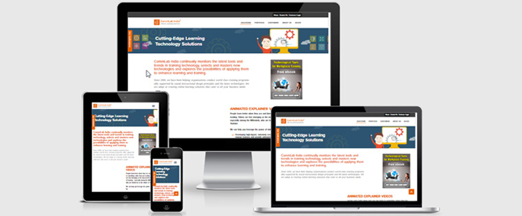
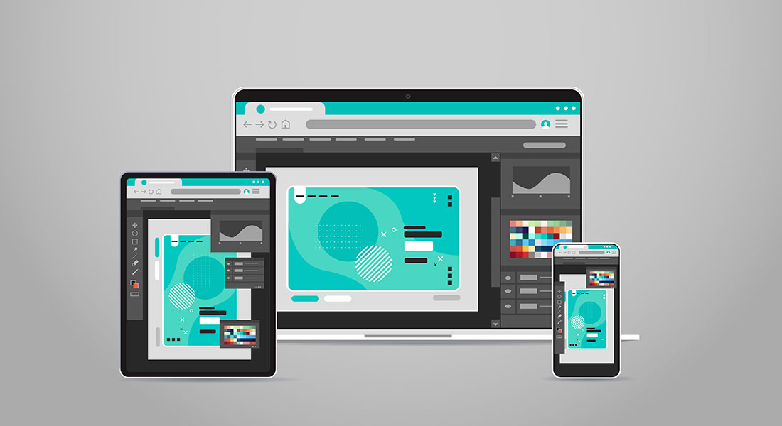
Responsive eLearning Design enables you to access the same content across multiple devices, resizing it to fit the device’s dimensions. Irrespective of the screen size the user experience remains the same, Seamless! The modern workforce is always on the go, and to cater to modern learning needs, developing a responsive eLearning course has become important for organizations. The current trend of BYOD (Bring Your Own Device) is trending among modern learners, and it is always wise to follow the current trend for enhanced learning.
Do You Want Your Learners to Have Seamless Learning, no Matter Where They Are?
Here Are 4 Situations Where Responsive eLearning Design Helps You with Any Time, Anywhere, And Any Device Learning:
- When Your Training Has to be Accessed from Multiple Devices
- When You Need to Optimize Development Time
- When You Want to Make Training Future-Proof
- When You Want a Hassle-Free Distribution
There are many situations where employees need to access courses on a just-in-time basis. They might need information wherever they are. Responsive eLearning works as an apt solution for such situations.
4 Situations Where Responsive Design is a Must for Organizations
1. When Your Training Has to be Accessed from Multiple Devices
Responsive eLearning design’s primary goal is to make courses adaptable to multiple devices. Whenever there is a situation where the courses have to be accessed from multiple devices, it becomes a must for organizations to rely on responsive eLearning design.
An organization might have many employees who are not always available on their desktops or have limited access to them. What should an organization do to provide continuous learning to such employees? Well, the responsive design seems as the only answer.
Just like responsive courses, explore 5 other current trends in eLearning design and development
2. When You Want to Make Training Future-Proof
Nobody would have thought of accessing training on mobile phones a few years ago. Actually, if we talk about a decade ago, nobody would have thought that everyone will own a smartphone someday. But as we know future is unpredictable. Things that seemed impossible some time ago, are now a part of our daily routine. Now arises an important question, what will be the scenario a decade from now?
Well, sometime from now or a decade from now, whatever the sizes of the screens will be, responsive learning will help you meet the required learning needs. It is one of the best solutions to future-proof your training. Responsive eLearning design will help you stay updated as technology advances and screen size changes.
There will be new devices almost every day in the market, but the responsive design will make sure that your courses run seamlessly on each of them.
3. When You Need to Optimize Development Time
Planning to optimize course development time at the same time making the course adaptable for all screen sizes? Here responsive eLearning might be your go-to learning partner. Unlike adaptive design, in responsive design, you only have to develop one master course. Of course, if you have to design the same course separately for a tablet, desktop, smartphone, etc. it will take up a lot of time. However, with responsive eLearning design, you only have to develop one course and it can be accessed on any device, talk about being efficient.
4. When You Want a Hassle-Free Distribution
Wouldn’t it be a hassle if you have to upload multiple versions of the same course on a Learning Management System (LMS)? Of course, it will, plus you will also face difficulty in tracking and generating reports. Is it possible to make it simpler? Yes, it is, thanks to responsive eLearning design. In a situation where an organization has to upload a course on LMS and distribute it to the targeted audience, a responsive eLearning design will be a great choice.
If you develop courses using responsive eLearning design you only need to upload one course. Your learners will easily be able to access it irrespective of the device they are using, and the LMS will also be able to track and generate reports easily. The whole process becomes a hassle-free affair and can be easily managed through an LMS.
These are some common situations an organization might face, there are many such situations where learning needs to be accessed on a different device. If there arises any such situation, you can easily trust Responsive eLearning Design. Apart from getting you out of these situations responsive design also offers many other benefits.
Some Noteworthy Benefits of Responsive eLearning Design
Cost Effectiveness And is Faster to Develop
The responsive design approach only requires you to create one master course and it will run equally well on all devices. This will significantly reduce the development cost and time.
Seamless Access to Navigation and Content Flow
eLearning courses that are developed using responsive design, can be easily accessed on any screen size. It doesn’t really matter what kind of device it is, the feel and functionality of the course remain the same.
Increased User Base
If you make your courses responsive, you are providing your learners across the globe with access to the course on any device. More and more people can be a part of the learning program.
Easy Tracking and Reporting
This is one important benefit of responsive design. It makes it easier to track learning and generate reports. Instead of tracking multiple courses according to different devices, with responsive design you only have to track a single course that is accessed on multiple devices and generate a single report.
Final Thoughts
What is your response to responsive eLearning design? I am sure you love it and your learners will love it too. Learning is no more defined in a cubicle. Now you can provide the best possible learning experience to your learners, no matter what the device. Are you ready to future-proof your training and make your courses to be responsive? If yes, here is our eBook to help you with everything you need to know about responsive eLearning.