

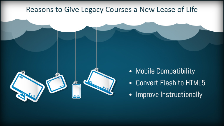
Mobile technology has exploded. Smartphones and tablets are changing the way we live. The boom has brought in a plethora of smartphone options into the market. Each device has its own hardware specifications and specialties. This gives users a wide variety of devices to choose from, according to their needs and preferences.
This means that the target audience for your digital course is using a smartphone from a very large selection. Designing eLearning courses for so many different devices, with so many operating systems, is a big challenge.
Incompatibility of a course with a device can mean that its elements don’t look and function consistently. Nowadays, when it is common for users to have multiple devices, this inconsistency can create a bad impression about the quality of the course. The navigation might develop glitches, which greatly compromises the learner experience. The course or application might hang mid-way through the course, further distressing the learner. Learners immediately lose interest in a course that is not compatible with their device.
To avoid an unpleasant user experience, developing an online course that is compatible with a wide range of devices is very necessary. Below are some of the tips, using which organizations can design courses for multiple mobile devices:
Keep System Requirements Minimum
Your learners will have devices ranging from the most advanced processors and hardware, to the most basic ones. It is essential that you make your course light in terms of utilizing processing power. The course also needs to be compatible with the earlier versions of the various operating systems. As not all devices run the most latest and advanced operating systems, course developers should take into account these limitations too. This way, even employees with the most basic smartphones can undertake the course, without compromising on the learning experience.
Choose Readability over Creativity
Everyone likes to use fancy fonts and intricate design elements to make their course look more appealing. But, you need to keep in mind that not all screen sizes are the same, or have the same display resolutions. Font that is readable for one particular display, might become illegible on another one. The same goes for design elements. They might look good on one screen, but may clutter up a smaller one. So, always go for traditional fonts, and use minimalistic design elements to keep your screen free and easily readable.
Make Navigation Easy
Trying to access a mobile learning course only to realize that it can only be navigated using physical buttons, which you phone misses, can be a very frustrating experience. As smartphone screens are small and their hardware capabilities are different, it is best that navigation through the course is kept simple and universal. Make navigation icons clearly visible and place them at an easily accessible location. It is also a good practice to avoid using minute hyperlinks.
Use the Right Authoring Tool
Make sure the authoring tool used by you offers the responsive design feature. A responsive design gives you the ability to create just one master eLearning course that can be evenly viewed on all smartphones and tablets. When your mobile learners access the eLearning course, its elements, such as menu, text boxes, etc., all adjust to offer the best possible learning experience. But, not all authoring tools support courses for all devices. So make do your due diligence before making the choice.
Multi-platform eLearning courses give every member of your audience convenient access to your course, no matter what their technology or device choice may be. Multi-device compatible courses mean that learners get an overall better learning experience. This in turn increases positive user feedback and knowledge retention among learners. Corporate organizations get better returns on their training expenditure. When learners experience a smooth and seamless functioning of the course across all the devices, their willingness to undertake the course also increases. Trainings that run evenly across all devices feel more customized to the learner and makes your organization distinct.