5 Tips to Convert Legacy Courses Into Responsive Courses

As your learners continue to go mobile, accessing information on various devices and browsers, it’s time for you to start thinking about redesigning your legacy eLearning courses and retrofit them for your mobile audience.
If the very thought of completely overhauling your beautifully designed courses strikes fear in your heart, take a breath. We have your back; this post throws a few tips to make legacy courses responsive.
Segregate the Legacy Courses
Before you start converting the course, make sure you collect all the source files, along with the media and supporting files (FLAs, XML, JavaScript, audio, videos, etc.). Once you have all the course files, it’s now time to segregate these courses. You can segregate the courses based on the topic, and also based on the level of instructional design applied to the courses.
For example, courses developed earlier, which are usually developed by HR, or by SMEs, are devoid of instructional principles and adult learning principles. These courses need a facelift, so tweaks to the content can be made wherever appropriate, and the instructional and visual design need to be enhanced. And those courses which are developed recently, which are usually developed by learning experts, can be directly dumped into rapid authoring tools and published into HTML5.
Once you segregate them based on the topic and level of instructional design, to make the work easier and quicker, you can segregate these courses based on the priority level. Start working on the courses which you think are a high priority; low priority courses can be converted later. Also, every organization has senior and highly skilled employees who can be used to work on complex courses or courses which are of long duration. When you put your best team on the job, they would ensure that the job is finished on time. You can save your budding or the junior developers for less interactive or small courses. This way, your conversion runs smoothly and on time.
Develop Wireframes
Since we discussed that some old courses are devoid of instructional principles, you can create new wireframes, which are instructionally rich with visual elements and intuitive navigation. Using wireframes, you can quickly convert legacy courses into responsive courses. A wireframe is the skeleton of the course slide, usually built with basic shapes and lines with organization branding colors and styling. To create a course that is responsive, the focus should entirely be on figuring out the layout and placement of the content, and solving navigational and functionality problems, while creating wireframes. The other important aspect to focus on while creating these wireframes is to give a rich learning experience to the learner. The placement of the objects, design of the layout, buttons, instructions, color, everything affects the consumption of content by the learner.
These wireframes can be developed using any available authoring tool, like Articulate Storyline, Lectora 17, Adobe Captivate 9 and many other tools. You can develop these wireframes after analyzing your legacy course. For example, you can have wireframes designed only for scenario-based courses. Likewise, you can have a wireframe for assessment-based courses, wireframes for courses with plain graphics and text, and so on.
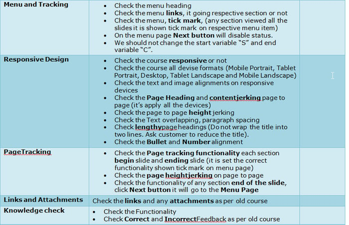
Create a Standard Checklist
Most legacy conversions go barreling headlong, without considering whether the courses are meeting quality standards. Hence, everything comes to a halt. A lot of issues arise when courses are tested on different mobile devices, and on different browsers.
The menu does not work on a mobile device, or the page layouts are cut off, content overlaps on images, videos don’t load, hyperlinks are missed, interactivities do not work, these are some of the complaints you will hear from your quality team. Going back and fixing everything will decelerate the development. Hence, having a standard checklist in place ensures you don’t miss anything.

Decide on the Design
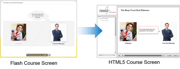
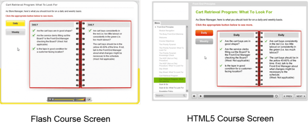
Some Flash animations in legacy courses do not work on mobile devices. Hence, these can be converted into videos. Also, rollovers should always be avoided on mobile devices because there’s no mouse cursor. So, rollovers need to be avoided or converted to clickables. Sometimes drag and drops do not work on the mobile device; you can also change this interactivity to match the following. Also, in scenarios, sometimes text extends out of the callouts in a mobile device, so make sure that the text is limited for callouts. All those complex interactivities and games developed in Flash may give a hard time for both the developer and the learner. Hence, these interactivities can be converted to simple interactivities. Care should be taken to make the navigation simple and easy for the learner.


These are a few tips to help make your courses responsive. Transformation of legacy course to responsive design is easier than ever to implement these days as there are so many great tools to help you. Do you have any advice on responsive design? Want to share your experience or have anything else to say? Don’t forget to leave a comment!


![6 E-learning Templates that Speed Up Your Online Training Course Development [Infographic] 6 E-learning Templates that Speed Up Your Online Training Course Development [Infographic]](https://blog.commlabindia.com/hs-fs/hubfs/Imported_Blog_Media/elearning-templates-for-online-training-infographic-2.jpg?width=670&height=2584&name=elearning-templates-for-online-training-infographic-2.jpg)


