Responsive Learning – The New Trend in E-learning

With each passing generation, many learning trends existed. These trends have gradually shifted from classroom training to e-learning and now it is the time for responsive learning. Let us see what responsive learning is.
Responsive learning as the name says is a course that is responsive to multiple devices. In simpler terms, an e-learning course that is compatible with laptops, PCs, iPads or smartphones is responsive learning. Recently, I developed a course for one of our clients; they wanted to have a multi-device-compatible course.
This requirement raised a couple of questions in my mind. Will the instructional and visual design strategy differ for each device? Do we need to create multiple storyboards for multiple devices?
The answer to these questions is “No!” We can use one strategy for all devices, but the only difference that we see is, in larger devices, the entire text can be shown at once, whereas in smaller devices, the content is shown in small bits at a time. This difference is because of the difference in the screen size of the devices.
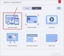
In this blog, I share my experiences on how a single instructional and visual strategy was applicable for a responsive course.
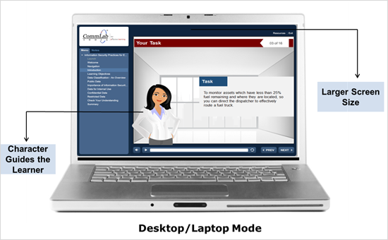
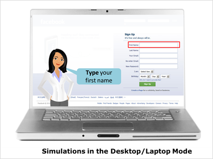
First let us begin with desktop/laptop e-learning. We are very familiar with the know-how of desktop/laptop learning; we have a larger screen size and hence, more space. The global strategy for this course was that of guiding and learning where we have a character that guides the learner through simulations and steps of the software. The learner then gets to do the simulation themselves. Presenting such a requirement in a responsive mode was a difficult task; here is how we did it in the desktop mode.
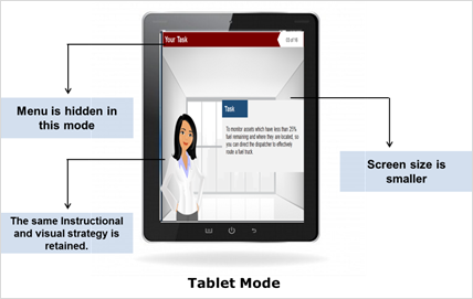
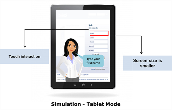
Next comes the Tablet or iPad mode, where you have a smaller screen size and touchscreen functionality. Thanks to the responsive design, a simple change in the settings will turn your desktop course into a tablet-based course, where click-on interactivities become touch interactivities. Hence, instead of using a mouse, the learner does the simulation with the touch of his finger. When it comes to the text and images onscreen, all you need to do is adjust the text and images onscreen and have a look at the same screens on a tablet.
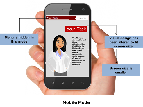
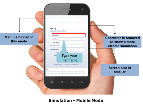
Finally comes the Mobile Mode; again thanks to the responsive design, all you need to do is resize your images to fit your average mobile screen. However, when it comes to need, there will be a lot of scrolling; this can be considered an exception, given the screen size. Another important point to note is that mobiles today are mostly of the android variety; hence, you will again encounter touch interactivities. As mobile learning is picking up today, this form of learning is soon going to be the most sought-after requirement from your client. Again, have a look at the same screens on a mobile device.
Responsive learning is catching up fast; with the advent of BYOD (bring your own device), learning needs have changed and so have client requirements. What are your experiences with responsive learning? Please do share your views.


