4 Responsive Design Considerations for Flash to HTML5 Conversion
The popularity of mobile devices has impacted how learners interact with online learning content. According to a report by Towards Maturity, around 64% learners find it very useful to access their training content from mobile devices. Clearly, the momentum of using mobile technologies for training is far from showing any signs of slowing down. However, Flash-based eLearning courses fail to meet your learners’ anytime, anywhere learning need, as Flash output isn’t mobile-compatible.
Responsive Design Considerations for Flash to HTML5 Conversion
- Choose an appropriate eLearning authoring tool that offers responsive output
- Make the courses responsive while converting
- Take care of design and development considerations
- Test the courses before the final launch
Moreover, major browsers such as Mozilla Firefox and Google Chrome have announced their withdrawal of support for Flash by 2020. Hence, converting your eLearning courses from Flash to HTML5 is imperative to obtain responsive output that can be accessed across platforms and browsers. Having said that, choosing an eLearning authoring tool that can offer the degree of responsiveness you want in your courses is a crucial part of responsive course design.
Tips to Ensure Flash to HTML5 Conversion Leads to Responsive Design
Choose an Appropriate Authoring Tool That Offers Responsive Output
Responsive eLearning design implies the development of a single course that can be viewed on various browsers, operating systems, and devices. When a course is responsive, onscreen content adapts to the screen size and orientation of the device being used. How do you obtain responsive output when converting Flash to HTML5? You can rebuild courses built in Flash and other software that’s now obsolete, using newer versions of authoring tools.
Most eLearning authoring tools such as Articulate Storyline 360, Adobe Captivate, and Lectora Inspire offer responsive output, however the degree of responsiveness differs.
Scalable Output
With authoring tools such as Articulate Storyline, onscreen content can be scaled to fit the screen size of the device being used. Articulate Storyline 3 and 360 offer a Responsive Player that offers five previews:
- Desktop/laptop computers
- Tablets in the landscape mode
- Tablets in the portrait Mode
- Smartphones in the landscape mode
- Smartphones in the portrait mode
This enables you to check how the converted course will look on various devices and orientations. Although learners can view the converted Flash to HTML5 eLearning courses on their devices, depending on the device, learners are able to view white space.
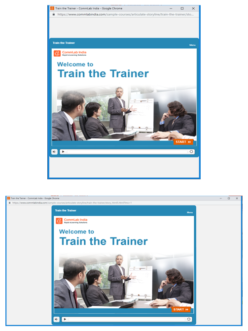
Click to view the Source: CommLab India
These two images show how onscreen content is scaled to fit the screen, which displays blank spaces depending on the device size and orientation.
Responsive Breakpoints
Breakpoints signify pre-defined dimensions of the most commonly used devices. Course developers can use multiple breakpoints in a course and switch between them anytime. Rapid authoring tools such as Lectora Inspire, Adobe Captivate 8, 9 offer breakpoints that allow course development for varying screen size.
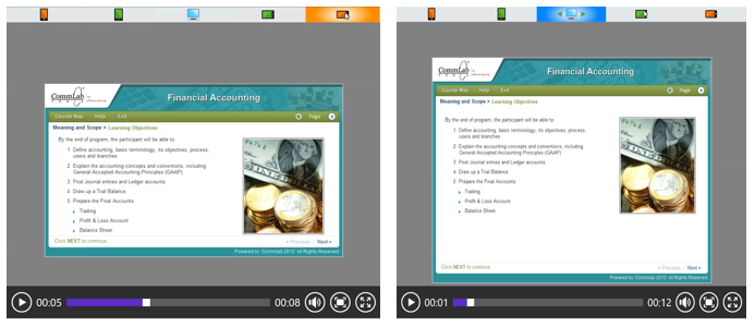
Two examples of using breakpoints in a course. Image 1 shows a course view on a smartphone in the landscape view whereas Image 2 shows course view on a desktop.
Responsive Templates:
Authoring Tools such as Articulate Rise, Gomo, and dominKnow Flow allow the creation of fully responsive eLearning courses. Slides automatically get adapted to every device without having to tweak them manually. Adobe Captivate 17’s Fluid Box feature automatically adapts objects placed on a screen for multi-device view.
Make Courses Responsive While Converting from Flash to HTML5
Replacing your Flash-based eLearning courses with HTML5 makes device-independent learning a reality! Learners will overcome the confinement of accessing courses from their PCs or laptops. It no longer matters whether your learners are viewing the course on an iPhone or an Android tablet; HTML5 ensures output is consistent across platforms. Depending on your Flash to HTML5 conversion requirements, your organization can choose from the Republish, Rebuild, and Redesign conversion methodologies to obtain mobile-compatible eLearning courses.
Converting existing Flash courses to fully responsive courses can be daunting considering objects on the screen have to be manually adjusted in the converted course according to the device type. Course developers have to manually align text and objects (such as images and graphics) of each slide for an optimized view on various device types. Moreover, your organization can also incorporate modern-day learning approaches such as microlearning when converting Flash to HTML5.
For instance, let’s assume your organization wants to breakdown your text-heavy Flash-based eLearning courses into microlearning modules. These microlearning modules can either be incorporated in the larger training framework or availed during moments-of-need as performance support.
Take Care of Design and Development Considerations
To ensure your converted eLearning courses look and function well on all target devices, here are some design and development considerations that should be taken care of.
When choosing to Rebuild:
- Interactivities used in Flash-based eLearning courses might not function properly in the converted HTML5 courses. Hence, interactivities are converted using authoring tools. However, if direct conversion is not possible, the closest alternative is selected in the tool to ensure error-free functionality.
- If the Flash-based animations are too complex, they are recorded using screencast recording software and included in the HTML5 course.
- Have you noticed the use of rollovers and pop-up menus in Flash-based eLearning courses? Rollovers and pop-up menus in mobile learning courses is a problem considering that today’s mobiles come with a touch that requires gestures such as click, swipe, zoom-in, and scroll. So, elements such as rollovers should be replaced with clickable buttons to ensure learners seamlessly navigate through the course using their fingers.
- To avoid slow loading of courses, ensure content is crisp and includes only “must-know” information. Creating different versions of images for optimized view on each device is another best practice.
Test the Courses Before the Final Launch
Once courses are converted from Flash to HTML5, the first phase of checking can be done in SCORM Cloud that allows you to deploy, test, and evaluate courses for functionality on the cloud, without having to bow down to proprietary solutions. You can check aspects such as bookmarking, course status, scores, number of learner attempts, and much more.
Additionally, courses should be tested in the vendor’s as well as your LMS. Most LMSs have a preview tool to check the functionality of the course before the final publish. Test your eLearning programs across all likely devices and platforms before publishing. Ensure to check alignment, images, fonts, and navigation.
With learners spending increasing amounts of time on their mobile devices versus their desktops, responsive design is now considered crucial in designing effective eLearning solutions. To gain more from Flash to HTML5 conversion, use the tips above to enhance responsive design and ensure an effective learning experience no matter which learning platform your learners may use.


