

Over the years, the word ‘Responsive Design’ has been gaining momentum in the eLearning industry. However, do you know what responsive design means in an eLearning course? And what are the best tools available to develop a responsive eLearning course? Well, through this blog, I will highlight a few aspects that will help you know more about responsive eLearning design, and the responsive features offered by various authoring tools.
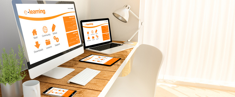
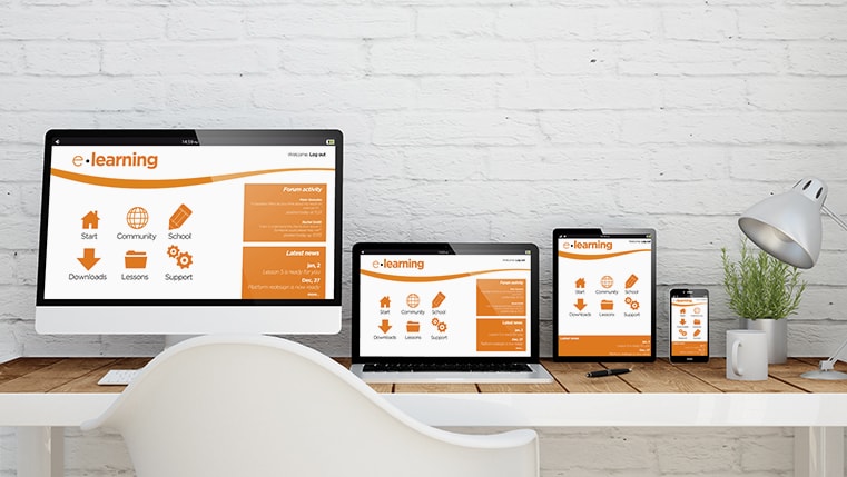
What exactly does Responsive Design mean? Responsive design is the development of a single course that can be viewed on multiple devices, various browsers, and operating systems. When a course is responsive, it adapts the page or slide content to the screen size and orientation of the device in use.
As responsive courses adapt to the screen size, the orientation of the course will be in accordance to the device. For instance, when you view the course on a smartphone in the Portrait mode, it will be a little different from the Landscape view. This is because objects rearrange on the screen, based on the display size.
Most eLearning authoring tools such as Articulate Storyline 360, Articulate Rise, Articulate Studio, Adobe Captivate, Lectora Inspire, and iSpring Suite offer responsive output, but the degree of responsiveness differs.
Let’s look at some of the ways to approach a responsive design output.
1.Scalable: With Authoring tools such as Articulate Storyline and Adobe Captivate (Adobe Captivate 8), you can scale the screen by adjusting the slide, page, and Player, by increasing or decreasing the size to fit the device. This is the usual HTML5 output approach.
However, this cannot be considered as responsive output. Though some portions look good on desktops, they tend to appear skewed on mobile devices.
Check this video to get a clearer understanding of how the view of courses changes when they are scaled.
2.Responsive Player: The Responsive Player feature offers the best output on the screen sizes and orientations of smartphones and tablets. Articulate Storyline 3, Articulate Storyline 360, and Studio 360 added new features to the responsive course player.
The Player has 5 layouts that enable you to check your courses, based on the device being used. With this approach, the slide can be scaled to the size of the device. However, only the main GUI features such as the menu, and player controls are fully configured for a responsive approach.
This video shows how responsive courses adapt to varying screen sizes.
3.Responsive Breakpoint: Breakpoints signify the predefined dimensions of the most common devices used. It is therefore quite unlikely that learners will face poorly formatted screens when breakpoints are set for a course.
You can set multiple breakpoints or resolutions in a course, and switch between them anytime. Rapid authoring tools such as Captivate 8, 9 and Lectora Inspire offer the breakpoints feature that helps in developing responsive course design for varying screen sizes.
You need to opt for the mobile-first approach as it helps lay out the content in a manner that is logical and easy to develop for all devices. Once the smallest device is set, it becomes easier to adapt for expanding screen sizes.
Authoring tools allow you to customize all the design elements in those breakpoints. One of the benefits of creating diverse breakpoints for your eLearning course is that you can customize each layout to suit your needs.
In this video, you can see how the content adapts well to the varying screen sizes because of breakpoints.
4.Responsive Template: Web-based rapid authoring tools such as Articulate Rise, Adapt, Claro, and Gomo create beautiful, and fully responsive eLearning courses. However, these tools are template-based.
The course automatically adapts to fit in each of the devices, and there is no need to worry about arranging the slide content and design. However, eLearning templates offer limited scope to customize courses. Based on the content, you can utilize templates that suit your eLearning needs.
Watch this video to understand how responsive templates work.
5.Responsive Fluid Box: Adobe Captivate 2017 was upgraded with the Fluid Box layout feature. The Fluid Box feature adapts objects placed on the slide automatically so that the content can be viewed on multiple devices. The content has to be added only once, and the design will adapt to every device, from desktop to mobile.
Adobe Captivate’s Fluid Box feature is a newbie in eLearning course design. So, designing responsive courses using the fluid box feature will take a few times to explore and use. However, you can be sure that your end result would be a fully responsive course.
This video shows how Fluid Boxes can be used effectively.
No rapid authoring tool is perfect. Every tool has its own flaws and benefits when it comes to developing fully responsive eLearning courses. However, you can choose the eLearning tool that perfectly fits your organization’s need and is capable of delivering exactly the look you need.
I hope this blog has given you an insight into the features of responsive rapid authoring tools and will help you choose the right tool for your upcoming eLearning courses. Do share your thoughts on other responsive design features that you have come across.

![Responsive E-learning: Insights to Make Device Agnostic Online Learning [Infographics]](https://blog.commlabindia.com/hubfs/Imported_Blog_Media/responsive-elearning-development-software-4.jpg)