7 New Features of Captivate 2017 Release aids Responsive eLearning

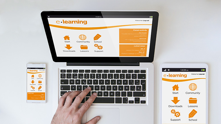
With the latest version ‘2017 release’, Adobe Captivate has also joined the bandwagon of responsive eLearning authoring tools. It has come up with promises such as conversion of legacy courses into fully responsive eLearning, beautiful fonts & style consistency across the devices, and a lot of scope for customization.
So let’s see the new features of Captivate 2017 Release and how far Adobe has succeeded in its promises.
1. Responsive Project
Now with the newly added ‘Responsive Project’ option, you can create multi-device responsive eLearning easily.
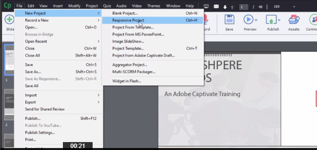
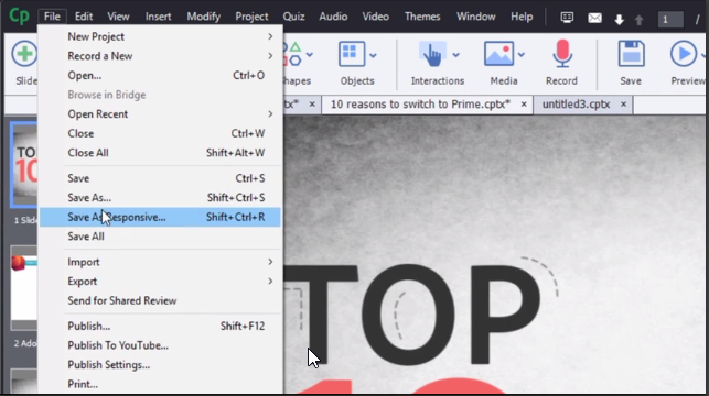
You can also convert the legacy courses into fully responsive eLearning projects in a few clicks. For this, you just need to open a legacy course in the latest version of Captivate and save it as a responsive project. It will automatically create responsive content that fits for all your learning devices according to their screen sizes.
2. Fluid Boxes
Fluid Boxes are the fully responsive text and image boxes meant for the optimal use of white space. You can choose them according to your responsive theme or draw your own Fluid Boxes. Text or objects placed in these boxes get aligned automatically as per the devices’ screen sizes and web browsers.
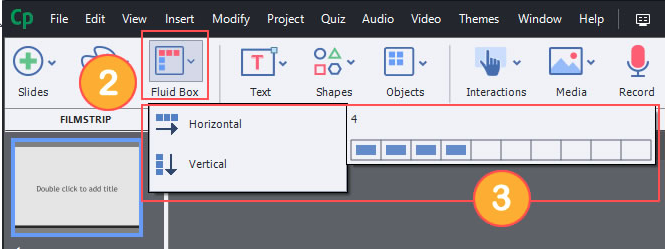
This facility will reduce the eLearning authoring time drastically and speed up course development. However, you have the option to lock aspect ratio of objects for proper display on all devices.
3. Typekit Integration
Maintaining good typography and font’s style consistency throughout the courses and across devices are made easy with ‘Typekit Integration’ feature.
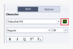
This helps to create visually rich online courses by adding beautiful fonts. Your courseware designers can create a cloud-based kit of selected fonts to use in online courses.
4. Responsive Sliders
New vertical slider added and horizontal slider revamped to preview content across a broad device landscape, from 320px to 1280px width and 100px to 5000px height. Now, you shouldn’t worry about fixed sizes and breakpoints.
5. Responsive Text Support
You can provide easy-to-read experience to your learners with ‘Responsive Text Support’ feature, even if the course is text heavy and delivered on mobile devices. With this, lengthy paragraphs are automatically collapsed to a few lines, and learners can click to view more.
6. Customizable Closed Captions
This feature helps you to create section 508 compatible courses that meet accessibility standards.
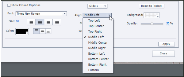
Closed captions are generated from slide notes. They are also useful for slide videos. You can enhance their look and feel by customizing the properties.
7. Device-specific Previews
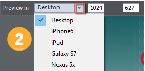
Now you can preview the courses how they look like on all devices even before publishing them. This you can check for all devices – from desktops to iPads and smartphones. This feature helps you to eliminate guesswork and saves a lot of course development time. For this, you just need to select a preset device menu and make necessary adjustments. You can also add new devices to the menu if you have any other custom screen size.
So, make your eLearning courses more interactive in the multi-device world with all new features available in Adobe Captivate 2017 Release.


