2 Tools to Develop Smashing Content for Multiple Devices

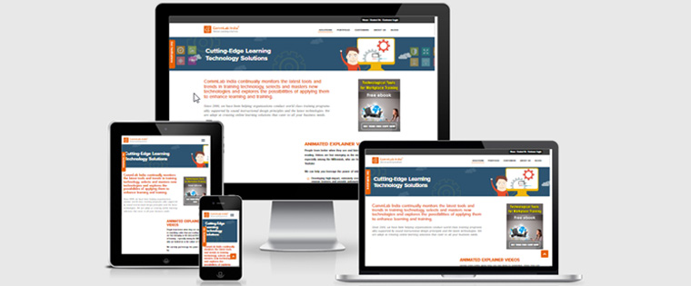
Technology has done it yet again – made our lives simpler in yet another sphere. I’m referring to employee training on any of the numerous devices that we (once again, thanks to technological advancements), depend on. Course designers have kept pace with this requirement by creating training courses that can be accessed on any device – be it a tablet, smartphone, laptop, notebook, iPad… you get the drift. But for specialized course development tools, this process would be impossible. I’m going to tell you about two of these amazing tools that do away with the painstaking and time-consuming burden of creating a separate course for each OS and screen size.
1. Adobe Captivate 2017 Release
This one is high on my list. Adobe Captivate has supported the creation of responsive courses (courses that can be viewed on multiple devices and screen sizes), for a while now. However, the Adobe Captivate 2017 Release (that’s the name of the latest version), has made it simpler for designers to create such courses, and for learners to read large amounts of text on devices like smartphones and tablets.
Firstly, you can have a preview of what your project will look like on several devices – of varying width and height. There are some device options that you can choose from the drop down menu – iPhone, iPad, Google Pixel, and Galaxy S6. In case your organization uses a device that you don’t see, you can customize a preview for that device and save it in the dropdown menu.
Secondly, the 2017 Release has a new feature known as the fluid boxes. This allows developers to choose either a horizontal or a vertical orientation for the content, as well as the number of boxes for each slide. There are prebuilt themes for different fluid box configurations. Content is wrapped so that it flows directly from one line into the next, or it can be squeezed into one line. Left, right and center alignments are possible too. This way, content responds in a much more predictable manner than with any of the previous versions.
Thirdly, the new ‘expand text’ icon allows readers to read large amounts of text. The icon sits on the screen, and when clicked, a semi-transparent, scrollable textbox pops up, enabling readers to scroll and read all the text in large fonts. Click the icon again, and the textbox disappears.
If you have a nonresponsive course that you would like to convert into a responsive one, the 2017 Release lets you do this in a straightforward manner, unlike the earlier versions in which everything had to be done manually. To cut a short story even shorter, from the file drop down menu, choose ‘Save as Responsive’. A new popup window allows you to check for objects/images that are not mobile compliant. A HTML5 tracker finds them and lets you replace or just delete them. And you are done. Well, almost done – there may be a few minor adjustments that may need to be made.
2. Lectora Inspire 17
My next favorite is Lectora Inspire 17. This beast has some pretty neat responsive design features as well. Converting existing nonresponsive courses into responsive courses can be done in a couple of clicks – no more manual labor.
If your organization uses more than one type of device – perhaps tablets and smartphones, you can make the required changes for one of these devices, and the changes are automatically inherited to comply with the other. Think of the time you can save when you kill these two birds with one stone.
Customize content to your liking, and if you change your mind, you can always revert to Lectora’s Responsive Course Design Device Inheritance.
The tool also makes automatic content height adjustments so that content fits the screen. Content-heavy pages will have a scroller that allows learners to scroll down to read all the text.
Need to create a responsive course with a specific device and orientation in mind? Lectora Inspire 17 lets you view content and control its orientation. You can change the orientation for just an exercise sitting within the course or you can change the orientation of the entire course.
It’s not just about what you want. Your learners may prefer viewing a course in landscape orientation rather than in portrait. Device rotation trigger actions allow them to choose their preferred orientation.
The browser gives you an idea of what the title and/or content will look like, on different devices. All you need to do is resize the browser window to mimic that of the respective devices.
It just keeps getting better with responsive course design features, and designers are making the best and the most of these tools to provide their employees with engaging and accessible courses. For more information on how we create great courses with rapid authoring tools, click here.


