4 Features of Lectora 17 that Support Responsive Design

In our review of Lectora Inspire 17, the latest version from the Trivantis stable, we had mentioned how the new features in this version support responsive design. In this blog, we will further explore the features of Lectora 17 that support responsive course design (RCD).
→ Access Tool: eLearning Authoring Tool Finder
While Lectora is the first choice when you want to convert text-heavy courses into e-learning or translate a course into multiple languages, it can be used to create courses with responsive design.
The tool can convert your existing non-responsive course titles to RCD. It makes automatic adjustments to ensure your title looks good and functions perfectly across multiple devices. In fact, title themes are also responsive in this new version. The RCD feature will make the course fit automatically in the screen of any device.
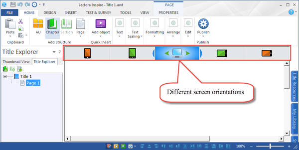
The tool offers page layouts that are a convenient way to organize basic content and help you know how the content will appear on the screen of each device and its orientation, Lectora offers different layouts for each device. It also provides the best designs for each type of device. You can also create customized page layouts with the tool.
The tool also allows you to move or resize an object proportionally on views for different devices, using Ctrl+Shift+drag.
The device inheritance feature of this tool is of great help when you have an object or a group of common objects which needs to appear on all the devices you want the course to appear in. The inheritance feature will help you transition your design from one device to another. Anything you develop for the desktop using this tool will be inherited to the tablet and anything developed on the tablet will be inherited to the phone.

This feature is also useful when you need to have an object or group of objects in more than one page of your course.
Page Height Adjustment helps you when the content on a mobile device is too low on the page to appear within the default height. This feature will automatically expand the page to create virtual scrolling to ensure no content is lost. Text can be made to appear smaller or larger on a mobile device, by applying the scale factor to the base point size.

Another feature called the reserved variable allows you to display content and control actions, based on the device type and orientation. For instance, if you want the device to show the display in the landscape mode for a particular exercise, a message will be displayed on the screen that will instruct the learner to change the orientation if the screen is in the portrait mode.
The features of Lectora 17 are conducive to responsive course design. They help you create a single course which can be adapted to different devices. Considering the fact that learners today are more likely to switch between devices when going through an e-learning course, Lectora’s RCD features are a boon to e-learning developers.


![10 Steps to Convert Legacy Courses to HTML 5 [Infographic]](https://blog.commlabindia.com/hubfs/Imported_Blog_Media/ten-steps-to-convert-legacy-courses-to-html5-infographic.jpg)

