Legacy to Responsive Course Conversions: Tips to Perform Cross-Browser Testing

Given the burgeoning mobile workforce, organizations are running wild to make their legacy courses responsive. There has been an explosion of articles related to this topic, telling you how to make your legacy courses responsive. There are various tools in the market that make your job easy, in your pursuit of responsive courses. But, the real problem arises when your learners realize that the courses are not really responsive on their devices. Hence cross-browser testing is one of the most important steps in converting legacy courses to responsive. Let’s explore more about this topic.
What is Cross-Browser and Cross-Device Testing?
Cross-browser testing is the process of reviewing your eLearning course across multiple browsers, operating systems, and mobile devices, to uncover any potential incompatibility issues.
Why is it important?
The e-Learning courses we develop can be viewed on any number of browsers, in multiple formats, on various devices, and at any size. This means that when we develop, we need to be sure that what we’ve developed can be viewed correctly, no matter how the learner chooses to consume it.
Every browser has its own HTML rendering engine and interprets JavaScript differently, which causes inconsistencies across browsers. These could be content, functionality, or usability issues. What looks fine on one browser can have issues on another browser.
Similarly, with each device having its own platform, it is difficult to deliver e-Learning on all these devices in the same way. You may notice issues related to misaligned content, loss in image quality, text readability, etc., when content is presented on different devices. Hence, performing cross-browser testing is important to make sure the quality of e-Learning is uniform on all browsers and devices.
Tips to Perform Cross-Browser Testing
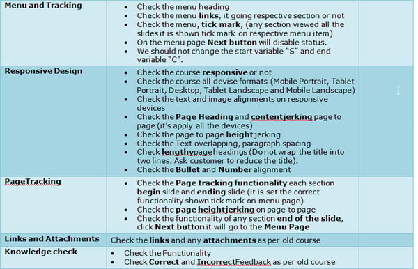
Maintain a Standard Checklist
A checklist will act as a guide to the developer when converting legacy courses to responsive. The checklist can include specifics about the course title, font size, navigations buttons, menu, individual page content, hyperlinks, graphics, and videos. This checklist can be developed after testing a fully functional responsive course, so that all the courses in the pipeline follow the same checklist, ensuring that they go on time.

Test Content
During the conversion, the content from the old course is pulled into the new template, where developers need to adjust the layouts across the responsive backbone and reformat the content to match the new template. During this process, the developer may fail to copy the content correctly or sometimes the content might overlap the other objects in the slide. Since we test the course on multiple devices and multiple browsers, and each browser has its own way to render onscreen content, misalignment is a common issue.
Also, when it comes to mobile devices, text readability and blurred graphics are common issues too. Hence, care should be taken about these issues while checking courses on all devices.
Test Functionality
The smaller the device, the harder it can be to touch a precise spot. While testing, ensure that touch targets are large and wide apart to be comfortably used.
Coming to the navigation, while there may be space on larger devices to display all navigation controls upfront, it is recommended that be logically grouped and layered on smaller devices.
If the eLearning course includes interactivities or navigation that requires specific gestures, check whether clear and explicit instructions are displayed on the different types of test devices.
To perform cross-device testing, these tools can come handy:
- Browser Sandbox
- TestingWhiz
- Rapise
- Browser Stack
- Adobe Edge Inspect
- Vanamco
These tools are especially useful when your reviewers don’t have sufficient devices to do the testing. These tools can be used to test how your e-Learning course works on different devices and browsers.
Keep an Issue Log
When converting bulk courses to responsive, an issue log can be maintained, where all the issues are recorded and tracked. This helps the project manager report and communicate all issues raised during testing with the development team. Thus the issues raised can be investigated and resolved quickly. Also, this will ensure that developers cut down such issues in the next e-learning courses. This in turn can help a project manager deliver the project within budget and on time.
Leverage E-learning Course Review Tools
While reviewing an e-Learning course, taking screenshots of the slide which has bugs and adding comments is a tedious and time-consuming task, especially if you have a course with more than 60 slides. To make your work easy and cut down the feedback rendering process, online review tools come handy. Some of the most popular tools are Adobe Captivate Reviewer, Review My eLearning, and Review Link. Reviewers can now directly review the course outline, insert comments on the slide, and once the review is done, a notification will be sent to the developer.

These are some of the ways that help you perfect your cross-browser testing. If you have other tips which you have employed in your testing process, kindly share.


