Responsive or Adaptive Design: Differences that Influence the Choice of E-learning

With the growing preference of learners to access e-learning courses on multiple devices, the need to design courses that will be accessible on various devices and improve the user experience has gained prominence. Thanks to rapid advances in technology, this has become less of a challenge and more of a choice. The advent of responsive and adaptive design in e-learning has left learning designers mulling over what to choose. Let us explore these two concepts in detail, their pros and cons, and factors that determine the choice.
Responsive Design
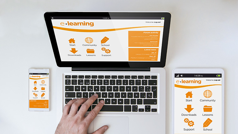
It is design that seamlessly alters the layout to fit the device an online course is being viewed on. With responsive design, the layout of the screen changes based on the device the content is being viewed on – desktop, laptop, tablet, or smartphone.
With responsive design, it is possible to offer an optimal viewing experience to the learner, irrespective of the device. Images are downloaded at full size and then resized to fit the available screen layout. This design requires the development of only one master course, where the display alters according to various screen sizes.
Adaptive Design
In adaptive design, the content display changes to fit a pre-defined set of devices. Several layouts are created for multiple screen sizes. So for each different screen size, a different layout has to be designed. If the content has to display on a desktop, laptop, and smartphone, three different layouts to suit these devices will have to be created. Images are altered to suit specific screen layouts.
For adaptive design, the learning designer adds the presentation, layout, and interactivities suited to each layout so that the browser will download only the relevant elements appropriate to the specific screen. Based on the device used, the course selects the pre-set layout for that device.
What’s the Difference?
The difference between responsive and adaptive course design is basically their approach to different layout sizes. Responsive design provides a fluid layout regardless of the device, whereas in adaptive design, the pre-designed layout is activated based on the device used to access the course.
Pros and Cons
Here is an overview of the pros and cons of each design approach:
| Design Approach | Pros | Cons |
| Responsive |
|
|
| Adaptive |
|
|
Responsive or Adaptive?
The choice to adopt either a responsive or an adaptive design approach depends on a number of factors. We have listed a few important ones:
Devices learners will be using:
Your decision will depend on the devices your learners will use to access the online courses. If you’re confident that your learners will use only a limited number of devices for accessing the courses, say a tablet or a mobile phone, then you can choose adaptive design.
You create pre-determined layouts for specific devices and control how the content will display on these devices. Your learners will have a better learning experience because the pages will load faster, as the design is optimized for each device or browser.
A responsive design approach will work better when you are not sure of the devices your target learners will be using. Even though this approach requires focused design efforts and testing on different devices, it ensures a quality learning experience, irrespective of the device used.
Training need:
Another factor is the subject matter and the user experience you want to deliver. If the content is aimed at performance support or just-in-time learning that is delivered on mobile devices, then responsive learning is ideal.
However, if the course involves a lot of text-based content or complex simulations, it may not display well on a mobile phone in spite of a responsive layout. In such cases, adaptive design is more suited because it provides different layouts for each device where the display element is optimized.
Authoring tool support:
Today there are a number of authoring tools available that offer exclusive responsive design or adaptive design features. There are some tools that offer both. All these authoring tools use HTML5 for quick connectivity. This is essential for delivering multi-device media-rich courses that can be accessed on the go.
Responsive authoring tools promise responsive layouts, customization, and navigation options while adaptive authoring tools promise fast loading times, unique layouts based on the device, and better display on mobile devices. Your choice of authoring tool will be based on your design option and the learning experience you want to provide learners.
Cost of development:
When the two design options are compared, adaptive design is more expensive because it requires investment of more time and resources than responsive design.
That said, both responsive and adaptive design have their pros and cons. When choosing between the two, consider the profile of your learners, their work context, and the content you are delivering and how you want it delivered. Your decision must be based on your budget, learning strategy, and training results. Which design approach will you adopt and why?


![4 Benefits of Responsive E-learning Design [Infographic] 4 Benefits of Responsive E-learning Design [Infographic]](https://blog.commlabindia.com/hs-fs/hubfs/Imported_Blog_Media/responsive-elearning-design-infographic-3.png?width=670&height=1200&name=responsive-elearning-design-infographic-3.png)


