

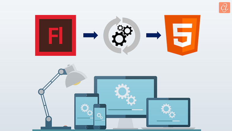
The world today is embracing mobile learning. Deciding whether to go for responsive or HTML5 output can be confusing as many authoring tools are available in the market, which can give both outputs. This blog will help you explore the differences between responsive and HTML5 mobile-friendly e-learning, and provides some guidelines on making the right choice for your eLearning projects.
What is the best option for your eLearning courses? Do you need responsive or HTML5 mobile-ready courses? Let’s take a quick look.
Responsive Design
Responsive design allows the course to automatically fit the screen size and orientation of the device it is being viewed on. Responsive eLearning courses adapt the text, images, menu, navigation, and interactions to deliver the same comfort and usability to the mobile user as to the desktop user. It allows ensures that the course looks equally well on all types of devices.
![4 Benefits of Responsive E-learning Design [Infographic]](https://resources.commlabindia.com/hubfs/Imported_Blog_Media/responsive-elearning-design-infographic-2.png "4 Benefits of Responsive E-learning Design [Infographic]")
HTML5 Mobile-Friendly Design
HTML5 mobile-friendly eLearning courses are designed to work the exact same way across multiple devices. The output on a computer, mobile phone, and a tablet is the same. This is different from the responsive course design output, where the display varies with devices.
For developing mobile-friendly eLearning courses, you should keep in mind the screen size, content, load time, and readability because there are a bunch of mobile devices with different screen sizes, and courses need to fit every screen size. With responsive design, there will be no usability concerns with the device on which a course is being viewed.
How Will You Know Which is Right for You?
Here we’re going to help you identify the right option that suits your eLearning development needs.
Responsive Design: You can develop your eLearning course to achieve a customized mobile experience using responsive design. However, responsive eLearning courses do not require any expert skill, elaborate timelines, and big budget, as rapid authoring tools offer this output, and are template-based. You can choose the required template based on the content type to develop your responsive course, which can be viewed on any device.
Mobile-Friendly Courses: You can consider this option if you don’t have a majority of mobile learners; also you can choose this when the course comprises text and images, without any complex interactivities. It also offers fast loading on mobile devices.
Top Three Authoring Tools for Responsive and HTML Mobile-Friendly Output
Today, the eLearning market is filled with dozens of e-learning authoring tools and it’s very confusing to choose from them right away. Let’s check the top 3 rapid authoring tools that will help meet your eLearning development needs.
1. Articulate 360
Articulate 360 is a subscription-based tool, which has the ability to develop online courses with a high level of quality for both responsive and HTML5 output. For example, using Articulate Rise, you will be able to publish the course to a responsive output as well as to HTML5, without any hurdles by importing the Articulate 360 file.
![Articulate 360 - A Bundle of Nine E-learning Applications [Infographic]](https://resources.commlabindia.com/hubfs/Imported_Blog_Media/articulate360-elearning-applications-infographic.png "Articulate 360 - A Bundle of Nine E-learning Applications [Infographic]")
2. Adobe Captivate 2017
Adobe Captivate 2017 is an innovator in the field of responsive eLearning design. With the new fluid boxes feature of Adobe Captivate tool, you get several options to create fully responsive mobile learning courses easily, without any programing skills.
3. Lectora Inspire 17
Lectora Inspire 17 is a popular authoring tool that allows course development using the desktop and online versions; develop responsive, mobile-friendly eLearning courses. You can use this tool if you have text-heavy slides and images throughout your eLearning course.
The RCD (Responsive Course Design) feature enables the course to auto fit to any device. But it takes some manual adjustments to tweak the output for different devices, which costs extra development time.
Hope you’ve learned a bit more about responsive and HTML5 courses to identify what you need for your next eLearning project. Do share your views.