Responsive E-learning Development – What, Why, and How

How can you deliver good online learning experiences to your people? What does it take to ensure your people access your courses seamlessly? Well, you need to focus on one of the important aspects – making your technology-enabled learning content responsive.
→ Download Tool Now: Authoring Tool Finder
What is responsive elearning?
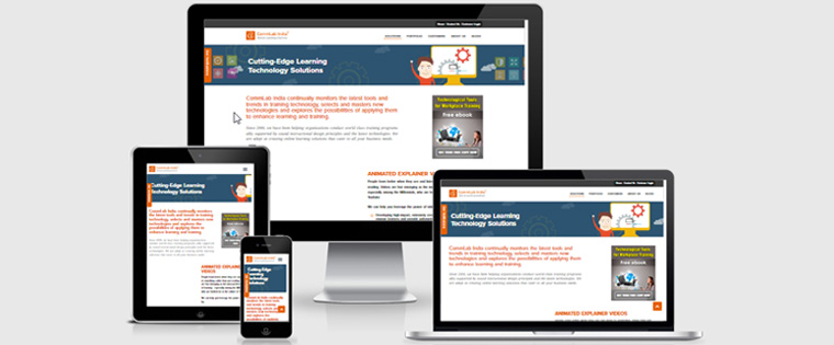
Before we see what responsive elearning is, we need to understand what Responsive Web Design (RWD) means. Responsive Web Design (RWD) is a web technology paradigm that facilitates the development of websites that adapt to the varying screen sizes of different devices – from Smartphones to desktop computers and provide an optimal viewing experience.
Responsive elearning is the application of RWD to the creation of online training material. It facilitates the development of online courses that can be efficiently accessed on multiple gadgets.
Why should online courses be responsive?
A study by Google revealed 98% of Internet users switch between devices with varying screen sizes in a single day. Companies need to meet the needs of their “multi-device” learners, and this leaves them with two choices – develop multiple versions of the online course, each for a specific type of device, or make the elearning course responsive. Many firms are going in for the latter option, primarily because creating multiple versions of a course takes more time and money. Moreover, using multiple versions of the same course makes tracking the different versions cumbersome.
How can a good responsive elearning course be developed?
You need to focus on 3 major aspects to develop an online course that can be accessed seamlessly on devices with varying screen sizes.
1. Begin the development of the elearning course with responsiveness in mind
Many a time, online course developers create a plan for the largest screen and then try to scale it down until they reach the smallest. A major problem with this approach is that developers often tend to include elements such as non-vector images, which cannot be rendered well on most mobile devices. To avoid this problem, it is better to adopt the opposite approach – developing the course first for mobile devices. And, when you design elearning courses for devices with varying screen sizes, it is important to focus on “breakpoints” i.e., major screen sizes which need your attention more than others.
- < 480px (ideal for most older Smartphones with small screens)
- < 768px (applicable to most Smartphones with large screens and small tablets PCs)
- > 768px (suitable for large tablet and desktop screens)
You can also focus on the following two sizes if you have time and money.
<320px (a good idea for older, small, low resolution phones)
>1024px (well-suited for desktops with wide screens)
Authoring Tool Finder
Find the Right Authoring Tool, Whatever Your Requirement.
- Enables hassle-free decision-making
- Offers ideal authoring tool options
- Boosts your productivity
- Understands your custom eLearning needs
2. Focus adequately on creating proper content layouts
You need to determine what content and features are most essential, and then, chop off the unnecessary ones. Once you have clarity about the content to be included, proceed to design the layout. It is important to remember devices come in all sizes. So, it is better you don’t try to avoid the scroll bar. However, make sure you place key information such as the learning objectives on the top of the responsive elearning course. Also, you need to be careful about the use of typography. Ensure the text of your course is clearly visible on screens of all sizes. It is advisable to test how the text is rendered on different types of devices before rolling out the course.
3. Ensure the navigation of the course is responsive
Navigation is inarguably the toughest aspect of creating a responsive elearning course. Unlike other elements of online course design, this is one area where you don’t need to be consistent. Menus which are used in courses meant for the desktop simply don’t work on mobile devices. So, you need to design different navigation for different devices. Many designers of responsive websites use “hidden” navigation, and there is no reason why you shouldn’t do the same. For example, you can use the icon of an ice cream to indicate a menu.
Today’s learners use a wide variety of devices, and this makes it important to make your course responsive to deliver optimal online learning experiences. To develop a good responsive elearning course, you need to plan well, keeping in mind screens of different sizes. It is important to pay attention to the design of layouts and the navigation of your online course.


![Do You Know What Responsive Design Is? [Infographic]](https://blog.commlabindia.com/hubfs/Imported_Blog_Media/responsive-elearning-why-and-how.jpg)