
![Do You Know What Responsive Design Is? [Infographic]](https://blog.commlabindia.com/hubfs/Imported_Blog_Media/responsive-elearning-why-and-how.jpg "Do You Know What Responsive Design Is? [Infographic]")
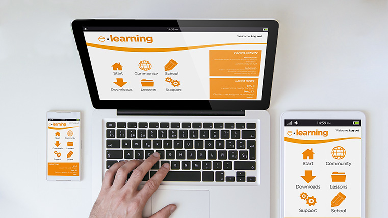
Now a days, users of the Internet access web-based content through various mobile devices such as tablets and smartphones, along with PCs. The growing use of mobile devices is compelling companies to make their online content responsive, so that it can be accessed on any device, irrespective of the platform it runs on and the size of its screen, and e-learning resources are no exception.
Responsive e-learning facilitates the development of online courses that can be accessed efficiently on multiple devices, browsers, and operating systems. We all know e-learning authoring tools offer responsive output, but the degree of responsiveness differs. Do you know what is the responsive output offered by each tool? Check this infographic for the answers.