

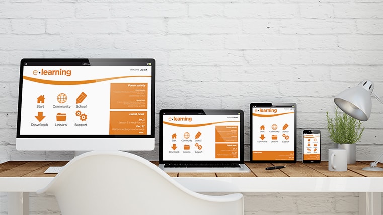
In today's world, learners access training content from a multitude of devices – desktops, laptops, tablets, and smartphones. Responsive design ensures your eLearning content dynamically adjusts its layout, images, text, and navigation to provide an optimal viewing experience across devices. Lectora, a robust eLearning authoring tool, offers powerful features to help you easily create responsive and engaging courses. In this blog post, we'll dive into how you can leverage Lectora to build eLearning experiences that are both beautiful and functional on any device.
→ Download Now: Download eBook: Guide to Rapid eLearning Authoring Tools
Table of Contents
- What is Responsive Design?
- What Are the Key Principles of Responsive eLearning Design with Lectora?
- How to Create Responsive Course Design (RCD) in Lectora?
- What Are the Different Interactivities Offered in Lectora?
- What Are the Tips to Ensure Responsive Course Design?
- How Can You Use Lectora for Rapid eLearning?
What is Responsive Design?
Responsive Course Design (RCD) is a method of developing eLearning courses that provide the best possible learning experience on several devices such as phones, tablets, and desktops. Responsive eLearning is visible on any type of device with minimal zooming in or out, allowing the user to get the most out of their learning experience.

What Are the Key Principles of Responsive eLearning Design with Lectora?
Planning to Take Up Responsive Course Design in Lectora?
Here are the key principles of responsive eLearning design worth appreciating:
- Flexible layouts
- Media optimization
- User-friendly navigation
1. Flexible Layouts
- Responsive Course Design (RCD): Lectora's RCD feature intelligently resizes and rearranges your course content to fit different screen sizes and orientations. This means that you primarily focus on designing an optimal layout for the desktop view. Lectora will handle the adjustments for tablets (portrait and landscape) and phones (portrait and landscape).
- Device Views: The device selection bar at the top of Lectora's interface lets you easily switch between device views. This allows you to visualize how your content will adapt and make any necessary adjustments.
- Inheritance and Device-Specific Adjustments: By default, Lectora uses inheritance, meaning the layout and properties you define for the desktop view will cascade down to smaller devices. However, you have the flexibility to make adjustments for specific devices when needed. For example, you might reposition a text block on a phone for better readability.
2. Media Optimization
- Videos: The easiest way to ensure responsive videos is to embed them from platforms like YouTube or Vimeo, which have built-in responsive players. Lectora also offers settings to control how embedded videos resize for different screen sizes. Here are a few popular video platforms you can use.
- Audio: Use audio formats supported by most browsers (like MP3). Provide player controls that allow learners to easily adjust volume or pause playback, which is especially important on smaller devices.
- Images: When choosing images, consider both resolution and aspect ratio. High-resolution images that are sized with common aspect ratios (like 16:9 for widescreen) will scale well across devices. Lectora also allows you to crop and adjust image scaling within the tool itself.
Watch this video to understand how to optimize picture and text placement in eLearning.
3. User-friendly Navigation
- Intuitive navigation: Clear and consistent navigation is essential on all devices. For smaller screens, simplify menus (e.g., collapsible or off-canvas menus) or replace them with navigation icons.
- Touchscreen vs. Buttons: Design for both touchscreen gestures and traditional mouse clicks. Make sure buttons and clickable areas are large enough for fingers to tap. Consider spacing elements further apart on smaller screens.

Rapid eLearning Authoring Tools
Explore the What and the Why of Popular Rapid eLearning Development Tools, and GenAI Tools
- Categories of eLearning Authoring Tools
- Considerations to Choose Your Next Authoring Tool
- Features of Popular Rapid Authoring Tools
- GenAI Tools to Create Content, Graphics, Audio, and Video
How to Create Responsive Course Design (RCD) in Lectora?
One of the most popular and widely used eLearning authoring tools is Trivantis Lectora. It has long been a favorite of corporate training professionals due to its Responsive Course Design (RCD) feature, and it is particularly effective when training a large number of employees with a varied set of devices.
Lectora enables eLearning developers to cater to the type and orientation of a device rather than the width of the device’s screen. This unique authoring tool offers 5 distinct designs to choose from. They are desktop, tablet landscape, tablet portrait, phone landscape, and phone portrait.

What is the Inheritance Model in Lectora?
Lectora allows you to start designing the course for desktop view first. Then you can move on to other devices such as tablets and phones. The content of the course will be automatically set in position for each type of device. Each device has a customized set of specific viewing requirements which are modified using the inheritance model illustrated below:

Changes made to the desktop’s set of specific viewing requirements will cascade down to all other devices. On the other hand, changes made to the tablet’s viewing requirements won’t affect the desktop, but they will be passed down to the phone. Changes done to the phone’s viewing requirements will only affect the phone. If the material does not fit within the tablet’s or phone’s screen, the content will be adjusted to suit the precise size of the mobile device’s screen.
This responsive course design (RCD) feature in Lectora enables you to create designs where you always know how information will appear on each device. Also, the content that is designed for the phone will look the same on every phone, regardless of that phone’s screen resolution.
A Closer Look at the Steps Involved in Responsive Course Design:
Create a New Responsive Title
Open Lectora and select "New Responsive Title" from the Getting Started window or click “Create New Title” from the File tab and select Responsive Title. Once you’ve enabled the responsive design, a device selection bar will be added to your display area. You can switch between the 5 devices to see how each object is being incorporated into the course.

Adding, Deleting, and Removing Objects
Add text, images, and other elements to your course. Lectora will design and develop your eLearning course to be viewed on the desktop. The position and size of textual and visual content included in these eLearning courses will be automatically adjusted to be viewed comfortably on different screen sizes.
However, for more granular control, you can manually adjust object positions and sizes for each device. This allows you to optimize the layout specifically for each screen. You can continue exploring the capabilities of Lectora and how you can view and modify your content on different devices and orientations.
Overriding Lectora’s Inheritance
Changing the essence of an object disconnects that object’s RCD inheritance and establishes an “override” for the part of the object that you changed. If you move an image on a tablet to a different place than the position it inherited from the desktop view, an override for the new position is established on the tablet, and the link to the desktop’s original RCD inheritance, or position in this case, is lost.
The location of that object on the tablet is no longer affected by moving it to a desktop. However, changes made to any other property of that object (e.g., size, initially hidden, always on top, etc.) will, however, be inherited over from the desktop to the tablet. The object’s position will be the only thing that will be overruled.
Not all attributes of an object can be overridden on a tablet or phone. Only a few elements can be changed and overruled. While examining the property ribbons of an object, if the name of the property is displayed in color it means that that is an overridable property for that particular object.
Moving & Resizing Objects
RCD inheritance passes down from the PC to the tablet, and then from the tablet to the phone. If there is no override for a particular position or size of an object in the “child” device, then moving or resizing an item on a “parent” device will cause the object to be automatically moved or resized on the “child” device’s screen.
The idea is to relocate or resize an item (or several objects) across all devices’ screens even though you may have previously overridden the default RCD inheritance by performing a unique modification. In order to do this simply hold down the Ctrl and Shift keys (Ctrl+Shift) while dragging an object(s) to relocate it or dragging an object’s corner to resize it.
Conditions and Actions
Lectora facilitates responsive course design in a manner that the activities and actions within these RCD modules are not overridable. Any change made applies to all devices’ screens and will occur independently of the learner’s device or orientation. You can, however, create actions and activities that are exclusive to a specific screen size.
Rapid eLearning Authoring Tools
Explore the What and the Why of Popular Rapid eLearning Development Tools, and GenAI Tools
- Categories of eLearning Authoring Tools
- Considerations to Choose Your Next Authoring Tool
- Features of Popular Rapid Authoring Tools
- GenAI Tools to Create Content, Graphics, Audio, and Video
What Are the Different Interactivities Offered in Lectora?
1. Interactive Elements
Lectora provides a wide range of eLearning interactivities that you can include in your training courses to engage learners and foster active learning. Some of the popular ones are mentioned below:
Buttons: Trigger actions, reveal content, or navigate to other sections
Clickable areas/hotspots: Create interactive zones on images or diagrams

Input fields: Collect text-based responses
Sliders: Allow learners to manipulate variables or explore a range
Drag-and-drops: Let learners match concepts or sort items

These interactive elements transform the learning process from passive to active and more engaging, thereby making Lectora a perfect fit for creating custom eLearning courses as well. For example, a clickable diagram could have hotspots that reveal detailed information when tapped or clicked.
2. Scenario-Based Learning
Lectora's BranchTrack feature lets you craft decision-based scenarios where learners' choices impact the path they take through the course. This mimics real-world problem-solving and consequences. For example, you can create a scenario for customer service training where learners must handle different customer interactions. Their choices lead to positive or negative outcomes, providing valuable feedback.
3. Quizzes and Assessments
Lectora offers various question types, including multiple-choice, true/false, matching, fill-in-the-blank, and more. You can use quizzes throughout your eLearning course for informal knowledge checks (formative) or as a final knowledge assessment (summative) and provide customized feedback based on learner responses.
You easily generate eLearning assessments with single-select and multi-select options. Here are a few screenshots depicting the same.
Single-select option for assessment

Multi-select option for assessment

What Are the Tips to Ensure Responsive Course Design?

Check Preview
Lectora's built-in preview tool is your best friend. Use it extensively to see how your course looks and functions on desktops, tablets, and phones. Pay close attention to how text wraps, images resize, and interactive elements behave across different screen sizes and orientations.
Test on Real Devices
While the preview is helpful, testing on actual devices is ideal if possible. This gives you the most accurate picture of the user experience, especially for touch interactions.
Solicit User Feedback
Before launching your course, consider getting feedback from a small group of test users across different devices. Their insights can reveal issues you might not have spotted. Utilize forms or surveys to gather structured feedback on the responsiveness and functionality of the course. Here’s an infographic to help you solicit the right feedback for your training initiatives.

Keep it Simple
Mobile devices favor clean, minimalist designs. Focus on the essential content and avoid cluttering the screen. Use ample whitespace to improve readability. The simple design also comes in handy for eLearning translations.
Use High-Quality Assets
Grainy or pixelated images and videos detract from the learning experience, especially when scaled up on larger screens. Choose high-quality visuals whenever possible.
Leverage Templates
Lectora offers pre-built templates and themes that are already optimized for responsive design. These can save you time and ensure a consistent look and feel across your courses.
Rapid eLearning Authoring Tools
Explore the What and the Why of Popular Rapid eLearning Development Tools, and GenAI Tools
- Categories of eLearning Authoring Tools
- Considerations to Choose Your Next Authoring Tool
- Features of Popular Rapid Authoring Tools
- GenAI Tools to Create Content, Graphics, Audio, and Video
How Can You Use Lectora for Rapid eLearning?
Lectora is a powerful authoring solution that rapid eLearning development. It helps eLearning course creators design impressive and astounding eLearning material. Before we jump right into the details of how to use Lectora for rapid eLearning, here’s a quick overview of what is rapid eLearning.

Now that you’ve got a good hang of what rapid eLearning is, let’s explore how is it made possible by Lectora.
1. Familiar Windows Environment and Intuitive Interface
The pre-loaded, customizable components of Lectora Online make eLearning course development easy. It offers templates, design themes, and wizards to help course creators of all levels such as beginner, intermediate, and advanced, to get started with creating their courses. These can be easily published on CDs, PCs, smartphones, and other learning management systems.
2. Responsive Authoring
It helps design, deliver, and publish courses across multiple mobile devices and platforms. It offers numerous responsive eLearning capabilities. It is a versatile tool that aids responsive learning to be quickly and easily brought to life.
3. Collaborative Authoring
With Lectora Online, you can now easily develop eLearning courses with your teams across the globe. The built-in versioning features help track revisions automatically. Irrespective of the time zone you are in, you can effortlessly manage, store, create, and review assessments, presentations, and training courses online. Multiple versions of the same course can also be created along with other authors.
4. Lectora Online Tools for Rapid eLearning
Some of the tools or assets of Lectora Online that help you create engaging eLearning content and boost your learners’ eLearning experiences are:
- Asset Library: Here, scenarios can be easily customized. You can gain access to your ideal image through the array of multimedia files it offers. More than 120 million assets offered by the asset library make it a cakewalk for content developers to create eLearning courses and engage their audience in the most effective way possible.
- Review Link: Lectora Online helps learners toggle between desktops, tablets, and phones. They can also switch to portrait or landscape modes. It helps them create and save custom views. Mobile content can be reviewed and approved easily as the review link is entirely responsive.
- CenarioVR: Virtual scenarios can be created within hours just by using your web browser. This is done in a fast and intuitive authoring environment. The eLearning material can be accessed via VR goggles, mouse, or touch.
- Extensibility Sans Boundaries: Building an effective online course is easy. Imagine it in your mind and you can build it in reality. This is exactly what Lectora Online allows content developers to do. Custom libraries and fonts can be included. Course creators can write their own scripts. It allows them to record videos. It is a flexible tool as it sets no boundaries for both learners and course creators. Triggers, actions, conditions, and variables are used to track and react to learners’ behavior. Personalized and dynamic learning can be created using sequenced events and conditional branching.
Wrapping It Up!
Responsive design takes a diagnostic approach to learning design. Learners can access courses from any location and on any device. The capabilities of Lectora make it easy for you to create responsive courses. It assists you when you want to create a course that can be customized for and compatible with a plethora of devices. Today’s learners are more likely to shift from one device to another while completing their eLearning course. This makes Lectora’s RCD capabilities a boon for eLearning developers.
But if your requirement is different from responsive course design, there’s a good chance that some other authoring tool may be well-suited for that purpose. But how will you know which authoring tool is the best for which requirement? Don’t worry! We’ve got you covered. Check out our guide on rapid eLearning authoring tools and make informed decisions confidently!
Editor’s note: This post was originally published on March 20, 2024 and has been updated for comprehensiveness.