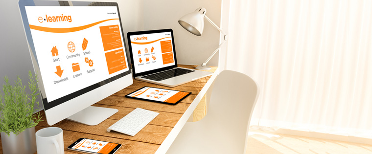
Storyline 3: Responsive Player Features to Optimize the Learning Experience

The ubiquity of mobile devices has not left e-learning unscathed. Training managers are looking for online learning that can be accessed both on computers and mobile devices. Learning developers are well tuned to these demands and now have authoring tools which offer HTML5 publishing options that make e-learning courses seamless on mobile devices as well.
The catch here is what kind of mobile devices we are looking at when designing e-learning. Today mobile devices can range from tablets and smartphones to even smart watches.
Designing an e-learning course that can be viewed optimally even on the small screen of a smartphone or tablet is called responsive design. It is not just scaling down text or images, it involves a lot more. Responsive design involves enabling the text and graphics to change based on the screen size. The change could be anything from multiple columns on a desktop to a single column on a smartphone or a regular sized image on a desktop to a smaller one on the tablet.
Articulate Storyline has supported responsive design by offering HTML 5 publishing options. The latest version which is Storyline 3, offers a responsive player which makes navigation easier for smartphones. But as a developer, you will still need to decide on the layout for the content, graphics, and interactions to ensure it functions on the smaller screen.
Responsive Player Features
After publishing courses using HTML5, the responsive player will display how well the course will appear on tablets and smartphones.
The responsive player can automatically adjust the screen size intuitively to different devices. To understand how content will appear on screens of varied dimensions, the tool offers a responsive preview toolbar which allows you to see how the slide will appear on a desktop, tablet, or mobile device. Once you click your option on the tool bar, the slide will dynamically scale and readjust, according to the screen size.
Apart from this, it hides sidebar menus till you need them and eliminates browser chrome. It provides mobile-friendly playback controls and the responsive player moves out of the way to provide more screen space for your content. The screen will maintain the aspect ratio and it will automatically scale to fill as much screen space as possible on tablets and smartphones.
This adjustment makes most of the space available and is optimized for landscape or portrait orientation.
The responsive player supports touch screen gestures, you can swipe smoothly between screens and use pinch or zoom gestures to read text on the screen. This feature removes the need to create different slides for different versions of the course so that it displays well on all devices. Now you can build the slide once and with this feature, get it to work optimally on any device.
HTML5 output in Storyline 3 and the responsive player give a superior viewing experience. To view the course on different mobile devices such as iPads, iPhones, or Android devices, the course can be published using either HTML5 output, the Articulate Mobile Player output or both. When learners launch the course, they will be able to view the right version based on your publishing choices.
The responsive player feature also allows the option of accessing courses even when there is no Internet connection. Learners will initially need an Internet connection to download the course and once this is done, they can access the course in the offline mode. However, if learner progress has to be tracked on the LMS, the learner has to be connected to the Internet.
Tracking Options
Storyline 3 HTML5 output makes it easy to track learners, no matter what device learners are accessing the course on. This output is supported by AICC, SCORM, and Tin Can API learning management systems as well as Articulate Online (which allows you to deliver Articulate courses and track the activities of learners).
It is best to publish courses using the HTML5/Flash format which is supported by all LMSs whereas the Articulate Mobile Player App supports only Tin Can API. A course published to HTML5 /Flash formats will allow learners to switch between devices, browsers, and formats without losing track of their progress or results. For developers, this will provide the option to cover a wide audience, provide a better experience, and cover the specifications for different LMSs.
Storyline 3 provides exciting options when you want to publish courses that are accessible on different mobile devices. Technology does the heavy lifting; developers have to build the course while the responsive player optimizes the learning experience.


