

You invest thousands of dollars to implement eLearning – develop engaging and interactive online courses, buy a learning management system (LMS) to host courses, and assign them to learners based on their roles. All good till here. Now what if a crucial segment of your employees – the field force does not get to access to these online courses?
→ Download Tool Now: Authoring Tool Finder
Yes, it often happens that your field force does not get to access online training programs.
A couple of reasons behind this:
- Field force does not always have dedicated computers at work
- Field force cannot take time off work to attend training sessions as their presence is crucial on the field
Mobile learning could be an option for such employees. But, would you want to invest your time, money, and efforts twice, to deliver the same course on another device? Why should you, when you have a more practical and viable solution?
Responsive eLearning design is THAT viable solution.
The term “responsive eLearning design” is derived from “responsive design”.
What is responsive design?
Responsive design refers to the design that adjusts itself to the screen it is displayed on. Instead of shrinking the size of the design, responsive design automatically resizes the elements to a readable size, based on the size of the user’s screen. This is quite common for webpages, which display bigger pictures and font on desktops, but adjust to a readable size on mobile devices, without the necessity to zoom in to read content or view visuals.
What is responsive eLearning design?
Just like the responsive design of a website page, responsive eLearning design refers to an eLearning course that detects the screen size of the device on which the course is being accessed and resizes onscreen elements to fit the device’s dimensions. It means you can access one course across multiple devices, without much hassle. This creates an optimal viewing and learning experience for the learner.
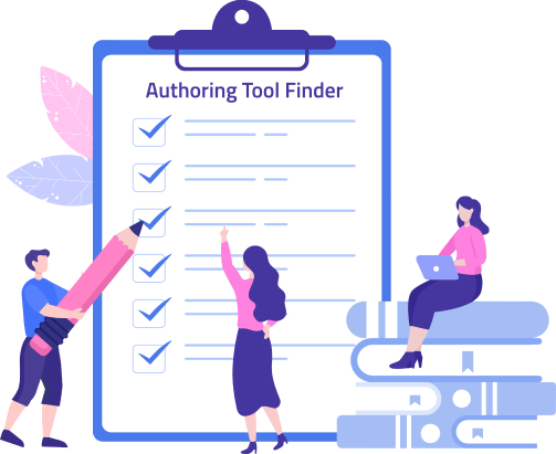
Authoring Tool Finder
Find the Right Authoring Tool, Whatever Your Requirement.
- Enables hassle-free decision-making
- Offers ideal authoring tool options
- Boosts your productivity
- Understands your custom eLearning needs
How is responsive eLearning design useful for field force?
Everyone today owns a smartphone; you’d hardly find anyone who doesn’t. We have already discussed that field force does not always have dedicated computers at work and cannot take time off work to attend training. So, if your eLearning courses are responsive, then the field force can access them even while they are on the field, on their mobile phones.
Other benefits of responsive eLearning design:
- Easy access for not-so-tech-savvy employees, as the design automatically adjusts the layout, detecting the screen-size
- You will save quite a few dollars on your training budget, as one course can be published to different devices, for in-house employees and the field force
- You will have a future-proof learning platform – irrespective of the screen sizes that may come in the future, your responsive eLearning will adjust itself to the screen size
- Your in-house learners will have flexibility of learning – they can access half of the course at work, on a desktop, and the rest at home, on their mobile
Responsive eLearning design lets the elements of your online learning courses, such as the content, graphics, menu, and other navigational features, adjust fluidly between different screen sizes. Such a design strategy for your online courses not only lets your field force connect to the organization’s eLearning platform, but also lets other employees access learning anywhere, anytime, and on any device they want.