Supercharge Your Mobile Learning with Lectora

Did you know that there are more number of mobile devices on this planet than humans? Considering this statistics, it is no surprise that an increasing number of organizations are encouraging mobile learning (m-learning) that can be accessed anywhere, anytime. If you are spearheading the m-learning initiative in your organization, you will need to invest in the right authoring tool, to design the mobile learning program.
To make existing text-heavy training content suitable for m-learning or to design a multilingual course that caters to mobile learners in different geographical locations, Lectora is the ideal choice.
→ Download eBook Now: Rapid eLearning Authoring Tools
The latest version of the tool, Lectora Inspire 17, provides a whole range of features that make it ideal for developing training programs that can be accessed on mobile devices. Read on to know more about these features.
1. Responsive Course Design
Lectora’s latest version comes equipped with the award-winning content authoring technology, i.e., responsive course design (RCD). In 2016, Brandon Hall Group conferred the ‘Excellence in Technology Silver Award’ to Lectora 16, which was the first version of the tool to feature RCD.
As more number of organizations lean toward BYOD (Bring Your Own Device) programs, your mobile learning course needs to be optimized for viewing on devices with various screen sizes and resolutions. RCD ensures that the graphical and textual elements in the course automatically resize and orient themselves to match the screen dimensions, as well as portrait and landscape orientations.
2. Pre-installed Templates
Lectora offers free iPad templates for you to jumpstart course development. Pre-installed templates for notebooks and smartphones save a lot of time when you have to create multiple courses with a similar look. Whether it’s an iPhone or an Android, you can use pre-installed templates to save on course development time, which in turn cuts down costs. If you would like to add more functionality, customization is possible in these templates.
3. Seamless Transition
Smooth transitions between pages in an m-learning course, enhances the learning experience.
In earlier versions of Lectora, the transition from one page to another was characterized by a screen wipe which looked like this.
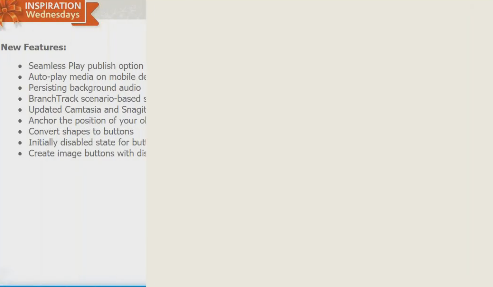
Lectora Inspire 17 fixes this problem with its ‘Seamless Play’ publish feature. Learners can switch from one screen to another without experiencing a ‘white flash’.
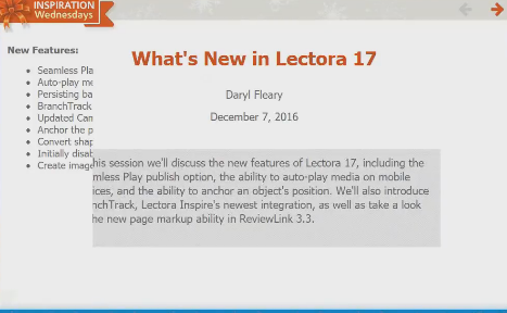
How ‘Seamless Play’ works is that Lectora loads the title once the course starts, and then pushes each page in the title, eliminating the need for the entire page to reload. This in turn facilitates smooth transition between pages.
4. Auto-Play Media on Mobile Devices
When your m-learning course has audio and video files to be played, you may notice that these are not played automatically on iPhones, Androids, and tablets. The auto-play function is blocked by Apple and Chrome to prevent additional data charges.
What do you do when videos are an integral part of the m-learning program and you do not want the learner to skip watching the video?
Lectora’s ‘Seamless Play’ feature automatically plays audio and video files. If you are wondering if this would increase mobile data usage for someone who prefers to learn while commuting, then don’t worry, as the same ‘Seamless Play’ feature takes care not to reload every component on the page. Lectora also lets you turn off this option when not required.
5. Anchor Position of Objects
The anchor position property of an object can be used to lock the object in a fixed position. For example, you might want a brand logo, navigation controls, and header/footer of the m-learning course to be visible even as the learner scrolls through the screen.
An example to explain this better, would be the YouTube screen. Even as you scroll through the page, the search bar and the navigation bar remain fixed on the screen. Imagine the confusion it would create if the navigation and search bars were to disappear when the screen is scrolled.
So, the anchor position of objects is indeed a great feature to use in your mobile learning courses.
6. SVG Rendering of Shapes
Have you ever come across instances where images are clear on a desktop, but blurred on a mobile? The same could happen to the course you intend to view on mobile devices. A blurred shape or navigation button will certainly decrease the aesthetic appeal of the course. The scalable vector graphics technology supported by Lectora ensures that shapes and buttons are presented in a crisp format, even on high resolution mobile devices. This also reduces the file size, and ensures quick loading of your m-learning course.
With all these enhanced features, there is no doubt that Lectora can supercharge your mobile learning course to deliver an engaging learning experience.
If you have used Lectora Inspire 17 to design m-learning programs or modules, do share your experience with us.


