5 Features of Adobe Captivate For Responsive E-learning Courses

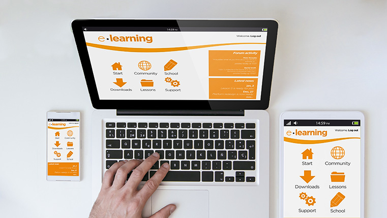
Today’s employees use multiple devices in a regular working day. So, both employees and trainees alike are looking at accessing e-learning on multiple devices with diverse screen sizes. As an e-learning developer, you have to look at designing a course that is suitable for every screen size and resolution. The authoring tool you choose has to meet the demands of responsive design. Adobe Captivate gives you the flexibility of creating a responsive e-learning course. Let us look at the five features of this tool that support responsive design.
#1. Create a Single Course for Multiple Platforms
Modifying a course to suit different devices is a tedious, costly affair. Thankfully, with Adobe Captivate, you can create a single course that can be used on multiple platforms. This cuts your development time. The tool gives you the option to create one master e-learning course which will automatically modify itself based on the device it’s accessed on. For instance, a learner who accesses the course on his mobile device will have the same learning experience as someone who accesses the course on his desktop.
Using Captivate, you can publish courses as one project and the tool makes the adjustments so that the view is optimized for different devices. This ensures that every image, block of text, or online exercise will automatically rearrange itself to fit the device.
One more advantage is that, the latest version – Captivate 17, allows you to convert non-responsive courses, developed in earlier versions of Captivate to responsive courses, using the ‘Save as’ function.
#2. Preview Courses Before Launch
When you create a course, you would obviously like to have a preview before you launch it, just to ensure that all the elements are in place. Adobe Captivate has a built-in preview tool that will show you how the course will look on every device – from mobile phones to a desktop. The tool allows you to preview the course using five different resolution options. There is also the option of previewing the course as you are developing it, to ensure the course is being designed as per responsive norms, at every stage of the development process. The Adobe Edge Inspect App allows you to preview the course on simulated mobile device screens.
#3. Pre-Built Themes that Save Time
Sometimes, you may not have the time to develop a course from scratch and wish for inbuilt themes that will quicken the process. Adobe Captivate solves your problem by providing you ready-to-use themes and templates that can cut your development time. These elements are responsive and modify automatically based on the device – either a tablet or a smartphone. The added benefit is that you can customize these themes and use them for future projects, which will result in further cost and time savings for you. Furthermore, the tool has an expansive library of media and interactive elements including e-learning templates with which you can customize every aspect of your course.
#4. Gesture Support for Interactivity
Creating responsive learning courses for mobile devices gives you the opportunity to provide better e-learning interactivity. Captivate provides you the option of letting learners go through every page of the course by swiping and using gestures when participating in an online training simulation. This helps you provide a realistic and immersive learning experience. The tool provides a number of gesture support features such as pinch, scroll, or swipe, which encourage learners to actively participate in the learning process.
#5. HTML 5 Ready
Adobe Captivate is HTML5 ready, this allows you to develop mobile-friendly courses. This feature makes it easy to integrate mobile themes, play bars and video buttons to make learning on mobile devices convenient. This feature also helps you import your PowerPoint presentations while retaining their elements, such as shapes and animations.
The above features of Adobe Captivate help you create responsive e-learnings courses that suit the needs of present day learners. Responsive design can truly enhance the learning experience.


