Visuals in eLearning: 7 Questions Answered for Curious Training Managers

Visuals play an important role in learning – both in classroom training as well as eLearning. Perhaps, they play a bigger role in eLearning programs because visuals paired with the relevant content and right instructional strategy aim to compensate the lack of an instructor in eLearning. While eLearning developers seem to possess an inherent understanding of the importance of visuals in eLearning, that’s not the case with training managers.
→ Download Now: State of Learning (Now and Beyond) [eBook]
Visuals in eLearning: Answers to Questions Revealed
- Use visuals instead of text when relevant
- Stick to simple visuals
- Place text close to visuals
- Use animations to teach hands-on skills
- Include previews for complex visuals
- Add audio for complex graphics
- Avoid distracting visuals
Are you clear about why certain visuals are presented in a specific way? You would need to know this, especially when you’re involved in reviewing, collating reviewers’ comments on the visuals used in eLearning courses, or are trying to understand the SME’s or the visual designer’s opinion on the visuals used.
Ruth Colvin Clark and Chopeta Lyons in their book Graphics for Learning, have highlighted certain guidelines for including visuals in training. This post is based on pointers from the book and attempts to answer questions that training managers might have on visuals used in eLearning.
7 Questions Answered on Visuals in eLearning
1. Why Use Visuals in eLearning Instead of Text?
We are all aware than an eLearning course has to have a balanced ration of text and images. But have you ever wondered why an eLearning developer has chosen to replace lines of text with an image?
Can a learner look at an image and understand what the slide or screen intends to convey instead of looking at text? Then the visual in your eLearning is enough to accelerate the learning process. Likewise, sometimes text alone is sufficient and adding illustrations to it is not going to improve learning outcomes.
For example, when you are dealing with numerical data it is better to represent it in the form of bar charts, pie charts, graphs, or tables.
2. Why Stick to Simple Visuals in eLearning?
Although you might be tempted to add some jazzy visuals to your eLearning course, it can do nothing to stimulate learning. Stick to simple visuals for a deeper learning experience.
For example, when you want to show learners the parts of an engine, a simple line drawing works better than a glossy photograph. This is because as compared to a line diagram, a photograph makes it difficult to differentiate the different parts within the engine.
3. Why Place Text Close to Visuals in eLearning Courses?
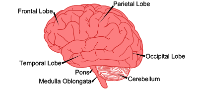
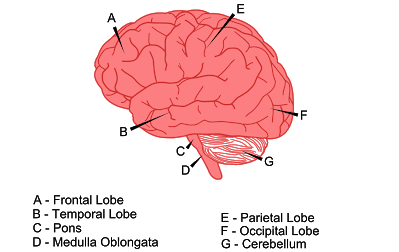
According to the Spatial Contiguity Principle, you learn better when words and pictures are placed nearby instead of far from each other on a slide or screen in an eLearning course.
Look at the images below. Isn’t the image on the top more effective than the image below? This is because it follows the contiguity principle and places labels close to the different parts of the human brain.


Source: https://sites.google.com/site/cognitivetheorymmlearning/contiguity-principle
Now you might wonder how the contiguity principle can be followed when space is limited, for example when you are designing for mobile learning, or when you have lengthy text. You could try a click and reveal interaction or a hover effect so that the screen does not look cluttered with text.
4. Why Use Animations to Teach Hands-on Skills?
The results of various experiments revealed that simple visuals in eLearning were effective in helping learners understand how things work, but a dynamic visual was more effective in teaching hands-on skills.

A Bird’s Eye View of What Top-Performing L&D Teams are Doin
- Aligning Learning Strategy with Business Strategy
- Developing Business Skills for the Future
- Investing in the Right Technology
- Much More
One of the experiments involved teaching two groups of learners how to tie nautical knots. One group followed an animated video that demonstrated this skill while the other group watched static visuals. Each group was allowed to watch the video or the static visual for 3.5 minutes, twice. When participants were asked to tie the knots, it was observed that learning was faster and better in the group that watched the dynamic visual (video).
5. Why Include Previews to Present a Complex Visual?
When eLearning course development includes complex content, instructional designers chunk the content and sequence it logically to reduce cognitive overload. Similarly, when complex visuals are included in an eLearning course, previews are used to control the amount of information presented at one time. Previews can include both text as well as graphics.
For example, if you’re including an animation that shows the working of an electrical device, ensure that learners are able to visually recognize the components of the electrical device and can name each component before you explain how it works. Here you are presenting previews or segments that make up the animation before you actually display the entire animation on the working of the electrical device. If you were to directly display the animation that depicts the working of the device before including previews where the components of the electrical device are shown, learning wouldn’t be effective. It would actually become difficult for a learner to understand the animation.
Another technique used in eLearning courses is where you build a graphic, allowing learners to gradually assimilate the pieces that make up the whole visual.
6. Why Do You Need to Add Audio to Complex Graphics?
Many experiments have been conducted to prove that complex visuals in eLearning are well comprehended by learners when accompanied by audio rather than text. This is in accordance with the modality principle that states that the learning experience is deeper when visuals are explained with audio instead of text. Whenever you’re presenting complex content in your eLearning course or your course is designed for beginners, apply the modality principle.
For example in online software training that includes a demo of procedures or steps to complete a task, including audio narration helps learners.
7. Can Visuals Cause Distraction?
Is it possible for visuals that are intended to aid or enhance learning to distract learners? Yes. When you use an image or animation in an eLearning course just because it looks good and not because it provides any instructional value, then the visual only serves the purpose of distracting learners.
Here are some DON’TS for visuals in eLearning. Don’t use:
- Multiple visuals, thinking it will enhance learning
- Decorative visuals
- Irrelevant visuals
Visuals in eLearning need to aid learning by making the content easier to understand, rather than just serve as attractive but irrelevant components of an eLearning course.
The next time you get to interact with the team involved in eLearning development – be it with your eLearning partner or an in-house team, you know what to look out for when you are reviewing the visuals in the eLearning course and what would be termed as brain-friendly graphics for your eLearning course.


