

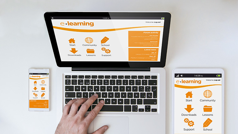
Do you own a smartphone? Or a tablet? Or a laptop? How many times a day do you access them? In all probability you use one of them or all, many times a day! Reports show that people use multiple devices to conduct their daily activities. Similarly, the phenomenon of learning has been completely transformed in the 21st century.
In this generation of technology, we live in a multi-device world with knowledge at our fingertips. Learners look for holistic learning solutions that are available anytime, anywhere and on any device. The millennials are used to multiple devices, and are always on the go. In such a rush, they expect uninterrupted learning, on multiple devices, regardless of the device they started on.
Along with the changing needs of learners, the role of the Learning Management System is swiftly changing too. As a result, it has become essential to design and develop a learning environment that is responsive and can be seamlessly delivered to the learners.
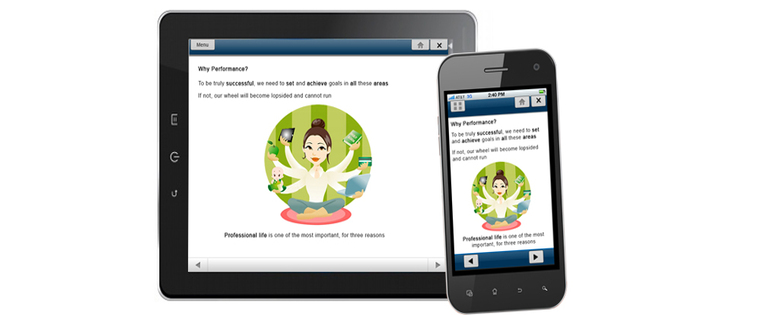
What exactly is a responsive LMS and how is it useful? For successful learning programs, a responsive learning management system (LMS) is essential. For learners, it means a seamless, flexible learning experience on any device and at any time.
Here are a few tips to develop a multi-device compatible LMS.
Identify Target Devices
Though the term Responsive LMS deduces that the LMS is device-agnostic, it is vital to pre-identify the possible devices that a learner can use and evaluate the LMS to ensure it works on all those devices. A few pointers to keep in mind:
- Device Dimension and Orientation: The market is filled with smartphones with multiple screen sizes and resolutions. Ensure that all device dimensions and orientations are taken into consideration.
- Restrictions of Various Devices: Every device has its own way of rendering output, and have specific default browsers that modify the way content is delivered. Verify if the LMS can adapt to different modes efficiently (such as transitioning from landscape to portrait modes).
Also ensure your LMS supports HTML5 format as it helps your learners access courses on any device, even when they are offline.
Eliminate Loading Issues
Learners need everything to be quick and effective. When an LMS takes time to load courses, learners lose interest. If the loading time is more, it is evident that the user experience is bad. If your learners have any bad experience with the LMS, the abandonment rate goes up. You can avoid these by compressing the content of the e-learning course and creating optimized versions of images for various devices.
Emphasize Easy Navigation
Ensure that you provide a responsive LMS that supports mobile features, such as touch, swipe, and scroll. An intuitive, user-friendly interface goes a long way in retaining learners’ attention and making the mobile learning experience enjoyable. Without a responsive LMS, learners who access courses from tablets or mobile phones will have a difficult time clicking tiny icons to access resource articles, videos, and external content.
Your LMS has to move along with your learners, as they move toward mobile learning. Ensure that your learners are provided with an enriched learning experience that is responsive, regardless of the learning device of choice.
Have other interesting tips? Please share with us in the Comments section below.

![Benefits of M-learning for Blended Learning [Infographic]](https://blog.commlabindia.com/hubfs/Imported_Blog_Media/mlearning-for-blended-learning-infographic.jpg)