

Are you also wondering what is all this hype about responsive eLearning? Is it really a game changer in corporate learning? Well, I won’t be exaggerating if I say that it has recently created a lot of and is one the most discussed topic in the world of corporate training. The learning and development environment is dynamic, everything is constantly changing and everyone is always on the move, hence ensuring that all the necessary information to perform a certain task is easily accessible to learners across various devices is a must.
Let us delve a little deeper and find out what this buzz is all about. I am going to discuss the importance of responsive design and I will spill the beans about creating effective responsive courses.
Ready to Unveil the Secret to Increasing Popularity of Responsive eLearning?
Reasons Responsive Learning is so Popular:
- Increased Popularity of Mobile Learning
- Access to Anytime and Anywhere Learning
- Enhanced Learning Experience
Responsive Design For eLearning, Why Does it Matter?
Today’s modern workforce is millennial and Gen Z dominant. Learners these days are highly dependent on their mobile devices; hence it won’t be realistic to assume that training should only be accessed through computers. No wonder, that developing responsive courses has become essential for eLearning. It is safe to say that it is one of the best practices followed by organizations. Let me give you a few reasons to understand this better:
Increasing Popularity of Mobile Learning
The majority of learners are dependent on their phones when it comes to searching for information. To keep up with the modern learning needs and learner preferences, mobile learning and responsive learning are becoming a standard for many organizations.
Discover some best practices to create successful mobile learning courses.
Any Time, Anywhere Access to Learning
It won’t be right to assume that all employees will remember every important detail from their training. While they are actually on the job, there is a high chance that they would want to refer to the training content. Is it possible? Of course, it is. Thanks to responsive learning, they can access the information they need with ease, and it is presented to them in an easily digestible way.
For instance, you have recently attended training to work on particular machinery, now it is time to get your hands dirty and get working. While working on it you realize you might need to go through some training content. What do you think is practical? Going back to your workstation, and going through the entire course again or reaching out to your mobile device, and going through short learning nuggets to access the important information quickly and easily? Of Course, the latter, thanks to responsive eLearning design.
Enhanced Learning Experience
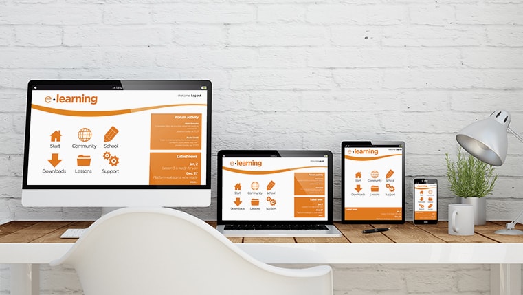
To make training successful and to get better learning outcomes, the content should be engaging, digestible, and available irrespective of time, location, and type of device. This is where responsive eLearning design plays a vital role, user experience will remain the same whether they access it from a computer, mobile phone, or any other device.
Now that I have stated the importance of responsive eLearning design, let me help you get started with responsive eLearning design.
Parameters to Consider Before Creating Responsive Courses
Evaluating Your Learners
Not only responsive courses but while developing any learning content it is significant that you evaluate your learners. You should know who is going to take the course and how is that the course will be accessed by learners. It is also important to analyze learner readiness and their technical competency. With assessing your learners, you should also check the resources or devices available to them to take the course. This will help you and the instructional designers to choose the appropriate user interface and media.
Evaluating Your Courses
Once you know your target learners, you should also evaluate the courses you are going to create. It is important to see if the content is mobile device friendly. If the content is text-heavy, it might not suit a mobile device. What you need for responsive design is content that can be chunked into short information nuggets to be adapted for mobile devices. Hence, it becomes important to evaluate the course and assess the learning objectives for better learning outcomes.
Tips to Create Great Responsive e-learning
Make Use of Microlearning
If microlearning is already a standard in your organization, great! If not, you might want to get started. While microlearning drives engagement and better learning outcomes, it can also be adapted easily across various devices. Microlearning formats such as infographics, videos, games, etc. are suitable for responsive eLearning design, making it easy to develop short, relative, and digestible responsive courses.
Focus on Need-to-Know Information
It is highly unlikely that your learners who work on a tight schedule would go through the whole content to get the important points. Hence, sharing need-to-know information and highlighting the most important points is essential. Making the important content noticeable also becomes important, because while working with small screens you have to be strategic to utilize the limited space well. Dumping the whole content might not be very effective.
Reduce The Number of Pages
If we talk about responsive design, the lesser the number of clicks the better. With limited content and a limited number of pages, learners are more likely to engage with the entire content.
Make Use of Effective Tools
Tools are an important part of the kit irrespective of the work. Tools play an important role while creating courses as well. It is important you consider tools based on your learning needs, the proficiency of your team, and their comfort level. Though there are many options available for you, these 3 popular tools are deemed fit for designing responsive eLearning courses:
- Adobe Captivate: It was one of the very first tools to provide responsive eLearning design abilities, offering features to create mobile-ready responsive courses.
- Articulate 360 and Storyline 360: it offers a wide range of tools to create interactive eLearning courses. You can also access tools like Rise and Responsive Player that will help to create responsive courses.
- Lectora 17: It is yet another authoring tool that follows the responsive course design (RCD) approach to create effective responsive courses.
Ready To Get Started?
Reaching out to our mobile phones in case of need has been embedded in our muscle memory. In the case of training, it is not any different. Hence, of late, responsive eLearning has been a hot potato in the learning and development world, and there is a big buzz around it. Through this blog, I have tried to provide insights on why responsive eLearning design is so popular and how you can create effective responsive courses for higher-impact training.
So, are you ready to make your courses responsive too? Do you have more questions about responsive eLearning before that? Find answers to all your questions related to responsive eLearning design in our eBook. Get your hands on this magical guide now!