

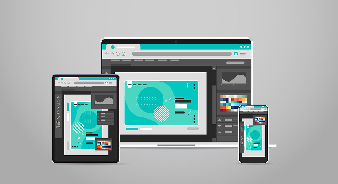
In today’s technological landscape, countless devices coexist. Each with its custom operating systems, browser applications, and screen sizes. This poses a significant challenge for course developers as they need to create a different version for each of the device classes. In the business world, where new skills and knowledge are required at a rapid pace, this tediousness will slow down the development process, and therefore learning, considerably. That’s why developers use responsive course design to speed up the development process.
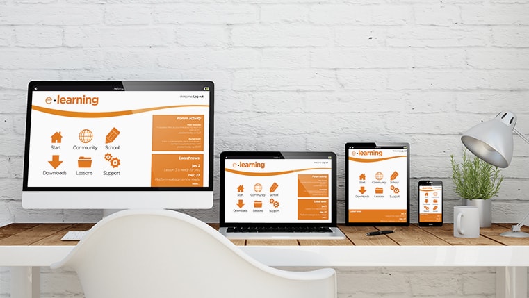
A responsive course design dynamically adapts course elements and interactivities according to the device in use. This way, a responsive course creates content that gives an optimal user experience, across a wide variety of devices, including phones, tablets, and desktop devices. Such content is usable across different device classes with minimal zooming or panning, allowing the learner to get the best learning experience on every device.
This results in a better learning experience as learners can seamlessly access courses across all devices. Responsive course design also helps you keep your costs down, as your developers need to develop, and update (if needed) a single course. However, the effectiveness of your responsive course design directly depends on the tool used to develop it. Let’s explore the features of some leading responsive e-learning development software:
1. Storyline 360
Storyline 360 comes loaded with a new responsive Player that dynamically adapts to different tablets and smartphones, and provides an optimized view of your course on every device, without any manual tweaking. The Player fluidly responds to different mobile screen sizes and orientations. It hides sidebar menus, eliminates browser chrome, and delivers perfectly mobile-friendly playback controls.
With the Responsive Preview, you can see how your course will look and behave on any device and in any orientation, without leaving Storyline. Just click the device icons on the new responsive preview toolbar. Storyline 360 has also optimized the responsive player for touch control. It supports touchscreen gestures such as swiping, dragging, and pinch-to-zoom in HTML5 output on tablets and smartphones.
2. Lectora Inspire
With the Lectora Responsive Course Design, you can not only develop titles for all device classes, but you also convert existing titles to responsive courses. With Lectora’s responsive titles, resizing the browser window from a desktop will keep the course in desktop view, rather than switching to the tablet or phone view. Lectora’s responsive features automatically position and size objects on the page in mobile views. You can control the information provided to your learners, depending on the type of device—desktop, tablet, smartphone—and the orientation they use. You can even change the position or the size of an object, across all devices at the same time.
3. iSpring
With the iSpring Suite adaptive player, all navigational elements of the course are automatically adjusted to the size and orientation of the device’s screen. Thereby, all your training materials are comfortably displayed on computers, tablets, and mobile phones. You can even use the preview function to see how your courses appear on different screens. iSpring Suite allows you to convert courses to HTML5, Flash, and MP4 video formats for universal compatibility. In addition, you can convert a course simultaneously to two formats: Flash and HTML5.
4. Adobe Captivate
With Captivate, you can deliver the most engaging, interactive device-independent content with minimum fuss. It automatically creates fully responsive content that best-fits your learners’ devices, automatically transforms legacy projects to responsive projects, and delivers great viewing experiences with Adobe Typekit integration.
With Fluid Boxes, you can make sure that your objects are aligned automatically according to the device in use. This tool allows you to create fluid object transitions that include motion paths and rotations in responsive projects. You can deliver a superior responsive learning experience by designing different effects for different devices.
The market is chock-a-block with authoring tools that have a host of powerful responsive design features. Analyze your requirements properly and pick the tool most suited for your requirements.