E-learning vs. M-learning – 4 Design Aspects that Differ

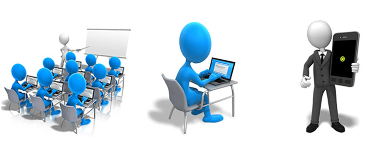
For decades, the instructor-led training (ILT) format was the only medium through which companies could train their employees. As information technology evolved, desktop computers became commonplace and learning materials began to reach their target audiences on these devices, and thus the age of e-learning had begun. Revolutionary developments in the last decade have resulted in the emergence of smartphones and tablets, eliminating the need for learners to be “tethered” to desktops or carry cumbersome laptops to access online learning content.
The rise of mobile learning (m-learning) begs a few important questions – are e-learning and m-learning the same? Can a course designed for the desktop be played on tablets and smartphones, as it is? The answer to these questions is a big NO.
There are four fundamental differences between e-learning and m-learning. The two forms of technology-enabled learning differ in the following four aspects:
- Purpose and context
- Length of courses
- Visual design
- Learning interactions
Let us now look at each aspect in detail.
1. Purpose and context
E-learning courses are primarily designed to impart comprehensive training on a specific subject. They are well-structured, formal and often, constrained by time. The objective of e-learning courses is to build knowledge and skills and help learners retain the information delivered. For instance, an e-learning course on industrial safety may provide comprehensive information on a wide variety of topics such as industrial hygiene, safety engineering, use of personal protective equipment and so on.
On the other hand, m-learning is primarily used to reinforce the learning acquired in a classroom or an e-learning session and provide just-in-time (JIT) information support. For instance, you can use m-learning modules to reinforce the knowledge on industrial safety and provide on-the-job learning support. For instance, a learner can access an infographic which lists the dos and don’ts of industrial hygiene, after a few days of completing the training program. Likewise, a shop floor worker can access a 5 minute video on his smartphone that demonstrates how to wear protective gear, at the workplace.
2. Length of courses:
Desktop and laptop computers have large screens and learners can remain focused for longer periods when the content is presented on these devices. This enables instructional designers to deliver lengthy e-learning courses (say 30-40 minutes), without affecting the quality of learner engagement. The long duration allows instructional designers to address 5 to 6 learning objectives in a single course.
Coming to m-learning, learners need to access content on the small screens of smartphones and tablets. Learners find it inconvenient to go through a course, if it is lengthy. So, it is necessary to present content in small chunks, each spanning 3-7 minutes. Designers of m-learning modules must make sure that each module covers only one learning objective comprehensively.
3. Visual design:
We all know that good visual design plays key role in enhancing the efficacy of online learning resources. When you design e-learning courses, you can take the liberty of using fonts of various sizes, as these courses are accessed on devices with large screens. You can include large amount of content, compared to courses designed for the mobile. Furthermore, you can include spaces between blocks of text to improve readability. You can also include images of various formats such as BMP, PNG, JPG and so on.
When it comes to m-learning, you need to remember that simplicity is the key to good visual design. Present only information required to perform a specific job task. It is advisable to use clear and large fonts in m-learning materials because learners access the materials on the small screens of smartphones and tablets. It is better to use images in the SVG format because these images are displayed effectively on all mobile devices, irrespective of the sizes of their screens.
4. Learning interactions:
Learners who access e-learning courses primarily interact with the learning content using the mouse and keyboard. This provides more flexibility in the type of interactivities that can be used. Designers can incorporate a wide variety of interactions such as drag and drop, rollover, hotspots, drop down, and more.
Whereas in the case of m-learning resources, learners use their fingers to access the content on the touch screens of their smartphones and tablets. Designers of m-learning materials must make sure that learners are able to access the content through touch-based interactions such as tap, pinch, swipe, zoom and so on, in a hassle-free manner.
We thus see that e-learning and m-learning courses need to be designed differently to produce the best results. Would you like to expand this list of differences? Please do so.


