Responsive Authoring Made Easy with Adobe Captivate

For today’s young workforce, using technology is second nature. They are at home with using multiple devices for their day-to-day activities. Combining laptops, tablets, and smartphones with high speed Internet, employees are constantly on the run, chasing clients or targets. This leaves them with little time to dedicatedly sit and learn; instead, they choose to take their learning with them.
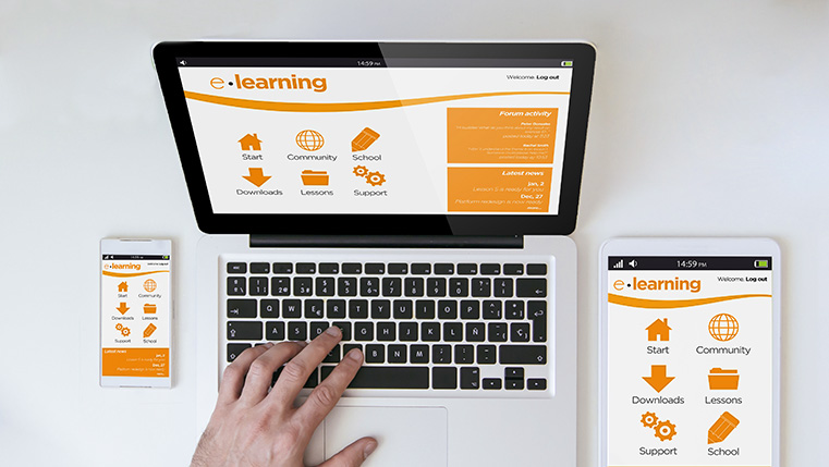
Mobile devices enable online courses to be accessed anywhere, anytime, giving learners the true power of flexibility. This makes e-learning developers responsible for developing courses that work flawlessly on every possible device; in other words, they need to develop responsive e-learning courses.
Only when learners get an unhindered learning experience on all their devices can they be completely at ease and learn without any problems. When employees get to learn according to their own convenience, they display a greater willingness to undertake the course. This translates to better absorption of knowledge and greater interest in the subject matter. Non-responsive courses throw up unexpected glitches, misplaced course elements, or hampered functionality on various devices. This inconsistent experience puts learners off and reduces their drive to learn.
Since responsive courses play such an integral part in the success of your learning program, consider using Adobe Captivate 9 as your authoring tool. This smart authoring tool is packed with many features that help you create powerful responsive e-learning courses. Below are some of the key features that make this tool highly indispensable for e-learning development:
Fluid Boxes
Worried about your course elements being displaced when users access it on different devices? Captivate provides you with fluid boxes to tackle this. With Fluid Boxes, you can be carefree about how your content looks on various devices. Fluid Boxes are smart containers that hold objects (text and graphics), kicking in when you choose a responsive theme.
Objects placed in Fluid Boxes align automatically according to the screen size or browser software of the device in use. This allows you to use white space more intelligently. Optionally, you can even draw your own fluid boxes. This new feature saves a lot of time and efforts in e-learning development while creating true a responsive e-learning experience.
Auto Migrate from Non-Mobile to Mobile
The way people learn might have drastically changed, but the same can’t be said about your content. Courses developed before the mobile-revolution might still be very much relevant for even today’s times. Instead of discarding legacy courses, use Adobe Captivate to join the mobile age.
Transform legacy non-responsive courses into fully responsive modules using the latest technology from Adobe. Bring in existing projects and save them as responsive in just a matter of clicks. When you re-launch them, Fluid Boxes will automatically appear around the most logical grouping of objects, which you can tweak according to your requirements.
Typekit Integration
When a course is viewed on different devices or browser software, chances are that the original fonts that you used are not present on the target device. Good typography makes for a great viewing experience only when it is consistent across devices, and delivering that just got a lot easier. This feature allows you to create a cloud-based kit of selected Typekit font families for use in your courses. Your courses will sport the same font in every device, giving learners a course experience exactly as you intended.
Responsive Motion Effects
This feature allows you to create fluid object transitions that include motion paths and rotations in responsive projects. You can add effects to both individual objects and groups of objects. Also, define Linear, Custom or Scribble motion paths to completely control the way objects move. More so, you can preview animations on hover, and see how effects play out on the integrated Effects and Project timeline. By designing different effects for different devices, you can deliver a superior responsive learning experience
Responsive Interactions
Captivate can help you in making e-learning fun with drag-and-drop games, quizzes, and learning modules that can run on any device. Choose from a variety of relationships between the drag items and drop target to implement learning outcomes more visually. Even provide customizable audio feedback to every drag-and-drop attempt to give interactions a greater depth.
Prefer Adobe Captivate for a seamless responsive course development experience. In case you are hiring an external vendor for development, insist on this tool for a powerful end product.


