Infographics in E-learning: What, Why and When to Use

Infographics are used in various domains. They are used in websites, newspapers, magazines, advertisements. Last but not the least, they are also used in eLearning. So, what are infographics, why do we use them and when should we use them? In this post, we will look at the answers to these questions.
WHAT:
Infographics are learning tools where information is communicated visually. They are used to convey the intended message with the least amount of text. Well-designed infographics reduce cognitive load and make learning memorable.
WHY:
The proverb ‘a picture is worth a thousand words’ means to convey a message using one picture. The main purpose of an infographic is to represent complex and large amount of information, clearly, in a way that it is understood at a glance. This is an excellent way to improve retention of information.
WHEN TO USE:
To compare and contrast data:
Infographics are ideal to display information such as comparison of two products, and to show dos and don’ts of a process.
To show a timeline:
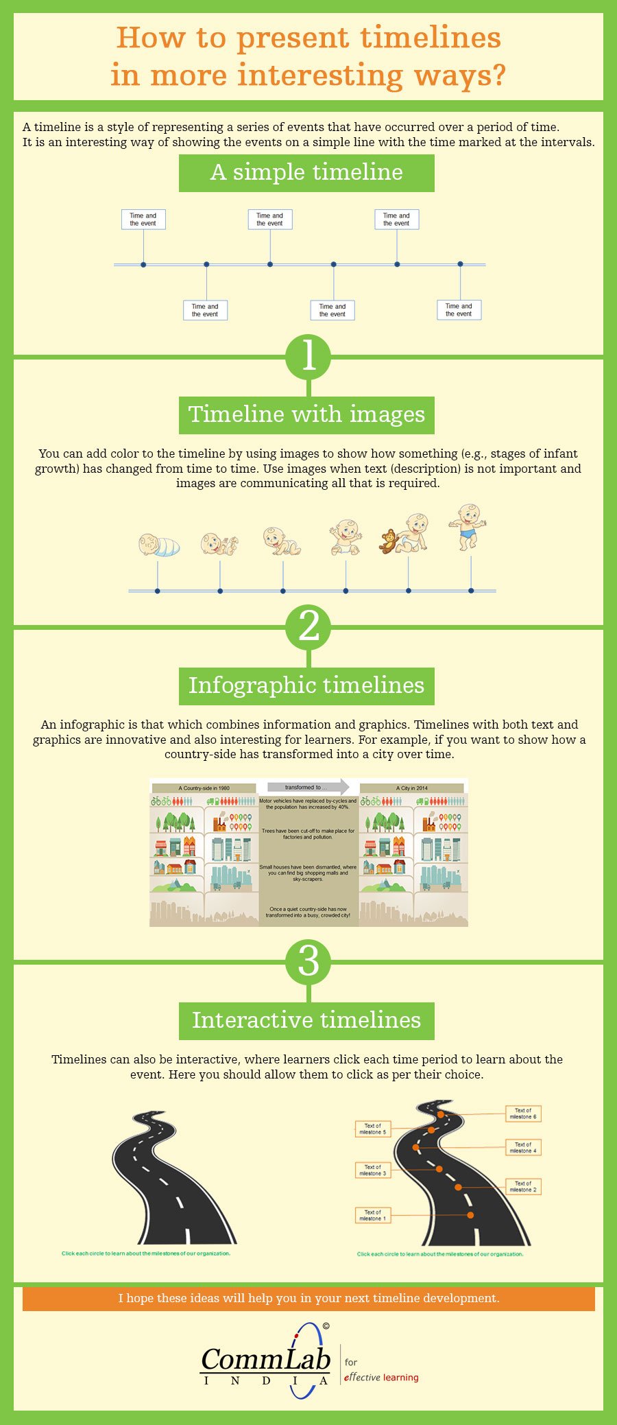
The main purpose of using a timeline infographic is to help learners remember and recall events and dates. A timeline usually consists of a sequence of events that have taken place over a period of time. In eLearning courses, we mostly deal with timelines that display the evolution of a company.
To explain a process:
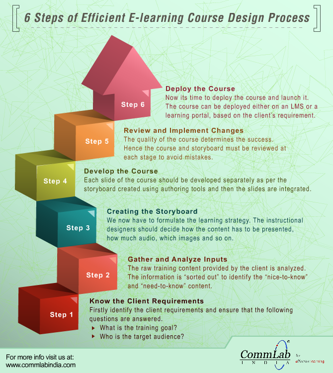
Infographics help in breaking down complicated processes into simpler ones and presenting them in a logical way for better understanding. For instance, the “Procure to pay” process or the procedure to register your name in a database can be explained easily using an infographic.
To show a summary or snapshot:
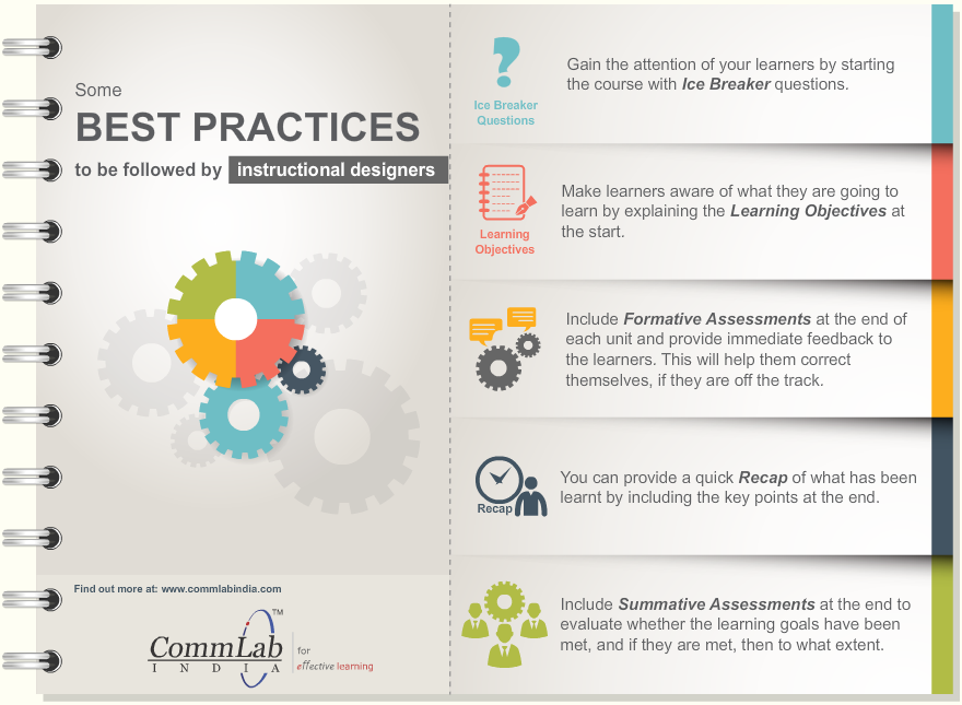
You can get rid of bulleted lists from summary slide by using an infographic. This is an excellent way to impart “last minute” knowledge to your learners.
To show an association of concepts:
Infographics can be used to express relationship between similar data (viewing eLearning courses on various smart devices), relationship between categories (statistics of products’ usage in different countries).
An important point to note is that always use infographics when the information on the screen can be best conveyed using visuals.
To conclude, these are some of the interesting ways to communicate information visually. Hope you find them useful.


![A Quick Round Up About eLearning Rapid Authoring Tools [Infographics]](https://blog.commlabindia.com/hubfs/Imported_Blog_Media/convert-ppt-to-elearning-with-lectora.jpg)
