Design Tips to Reduce Your E-Learning Dropout Rates

Elearning, as we all know, is based on the self-study format. It requires self-motivation and self-direction if a learner has to successfully complete an online course. Unfortunately, learning that is delivered in the self-study format is likely to suffer from high dropout rates. Various studies indicate that more than 20% of online learners do not complete the courses assigned to them.
→ Download Now: State of Learning (Now and Beyond) [eBook]
While the ideal situation for any organization is to have all its learners (employees) complete an elearning course, it rarely happens. How can you overcome this problem? Well, focus on certain key aspects can prevent eLearning course dropouts.
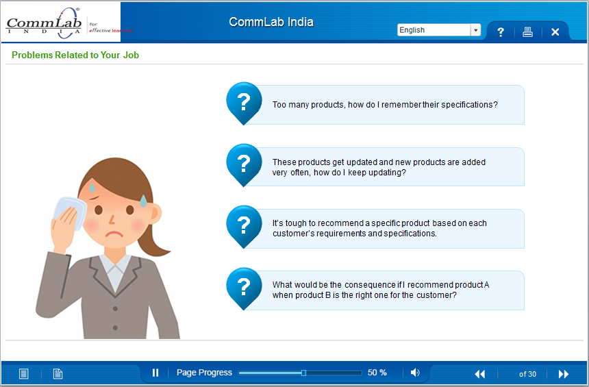
An important factor that can hook learners to a course is good elearning design. Once learners experience elearning content that is relevant and visually appealing, they are more likely to complete the course.
As an instructional designer, you must pay attention to these aspects to engage your learners. This blog will give you some design tips to help you succeed in this endeavor.
Tip 1: Provide relevant content
Whatever content you choose must help improve the performance of the learner or help them solve a problem. A good way to ensure this is to align your content with the learning objectives. Also, all facts and figures that are used must be up-to-date and relevant to the learner.
Courses that are text-heavy will only make your learners click passively through each slide without really learning anything. The trick is to divide the content into logical units that contain a single idea that can be easily assimilated. Proper chunking of the content will help you do this.
Tip 2: Ensure flow of content through proper chunking
Content should be arranged in a logical order and then chunked at the course level and screen level. This will ensure proper flow. If not, it will confuse learners and they would find it difficult to retain the information. At the course level, ensure content is logically sequenced into modules or units. At the screen level, ensure each screen is well-designed and presents a single learning point; if the points are short, you can have 3 points per screen.
Tip 3: Use creative ways to present content
Content should be presented in a creative way to be interesting to learners. Think diagrams, infographics, charts, images, animations, videos, or interactive illustrations to replace text. These will certainly grab the attention of your learner.
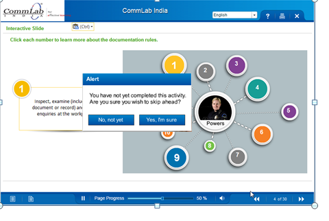
When using interactivities in your course, ask yourself about its purpose. If you are using interactivities just for fun, then it is a waste of your learners’ time. But if the interactivities help learners understand a concept better, then it is worth including them.

A Bird’s Eye View of What Top-Performing L&D Teams are Doin
- Aligning Learning Strategy with Business Strategy
- Developing Business Skills for the Future
- Investing in the Right Technology
- Much More
Tip 4: Help learners connect to the course in a personal way
To help learners connect to the course, address them directly; ask them questions that will make them think. Use icebreaker questions at the beginning of the course. This will keep them motivated and understand how the course will help them.

Tip 5: Images and videos should load quickly and have a purpose
Images and videos enhance a learner’s experience. When adding videos, slides, animations, or quizzes, do not ignore the technical aspects. They must be quick to download; learners will not wait forever! Slow downloads will put them off and make them think twice about continuing with the course.
Images and illustrations should be relevant to the topic. No image will be worth including if it is off-topic. Such images will only increase the cognitive overload of learners.
Tip 6: Avoid unclear navigation
Clear navigation is important if learners have to successfully get through the course. Remember this when including navigation buttons in your course. Do not leave it to the learners to guess what the navigation buttons stand for; instead be clear of what each button will do. Also remove buttons that are redundant to avoid confusion.

Good elearning design plays a crucial role in motivating learners to complete the course and reducing dropout rates. Ensure your content is relevant and has a proper flow to keep learners engaged. Present the content creatively, use interactivities properly, and pay attention to navigation. Help learners connect to the course. Find out more about building a professional, interactive and engaging elearning course by downloading this free e-book. Explore this useful resource to design a course that will keep your learners hooked.


![How to Craft Responsive Corporate eLearning Courses? [Tips to Success]](https://blog.commlabindia.com/hubfs/blogs/responsive-elearning-design-tips-corporate-training-courses.jpg)

