Want to Make Your E-learning Courses Visually Engaging? Avoid these 7 Common Mistakes

Do you want to make your eLearning courses visually rich? What are the mistakes we do when it comes to making a course visually rich?
Visual designing is not as easy as people think it is, and it’s well known that the most important factor that makes your eLearning course well-received by your target audiences is the visual appearance of course. You cannot judge a book by its cover, but the harsh reality is we do so – looks do matter. As an instructional designer, it is very essential to make the content look visually rich by following the style guide and maintaining clear fonts, using proper colors and appropriate images and ensuring consistency in the placement of images throughout the course. Good, attractive visual designing keeps learners engaged and helps them retain information longer. In this blog, I would like to list some of the common mistakes that we make when it comes to making the course visually rich and how to fix them.
Mistake #1: No “balance” between text and images
Dumping too much content on the screen will only make your course look clustered and makes the learner confused and overwhelmed. In an eLearning course, the content should be well structured and organized, so that your learner can remember the key points, and we use images to educate not to decorate the screen. As an instructional designer, we need to always ensure that there is a balance between text and images. This not only makes the screen look visually pleasing but also helps the learner to understand the content easily. Using too much of text or too many images does not help retain knowledge.
For example, here is a screenshot showing the balance between text and image.

Mistake #2: Low-quality images
Images are used to explain the content in a simple and effective way, and they create an impact on the learner’s mind, very quickly. You won’t “wow” your learners if low-quality images are used. Moreover, these images might divert the attention of the learners. We need to make sure that we use sharp, clear images and avoid blurred images.

Mistake #3: Not using clear fonts
Different organizations have different font preferences, and the right font and size need to be used to ensure clarity. Use big and simple fonts because fancy fonts might make the course look more polished but it becomes difficult for your learners to understand. For example, which of these fonts would you prefer?
Option 1:
Option2:

I’m sure that the second option is more appealing to you because it is easy to read. We should use commonly available fonts like Arial, Verdana, Times New Roman etc. because these fonts are available by default in all systems.
Mistake #4: Incorrect placement of images
Images should be placed in such a way that they grab the attention of the learner. You should not use images just for the sake of using them. Placement of images should serve the purpose of education, not decoration. As an instructional designer, we should never place the image at the bottom right corner because it goes unnoticed, and always place the content and the image in correlation. This makes it easy to compare and analyze.
For example, here is a screenshot showing how to place images properly while designing an eLearning course.

Mistake #5: Overuse of colors
In eLearning, colors are one of the powerful design elements and help convey key points of the course as they improve learners’ focus and also draw their attention to learning. It is advisable NOT to use too many colors as all colors do not help in effective learning. It is better to follow a color theme and remain consistent throughout the course.
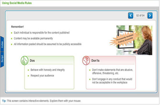
For example, in the below screenshot we have used two colors – we represented Do’s in green color (this color can be used to state positives, such as dos/ advantages) and Don’ts in red color (this color is ideal to show the negative aspects, such as disadvantages/ limitations/ don’ts of something).

Mistake #6: Using the “wrong” type of images
Some topics can be presented well with the help of icons instead of real images, while others can be explained using silhouettes or “zoo zoos”. For example, if the topic is about hazards, we can use icons in place of images. These symbols are self-explanatory. They are widely-used, and most of us understand what they mean even with the most cursory glance. Don’t use icons just for the sake of using them, and use them only if they are appropriate. Use them carefully to ensure effective learning and the ‘wow’ factor. Using icons makes eLearning courses visually rich, appealing, and iconic.

Mistake #7: Not using appealing and attractive GUI
Good GUI design is an important part of eLearning, and it helps learners to navigate through the course easily. It’s important that it should be clear, concise, familiar, and consistent. The buttons should be consistent, and we should use icons or text. We may use cool colors, images in the banner, and we can give a shape to the buttons which are visually rich.
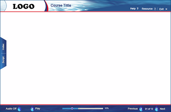
For example, we have designed a GUI of a new-hire orientation course, for a company which operates off-shore rigs. To make it appealing and attractive, we have incorporated the theme of water and sea. To make it visually rich, we used the image of the sea in the background and water droplets for ‘Next’, ‘Previous’, ‘Play’, and ‘Audio’ buttons. This adds to the visual element and helps the learner connect with the course content.

These are some of the common mistakes that I have listed out of my experience. Please do share your views.


![What is Rapid eLearning Development? [Infographic]](https://blog.commlabindia.com/hubfs/Imported_Blog_Media/what-is-rapid-elearning-infographic.jpg)

![Explore the Real Reasons Behind Converting Flash eLearning to HTML5 [Infographic]](https://blog.commlabindia.com/hubfs/Imported_Blog_Media/convert-flash-html5-hidden-reasons-info.jpg)