

A survey was conducted by the e-learning Magazine group on “E-learning User Study: Corporate Segment”. The research reported that most organization stated that Mobile Learning was on priority that needed to be included in their corporate training programs.
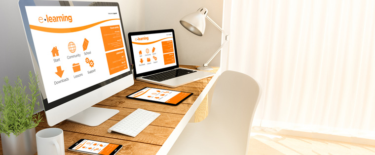
Today people have multiple devices such as BlackBerry, iPhone, Laptop, Tablet PC, iPads, and of course, the regular desktop PCs. A study by Google states that 98% of the internet users switch to various devices in a single day. So, how can you develop custom learning solutions for your workforce that uses various devices? Well then, you need to ensure that your online courses are responsive so that they may be accessed uninterruptedly on any device.
A responsive e-learning course facilitates the development of online courses that can be efficiently accessed on multiple devices. This helps a single version of an e-learning course to automatically adjust to the screen from which the course is accessed.
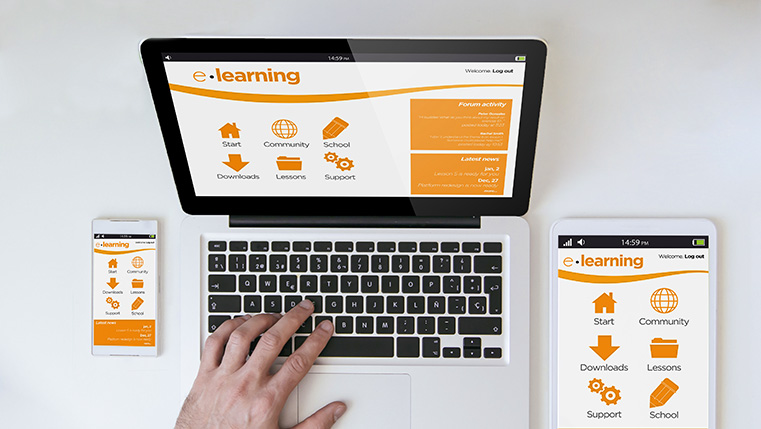
Let’s take an example of an employee who has a tight work schedule. At this point he may complete a part of the course during his working hours on his desktop and may later complete the unfinished part on his Tablet at home. When he accesses the course on his desktop, he expects that the course functions in the similar way as on his mobile. Is this possible? Certainly yes, with the help of a responsive e-learning course.
In this context, let’s take a look at some of the aspects that highlight the importance of responsive online courses on multiple devices:
Responsive e-learning course advantages:
- Phases out the challenges linked with maintaining different versions of the same course for multiple devices
- Facilitates an effective sequential learning where the learners can begin the course on one device and resume on another.
- Enhances learning experience to the learners making learning highly flexible and user friendly
Let’s take a look at how to develop responsive e-learning courses:
- Use HTML 5 document and follow guidelines
- Keep the layout flexible: Use flexible grids that use columns to align learning content and use relative width in order to adapt to viewport size
-
Choose Screen size: Keep in mind the intended screen size to be selected. Screen sizes can be categorized in the following way:
– Less than 320 pixels (for low resolution devices)
– Less than 480 pixels (for first generation smart phones)
– Less than 768 pixels (for high end smart phones and portraits iPads)
– Greater than 768 pixels and Less than 1024 pixels (for landscape iPads and devices)
– Greater than 1024 pixels (for desktop computers)
- Media query is a CSS3 module that places the content on the desired screen sizes effectively. Media queries, is a tool that changes the presentation style.
- Evolve right visual strategy: Visual elements should be based on the length of the page. Opt for key content on a smart phone first.
Thus, you need to keep in mind the technicalities of making your online courses responsive in sync with the fundamental aspects of effective e-learning course. Be it any device, the learner and the learning content need to remain the top priority. Future of learning is going to be surely responsive e-learning. What do you think?
Do share your views