How to Build eLearning Courses with Intuitive Design

Why do people go for iPhones that get more and more expensive with every version instead of cheaper Android phones with similar specifications? Or dream about an Aston Martin when a Prius is far more practical? Why buy couture or high-end branded clothes when you can get something that looks and feels almost the same from a local store? Most importantly, what have all these random questions got to do with eLearning? Well… these questions are not that random and the answer isn’t related to money. Why we prefer certain products, certain brands, and certain styles more than others, it’s because their ‘intuitive design’ appeals to us more.
Are you trying to Create eLearning Courses with an Intuitive Design?
Here are 4 crucial aspects you shouldn’t overlook -
- Structure
- Roles
- Connecting with learners
- Content-relevant GUI(Graphical User Interface)
“Design adds value faster than it adds costs.” Joel Spolsky
The same is true for eLearning courses as well. If it is only a matter of functionality, any training resource that could be accessed online in a digital format could be an eLearning course – a PDF document, a YouTube video, or a blog post. But it’s not so. Because eLearning courses are not just a repository of information but are designed specifically to impart information, making it more effective, engaging, and impactful for learners. And that’s what we are going to discuss in this blog – how you can create custom eLearning courses with intuitive design to enhance learning experience.
→ Download eBook Now: Instructional Design 101
4 Intuitive Design Aspects to Create Impactful eLearning
1. Structure
What is structure? Well, structure is something essential or fundamental to an idea or physical object, without which the idea or object might not exist at all. Bones give structure to our bodies. Without it, we’ll be just blobs of flesh and blood. In a narrative, the structure is the order and way information is presented. Without structure, Inception would be a schizophrenic’s dream instead of a blockbuster. Without structure, your eLearning courses are just random resources that nobody knows when or how to access.
Having a proper structure means having a plan for how eLearning courses are going to be delivered to learners. For this, you have to make two key decisions.
Standalone or Curriculum?
This depends on what kind of training you are offering learners. If it is a one-time training, dealing with one specific topic with limited information, a standalone eLearning course will do the job. However, if it’s extensive training with many learning points, you’ll need a curriculum of eLearning modules.
We usually advocate curriculums over standalone courses because a curriculum maintains the flow of learning and reduces the chance for knowledge gaps. Developing all courses in one go makes it easier for the Subject Matter Experts(SMEs) and also saves time and money.
Basic to Advanced Progression or Flexible Learning?
When it comes to corporate training, there are two ways of assigning eLearning courses to learners. One, you follow the traditional path of providing basic training and gradually advancing them to a higher level. Second, you can give learners free access and let them decide what course they want to take based on their knowledge level. While the first option may seem logical, it can backfire if your target learners have a mixed demographic of beginners and experts.
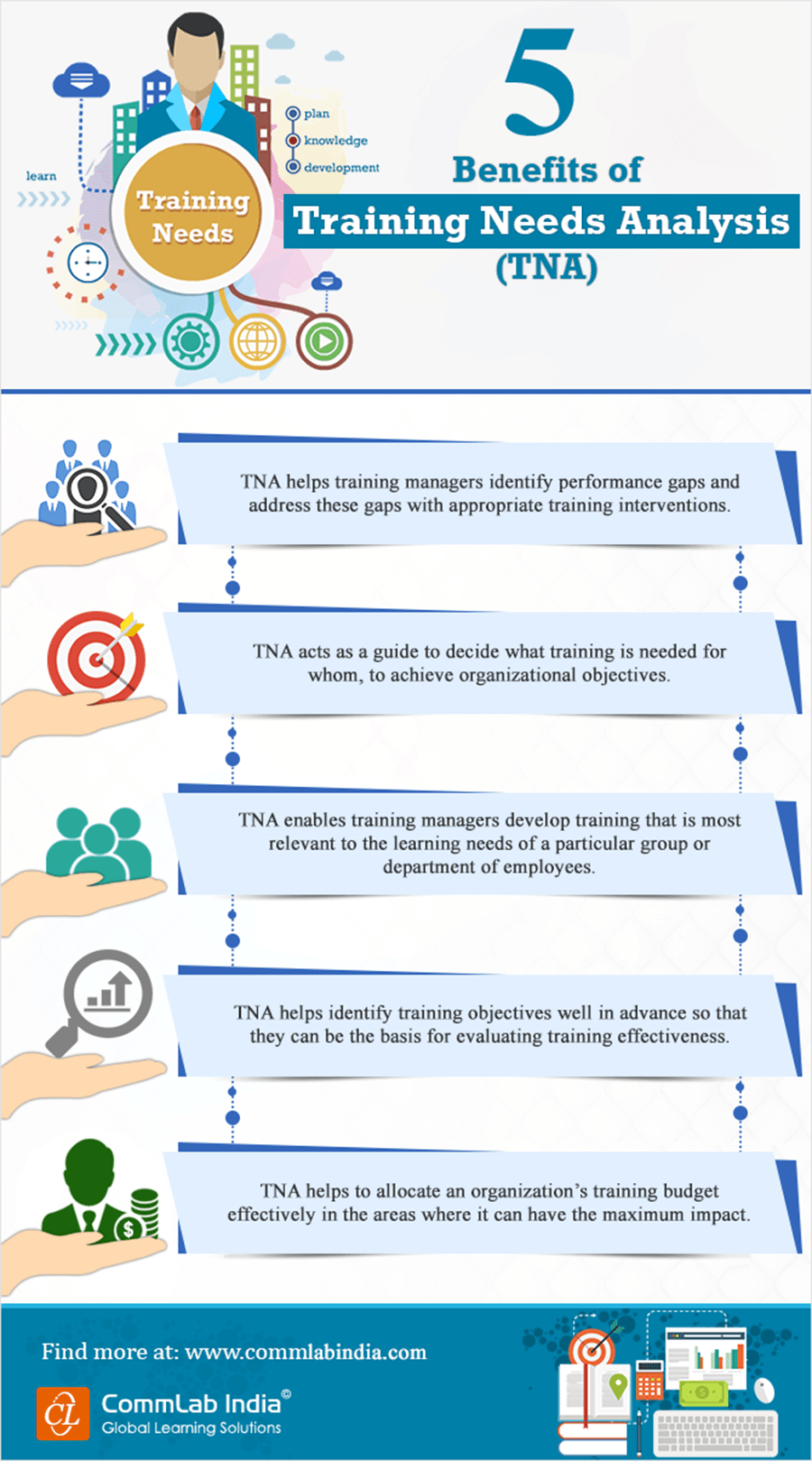
One way of dealing with this dilemma is to conduct a Training Need Analysis (TNA) which will give you an idea about who the target learners are. You can use a pre-assessment before the course/curriculum to get an idea of their knowledge level and assign courses accordingly.
2. Roles
“All the world’s a stage,
And all the men and women merely players;
They have their exits and their entrances,
And one man in his time plays many parts.”
– William Shakespeare
Be it in life, or in a professional setting, we all have our designated roles to play. And it is quite important to understand and define these roles because one’s knowledge and actions depend entirely on them. How all is this related to training, you ask.
Let’s take the example of product training. The knowledge of how a particular product works is something that will be required by your marketing staff, the sales people, the product maintenance team, and others for different purposes. The marketing staff will need it to reach out to different prospective customers for whom this product will add value, the sales team will use the same knowledge to make their sales pitch, and the product maintenance team will use the knowledge during product servicing.
Moreover, the level of training on the same topic will differ across job roles as well as corporate positions. The training required for a learner at the managerial level will be quite different from that of ground forces.
That is why assigning different roles at the start of an eLearning course or curriculum is a good step forward. And you can do that by creating a branching scenario where learners have to choose their roles at the very beginning and information will be provided to them based on their choices.
3. Connecting with Learners
This is perhaps the most important aspect of eLearning design. Why? Well…a design, no matter how incredible and creative, will not work if it doesn’t connect to the learner. In the absence of a physical instructor, it falls on the eLearning course design to be intuitive enough to gain the learner’s attention and keep it engaged throughout the training duration.
How can you make it happen? Here’s how.
- Language
Use terms and examples learners are familiar with.
Decide on the preferred tone (formal/informal) for audio narration.
Match the look and feel of the course to the learners’ visual preferences.
- Personalization
Offer a personalized experience by letting the learner type in his/her name.
Address them by name when giving feedback for assessments.
Allow learners to select their preferred avatar to take them through the course.
- User-friendly Interface
Offer open navigation to make it easy for learners to access topics/units of their choice.
Ensure navigation, interactivities, and eLearning assessments are free of technical glitches.
4. Content Relevant GUI
Next, we come to the visual and more technical part of eLearning design. At this point, you might ask, why is it important to customize the GUI according to the organizations branding or the topic of eLearning? Does it matter if the little-visible screen frame is in black, blue, grey, or gold as long as the instructional design is good and the content is interesting? It is a legitimate question. Because if you think about it, even without it, the eLearning course is functional, even effective.
But course design is much more than its functionality or physical appeal. It should appeal to learners’ emotions as well. Much like ‘brands do not sell a product, they sell values’, eLearning courses are also a way to sell your organizations’ values to your employees. It’s about establishing a connection with learners so they feel they are a part of something bigger than their job roles or their positions, and identify themselves closely with the organization.
End Note
Design is an integral part of an eLearning course and is our best chance of giving learners an engaging and effective learning experience. It takes a whole lot of technical expertise, a pinch of creativity, and a dash of empathy to perfect your course design. If you want to know more about such hacks to design and develop engaging eLearning courses, download our free eBook.
Editor’s note: This post was originally published in March 2021 and has been updated for comprehensiveness.


![What are the Intuitive Design Aspects for Impactful eLearning? [Infographic]](https://blog.commlabindia.com/hubfs/blogs/intuitive-design-aspects-impactful-elearning-info.jpg)
