9 Things to Ponder before Publishing your eLearning Course

An eLearning course that is not properly designed can be a punishment for your learners. Learners’ lose interest and will ultimately drop out of the course. Hence, before publishing a course, review is an important step.
In this blog, let’s discuss the points to be considered before publishing your eLearning course.
1. Is the text aligned properly?
The content onscreen should be aligned properly. The layout should be proper in such a way that the text does not jump from one screen to another. Check for double spaces and space between title and paragraphs. The most important point in alignment is widow text, that is, a paragraph-ending line, should not fall at the beginning of the next slide/line. The last line of the paragraphs should not be separated from the rest of the text.
2. Are the screen titles placed appropriately?
Check the screen titles according to the outline and storyboard. Improper screen title will confuse the learners. So this is an important point to be checked.
3. Are there any spelling or grammar errors?
One has to make sure that there are no spelling mistakes or grammar errors. One has to maintain a high command on the language without making spelling and grammar mistakes. One small mistake and you may lose your learners’ interest for the course.
For example, consider these two statements: “Let’s eat, Grandpa!” and “Let’s eat Grandpa!” One missing comma can change the meaning completely.
4. Are all the instructions appropriate?
Another important point before publishing your course is to check whether the instructions are clear and appropriate. Its helps the learners to easily navigate through the course without any problems. Improper instructions will frustrate the learners and discourage them from continuing the course, especially when interactive slides are included in the course. Vague instructions for testing your knowledge and games can confuse your learners.
For example, for single select, the correct instruction is “Select the correct option and click Submit.” But if it is “Select the correct options and click Submit.” the learners will get confused if it is single select or multiple select.
5. Is there any functionality issue?
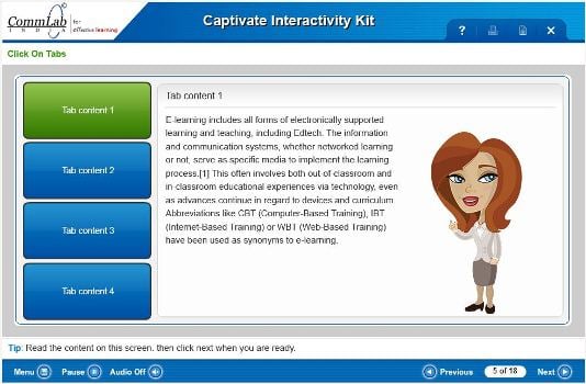
Functionality of the complete course has to be checked. Next button, previous button, seek bar, replay, etc., should work properly without any disturbance. For interactive slides, all the states such as visited, hover and normal states should maintain the style guide to maintain consistency throughout the course.
Here is a screenshot of an interactive slide from one of our courses. Blue color represents normal state, that is, the learner has to visit the state. Green represents hover state, that is, the learner is in that present slide.

6. Are the images placed properly?
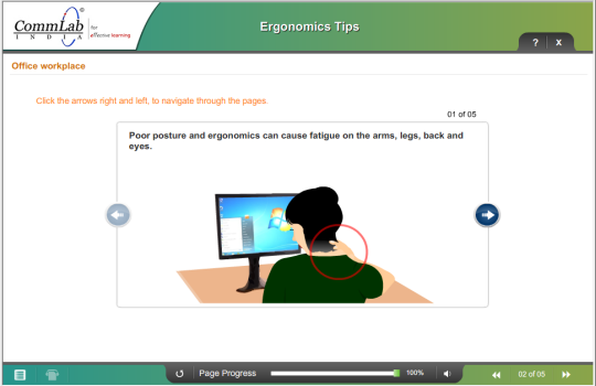
The alignment of images, and their size should be proper. In course-level, horizontal and vertical images should be placed appropriately; else the look and feel of the course will be lost. Images play an important role for the learners to understand concepts by visualization. Placement of images should solve the purpose of education, not just decoration.
For example, in the screenshot below it shows how placement of the image for the content will help the learner to understand the content quickly.

7. Are the videos working properly?
Videos are used in eLearning courses to reduce the reading load, and to help visual learners to retain information. If the videos do not play properly, the learners’ may get irritated and lose interest in the course. Hence, the videos in the course should play without any pause and disturbance, with good quality. For videos to work properly at learners’ end, videos have to be compressed so that they can download them easily. Slow Internet connection can be another reason for learners’ frustration. So, it is advisable to use videos in the FLV format for compression, without loss of quality.
8. Is the audio syncing with the onscreen text?
One has to check if the audio is in synch with onscreen text, otherwise learners will get confused. The topics being explained on screen also would fail to make an impact on the learners. For complex processes, learners may miss on some important steps. If there are numerous points, instead of just seeing them onscreen, learners may prefer to listen and learn.
9. Is the content for the glossary, print, and resources provided?
The first thing to be checked is if appropriate buttons are provided in the GUI for glossary, print, and resources. Check if appropriate content is provided for glossary, print and resources. If not, the learners may miss out on important technical terms of the course. The words in the glossary need to be checked with the content in the course. The PDF links should open correctly for the respective topic.
By considering these few things, an eLearning course will be of high quality and more authentic. These are few things that I have shared with you out of my experience.


![Creating Online Compliance Training: Tips & Best Practices [Infographics]](https://blog.commlabindia.com/hubfs/Imported_Blog_Media/tips-for-impactful-compliance-communication1.jpg)
![How Process Training Can Inspire Your New Employees? [Infographic]](https://blog.commlabindia.com/hubfs/Imported_Blog_Media/process-training-for-new-employees-infographic1-2.jpg)