Key Differences: E-learning vs. M-learning
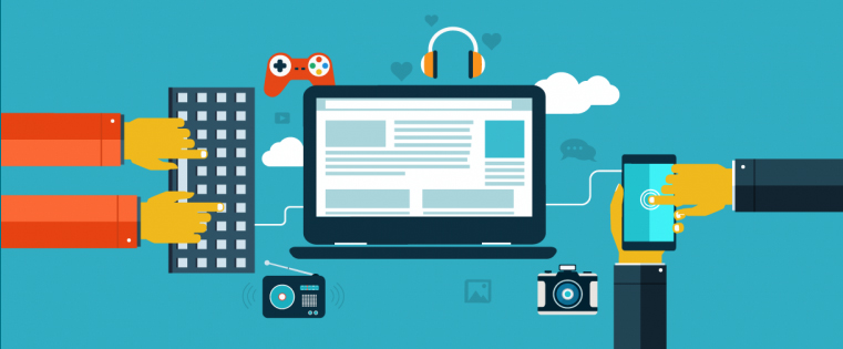
Many organizations are converting existing e-learning courses into m-learning by making the interface responsive and by publishing them in the HTML file. The reason behind this is to provide the most meaningful learning experience through the use of mobile devices. In fact, most of them consider e-learning and m-learning are the same. But in reality, e-learning is completely different from m-learning in various aspects such as variable screen size, GUI, access, scrolling, interface, and compatibility.
Here, I would like to share the key points that e-learning designers need to follow while converting existing e-learning courses into m-learning.
Learning objectives
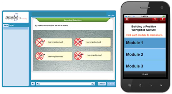
Each learning objective of an e-learning module can become an independent m-learning module. Due to the differences in terms of screen size and duration, they cannot be used interchangeably. E-learning provides learning in detail and their courses are delivered on desktops or laptops, whereas m-learning provides just-in-time (JIT) learning and their courses are delivered on mobile devices.
→ Download Now: Mobile Learning: How to Overcome Implementation Barriers
For example:
An e-learning module of 20 minutes duration can be divided into 4 separate modules of 5 minutes each.
GUI
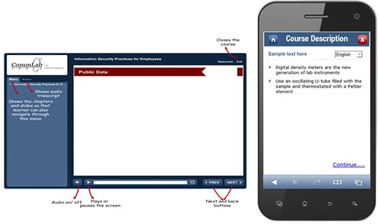
E-learning and m-learning are different in terms of the GUI. In e-learning, GUI is designed by using many elements such as menus, icons, controls, and so on. These elements allow learners to navigate freely throughout the eLearning course without any confusion. However, in m-learning, GUI is designed with only a few elements such as home, exit, previous, and next buttons, because of the small screen size. The goal is to keep the GUI easy for the user to navigate with a single finger and to avoid clutters onscreen.
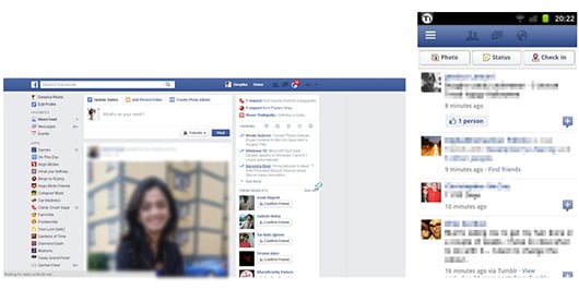
For example: Facebook and other social media sites do not make the interface responsive but have separate interface for mobile and desktop.
Scrolling
In e-learning, scrolling can be done horizontally and vertically depending on the length of the text. Whereas in m-learning, scrolling can be done vertically. It is recommended to avoid excessive scrolling in m-learning because it is very difficult to handle this function on smaller screens. For this, you can use short and crisp text onscreen.
Interactivities
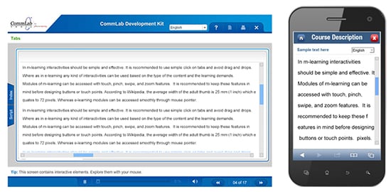
In m-learning, interactivities should be simple and effective. It is recommended to use simple click-on tabs and avoid drag and drops. But in e-learning, any kind of interactivities can be used based on the type of the content and the learning demands.
Modules of m-learning can be accessed with touch, pinch, swipe, and zoom features. It is recommended to keep these features in mind before designing buttons or touch points. According to Wikipedia, the average width of the adult thumb is 25 mm (1 inch), which equates to 72 pixels. But e-learning modules can be accessed smoothly using the mouse pointer.
Thus, these key points must be taken into consideration while converting existing e-learning courses into m-learning courses.


