6 E-Learning Templates That Speed Up Your Course Development

Many times, as instructional designers and developers, we are asked to create highly interactive courses, within tight timelines and budget. It’s a big challenge, right? So to make it work, you need to be ready with resources that can be easily leveraged.
One such resource is the library of eLearning templates. But what kind of templates can help us? How do we create the templates which can come immediately into use? Well, here is the list of templates that you need to definitely have.
1. Welcome Screen:
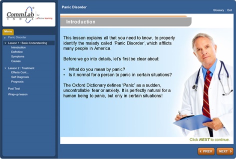
The Welcome or the first page of the course gives a glimpse of what learners can expect from the course. This page gives the first impression.
So, Welcome page templates should be designed with good designs, reflecting clients’ branding colors. These templates should have placeholders for images and content, in various layouts.
2. Navigation Screen:
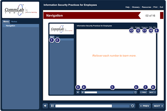
Learners can go through the courses effectively, if they are clearly instructed. So you need to design navigation templates, with clear and concise instructions.
Usually, the Navigation page will be same for all courses, if you have similar navigation features.
3. Learning Objectives Screen:
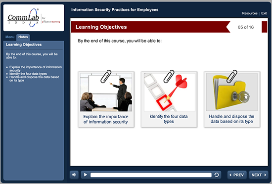
Adult learners will show more interest in the course, if they are told what they would be able to achieve after completing the course.
So you should ensure you create templates for the Learning Objectives section. You have to keep in mind that you will have bullet points in this screen while designing the templates.
4. Text Plus Image Screens:
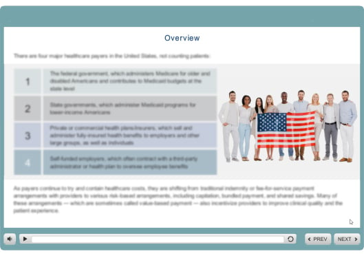
We commonly have many content and image screens in an online course. So you have to keep some designs ready for these screens. These templates must be designed in such a way that the learner doesn’t feel content has been dumped onscreen.
You should have enough whitespace around the text and images should be placed on the right, as learners scan a page from left to right. This will help them focus first on the text and then on the images.
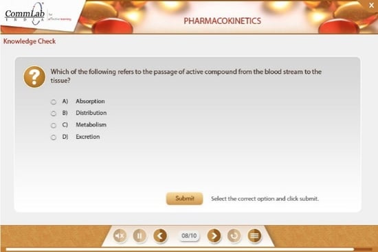
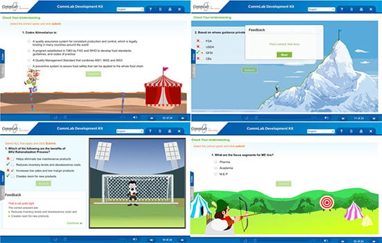
5. Assessments Screen:
We all know that assessments are added to evaluate learning. Sometimes, based on the subject matter, you may also want to design formative assignments using scenarios and activities.
So along with templates for summative assessments (multiple choice), try to create some templates for these interactive assessments.
6. Recap and Review Screen:
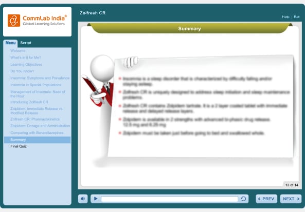
This is one of the most important portions of a training course. It should include all the takeaways and key ideas to recap what the learners have learned. These templates must also be designed keeping bulleted lists and images in mind, and not blocks of content.
So, do you have all these templates in your library? If not, consider adding them as these layouts can really save a lot of your time while designing courses, helping you also save costs.




![10 Learning Design Strategies to Engage Learners [Infographic]](https://blog.commlabindia.com/hubfs/Imported_Blog_Media/ten-learning-design-strategies-infographic.jpg)