How to Create Responsive Projects in Adobe Captivate 8?
With ever-growing mobile workforces and the evolution of the BYOD strategy, organizations have now realized the need to design and develop eLearning that adjusts itself to the varying screen sizes of different devices. But the authoring tools that publish eLearning to HTML5 are not responsive on mobile devices, they work well on iPads but on mobile devices, the course wont adjust to the varying screen sizes.
These tools have been updating themselves to make the dream of responsive learning to real and Adobe Captivate has done it. It has simplified the issue of running the single published course to the multi devices.
With this tool you can just build slide for the PC version and adjust the sizes for the iPad and Mobile versions. The developer just need to work on the primary version automatically it will be updated on the iPad and the mobile versions. By this you can create responsive eLearning projects without any efforts.
In this blog, I’m going to explain you how to Create Responsive Projects in captivate 8.
Follow the below five steps
- Open Responsive Project
- Adjusting Proportion
- Knowing the Connection between three views
- Adding themes or Questions
- Publish
Open Responsive Project
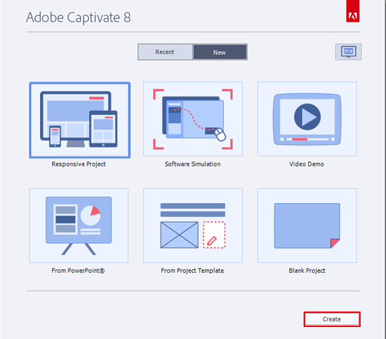
Open Captivate 8 and select Responsive Projects option which is highlighted in the screen shot below and click on Create button.
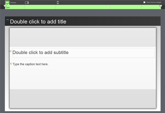
You can see the project is opened in the three different views for the (PC, iPad and Mobile version).
Primary view (PC), Tablet view (iPad) and Mobile view.
Adjusting Proportion
You can change the Proportions (dimensions) of the page as per your requirement or for the device sizes.
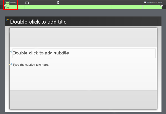
Just select particular view of the project (Primary, Tablet and Mobile) move the slider to left or right to adjust the width of the Course.
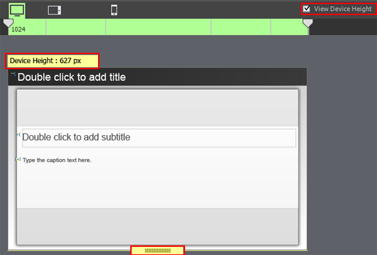
You can adjust height by selecting the View Device Height where you can see a dragger, by moving the dragger you can increase or decrease the height of the course.
In the same way adjust the heights and widths of the tablet and mobile versions.
Scroll to your page option helps to add extra content in your course. Just increase the particular area by selecting the properties panel.
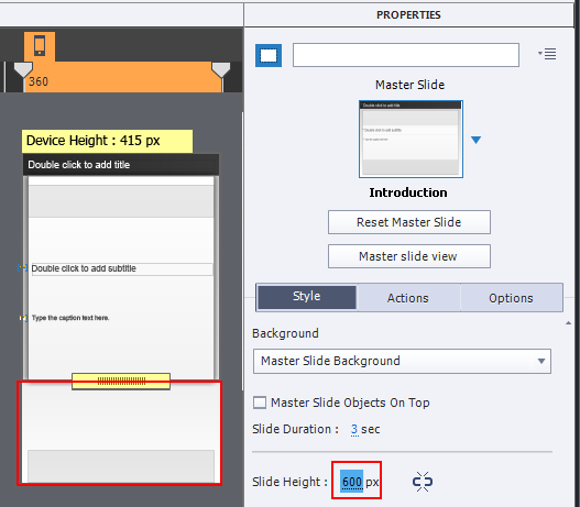
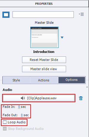
Insert audio to your course from Audio in the menu or from the properties panel. Click the Options tab in the properties panel. Beneath you can see the Add Audio tab. Click the tab you can see the Slide Audio window is opened
You can add audio in the slide by clicking on property panel Add Audio (F6)
Click on Import Narration and select particular audio. Click Import Narration (F6) tab and select the audio file and click Open.
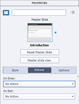
Adding actions to the course
You can add Action from properties panel or through the Advanced actions option in the Project menu.
Connection between three views
If you make any changes (add any text or image) in primary view it will reflect on Tablet and mobile.
Note
If you add any text or image in Tablet view it will reflect to only mobile view.
If you add any text or image in the Mobile view it will not reflect to primary view or tablet view.
If you add any text or image in primary view it will adjust size and position of text or image or any object automatically in remaining two views as show below.
If you don’t want any connection between each other you can take out text or image from particular area exclude it or delete it.
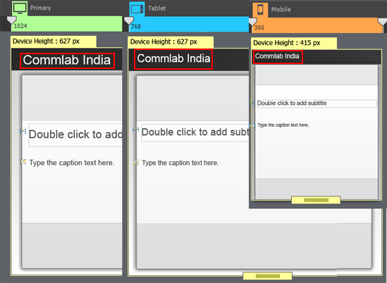
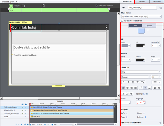
If you want to apply changes to any particular text or smart object adjust color, font, margin, shadow etc. from properties panel.
Adding themes or Questions
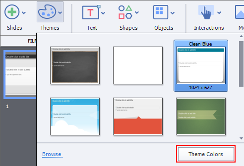
You can add themes to your course by selecting Themes. By clicking on the option in the drop down you can find all the themes and select one of the theme.
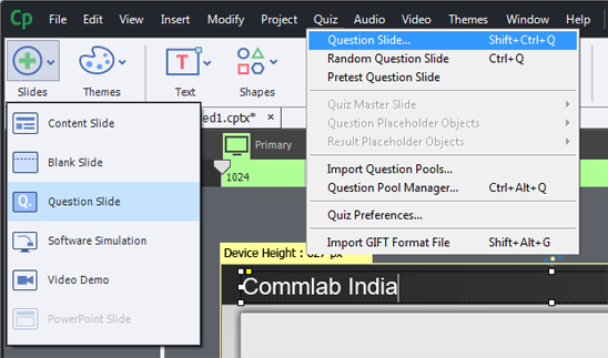
You can add Questions to the course (Shift+ctrl+Q)
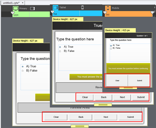
You can see the image below where the buttons are adjusted automatically. In mobile view only 2 buttons if you want you can add or delete or adjust the sizes to view the rest of the buttons.
Publish
You can preview or publish (Shift+F12)
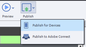
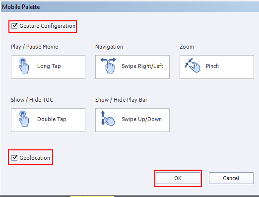
Check gesture Configuration it’s a multi touch interface which allows you to Play /Pause, Navigation, zoom, Show/Hide TOC and Show/Hide Play Bar.
Geolocation will check the location of the learner.
Select all the required option and click OK button.
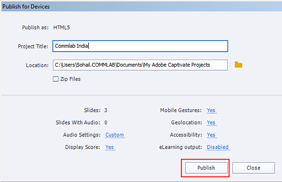
Browse the path and click on the Publish button.
You can upload your course in online and check in three different devices.
Hope this blog helped you in understanding how to create responsive projects in Adobe Captivate 8. If you have any other idea please share.


