Effective Navigation: The Hallmark of an Excellent E-learning Course

Having effective and clear navigation is vital to the development of a good online course. A course would be ineffective, if the learner is unable to navigate effortlessly, even if it is engaging. To avoid this, it is very essential to take some time to design the course navigation.
Here are a few tips that help you design effective navigation for your eLearning course.
1. Easy Navigation
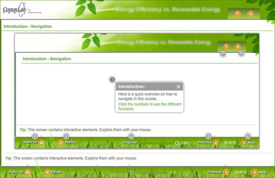
We must remember that not all learners know how to navigate an eLearning course. So, it would be helpful if we provide a ‘Help’ option which assists them in navigating through the course. You also need to focus on the position of the ‘Next’ and ‘Previous’ buttons. It is a good practice to place these buttons at the bottom right side of the screen.

2. Clear Menu
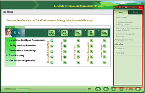
Having a simple menu would be helpful to the learner. The menu should have clear unit titles, and the slide titles. Each slide heading should match with the one in the menu to avoid ambiguity. To avoid confusion, it is essential to highlight the current slide title in the menu. This will give him a clear idea of “where he is”.

3. Highlight the Instructions
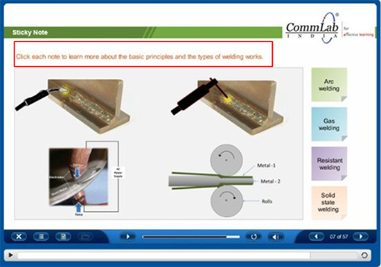
Each slide may have a lot of content and visuals. So, by highlighting the instructions in other color for the interactive slides would grab their attention and help them know what they have to do next. Placing the instructions next to the interactive elements helps your learners and makes the navigation easy.

4. Avoid Restriction
The navigation of the course should be based on the learner’s choice. Sometimes, a learner may want to skip some topics as he has prior knowledge about them. So, he must be allowed to freely navigate through the menu to prevent him from getting frustrated . Thus, a simple and effective navigation makes the learner’s life easy. Please do share if you have anything to add to the list.


![Let’s Estimate the Cost of eLearning Course Development [SlideShare]](https://blog.commlabindia.com/hubfs/Imported_Blog_Media/elearning-development-cost-factors-slideshare.jpg)

