5 Best Practices for Designing Corporate Training Videos

Today, after many months, I happened to visit our company’s YouTube channel and came across this video. Check it out.
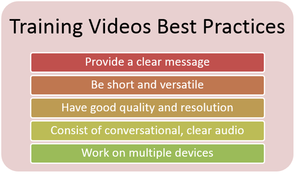
I think it is an excellent example of a well-designed corporate video, not because it was designed by the company where I work, but because it follows some of the best practices of designing corporate training videos. So, what are these best practices for designing corporate videos? Corporate training videos need to be clear in their message, be short, and have a good resolution with clear audio. Most important of all, they should be designed to be accessible on multiple devices.

Let the videos have a clear message
There is only so much that can be shared in a short video. Therefore, no point in trying to cram too much information. Take the CommLab video that I shared at the beginning. Except for a few sentences, most of the content is apt to be shared as a part of new employee training. The video gives a very quick overview about the company, its services, and its target customers. It succeeds in shaping the minds of new employees and directs their attention to the organization’s priorities.
Keep the videos short so that they can be versatile
Videos have to be short – no longer than 5 minutes. For best results, videos should ideally be around 2-3 minutes long. There are many advantages of short videos. You can:
- Use them as learning nuggets or re-useable learning objects
- Embed them into an e-learning course
- Upload them on to an LMS or an intranet portal to be accessed independently by employees at the time of need
- Share them at appropriate times as push training content to reinforce knowledge or to remind employees about key aspects as in safety training or compliance training
Ensure good resolution and quality for better viewing experiences
Video is a visual medium and therefore, you need to focus on how much content to share and how it is presented. Videos with real people might be expensive. However, you need not compromise on quality because of low budgets. You can easily create good quality, yet high impact videos using line drawings and animations. In fact, we have used high impact animated explainer videos quite successfully for product training and process training purposes.
Make sure audio is clear and conversational
A video with a bad audio is a disaster and a sure recipe to drive away learners. Ideally, audio should be recorded separately and embedded into the video for better clarity. Using a professional narrator with a cheerful voice is a good idea. It would be great if you provide learners the option to expedite or slow down the audio to cater to their individual comprehension abilities. Finally, the audio script should be conversational and complement onscreen content instead of just duplicating what’s on the screen.
Make videos work on multiple devices
Videos are great tools for learning and versatile to be used in multiple ways as shared above. Therefore, they have to be designed keeping in mind that learners might access them from multiple devices – PCs, Laptops, tablets, or smartphones. It means the design must be responsive and cater to multiple screen sizes – buttons should be big enough for touch devices, content just right for small screen sizes. Also, you should ensure that videos work on all browsers – android/safari as well as other apple devices.
Videos are powerful and thankfully, not as expensive to create as they once used to be. No matter what the budget, you can still create engaging and interesting videos for the purpose of training. All you need is to have your fundamentals in place. What do you say? Did you come across an interesting video recently? Why don’t you share it here along with your thoughts.


![9 Ways eLearning Works Better than Classroom Training [Infographic]](https://blog.commlabindia.com/hubfs/Imported_Blog_Media/positives-of-online-training-infographic.jpg)
![Build Engaging Induction Training with Online Learning [Infographics]](https://blog.commlabindia.com/hubfs/Imported_Blog_Media/key-components-of-online-supply-chain-management.png)