

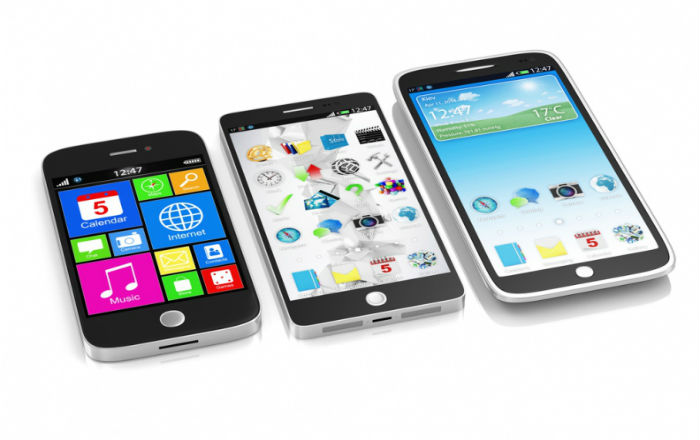
Gone are the days when digital interactions took place only through desktop computers. Today, many people use a wide variety of devices such as tablets and smartphones to access the Internet. A study by Gartner reveals that more than 50% of users will use a mobile device first for all online activities, by 2018. The huge growth in the number people using multiple devices to access the Internet is compelling companies to develop online materials that are device-agnostic, and e-learning courses are no exception.
Are you too planning to create web-based learning materials that can be accessed seamlessly on different devices? Among various aspects you need to consider, developing a good visual design strategy is inarguably the most important. Here are 3 sure-shot tips to come up with the winning visual design for your multi-device compatible online course.
1. Harness the Power of Cascading Style Sheets
Often, e-learning developers use the same visual assets for various layouts while designing a web-based course that can be accessed on multiple devices. However, it is advisable to include slightly different images, depending on the context. It is a good idea to use the media queries feature of CSS to display different images on different devices. Here is an example:

The above image is large and can be displayed effectively on desktop computers. However, it may not render well on mobile devices. So, this image can be replaced with the following, when the content is accessed on tablet PCs.

Make sure you adopt the ‘mobile first’ strategy, when you use CSS media queries. See that your default layout is the mobile layout, and not the desktop layout. This will help ensure that only mobile elements are downloaded when the course loads on a mobile device and not the desktop resources.
2. Use Vector Images Instead of Bitmaps
One of the biggest problems with bitmaps is that they can’t be re-scaled, and this leads to poor visual experiences at higher resolutions. You can overcome this problem by opting for vector images. These images, unlike bitmaps, scale infinitely, and this helps render them effectively on desktop screens.
You can use CSS to produce effects such as shadows, gradients, and rounded corners for vector images used in your responsive e-learning courses. However, most vector images are not rendered properly on old browsers such as InternetExplorer 8. You can overcome this problem using the <object> element.
3. Make the Best Use of JavaScript and WebGL/Canvas
You can use the HTML <canvas> element to create interactive graphics for your multi-device compatible web-based course. The Canvas API can then be used to come up with shapes and lines, insert image files and text, and perform compositing operations. Thereafter, JavaScript code can be written to animate the visuals. Two-dimensional images can be produced using the 2-D canvas context, while three-dimensional resources can be created using the WebGL API.
Canvas is ideal for creating graphics for games and visualizing complex information, but is not very useful to develop standard GUI elements. Moreover, the text on canvases can’t be altered easily, as they are raster images.
Effective responsive visual design plays a key role in delivering good learning experiences across multiple devices. By following the tips shared above, you can come up with the winning graphic design strategy for your device-agnostic e-learning course. Hope you liked the post. Do share your views.


![Top 3 Factors That Help Determine eLearning Development Cost [Infographic]](https://blog.commlabindia.com/hubfs/Imported_Blog_Media/elearning-development-key-factors-cost-determination-infographic.png)