Instructional Designers Keep it Simple! 3 Awesome Ways to Simplify E-learning Design

As instructional designers, we are so often caught up with our content, and in our desire to create wired, out-of-the-box instructional approaches, we end up creating a mess for the learner. So, when do you know where to stop? Easy. The answer lies within you! – You need to stop; when your course or strategy goes beyond the comprehension of the learner. The whole point of eLearning is to make learning simple! Let’s have a look at three ways to keep eLearning simple and awesome!
Awesome Way Number 1 – Focus on What Matters: Never forget the people who access your online course – your learners. If they are not on your mind while designing the course, then your course is going to be a big dud, and you will have a hard time explaining what went wrong to your stakeholders. Always! Always! Think about your learners. After all, they are the ones who decide whether or not your course is a success!

Awesome Way Number 2 – Do Not Go Overboard: This is perhaps the hardest task of an instructional designer. Going overboard is like second nature for a designer. Being passionate about your instructional approach is great. However, it should not be at the cost of missing project timelines and cost! There are times when you will fight it hard to restrict yourself and breakout into your old pattern, but remember creativity is born in constraints, and sometimes, we need to think above and beyond the course.

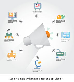
Awesome Way Number 3 – Simplicity At its Best: Be it visuals or text, keep it simple. Don’t have too much or too little on the screen. Lesser the clutter the better. Use apt and not abstract images. You need to remember that the whole point of using an image is to support the text to drive the point home and not confuse the learner. The same goes for narration, it is very easy to dump all the nice-to-know information in the audio narration, but a wordy narration kills your eLearning course. So, keep it simple because less is more!

These are the three awesome ways to keep eLearning course simple. If you have more awesome ways feel free to post a comment.


